---
subtitle: Running quality processing steps
author:
- name: Evelyn Metzger
orcid: 0000-0002-4074-9003
affiliations:
- ref: bsb
- ref: eveilyeverafter
execute:
eval: true
freeze: auto
message: true
warning: false
self-contained: false
code-fold: false
code-tools: true
code-annotations: hover
engine: knitr
prefer-html: true
format: live-html
webr:
packages:
- dplyr
- duckdb
- ggplot2
- plotly
repos:
- https://r-lib.r-universe.dev
resources:
- assets/interactives/fov_qc_vary.parquet
- assets/interactives/fov_locations.parquet
---
{{< include ./_extensions/r-wasm/live/_knitr.qmd >}}
# Quality Processing {#sec-quality-processing}
This section is critical in any data analysis. We'll pass the data through
a series of filters to ensure the downstream processing steps contain high-quality
data. We do this by screening and flagging any FOVs that might have lower quality
and running a counts-based filter.
```{r}
#| label: Preamble
#| eval: true
#| echo: true
#| message: false
#| code-fold: true
#| code-summary: "R code"
source("./preamble.R")
reticulate::source_python("./preamble.py")
analysis_dir <- file.path(getwd(), "analysis_results")
input_dir <- file.path(analysis_dir, "input_files")
output_dir <- file.path(analysis_dir, "output_files")
analysis_asset_dir <- "./assets/analysis_results" # <1>
qc_dir <- file.path(output_dir, "qc")
if(!dir.exists(qc_dir)){
dir.create(qc_dir, recursive = TRUE)
}
results_list_file = file.path(analysis_dir, "results_list.rds")
if(!file.exists(results_list_file)){
results_list <- list()
saveRDS(results_list, results_list_file)
} else {
results_list <- readRDS(results_list_file)
}
```
Load the dataset we generated in @sec-data-wrangle.
```{r}
#| label: load-anndata
#| eval: false
#| code-summary: "R Code"
#| message: true
#| warning: false
#| code-fold: true
py$adata <- py$ad$read_h5ad(py$os$path$join(analysis_dir, "anndata-0-initial.h5ad"))
```
## FOV QC {#sec-fov-qc}
Lower quality FOVs generally result in reduced overall gene expression or
reduced signal from select genes. Potential causes for lower FOV quality (e.g. lower relative signal for all/select genes for a given FOV compared to majority of FOVs) include tissue/section quality, high autofluorescence, and inadequate fiducials. We can
quantify this signal loss using the FOV QC method as described recently in
this [scratch space tool](https://nanostring-biostats.github.io/CosMx-Analysis-Scratch-Space/posts/fov-qc/index.html#fov-quality).
For a more detailed explanation of the the FOV
QC functions, expand the box below.
Since the FOV QC code was written in R, convert relevant annData components to R objects.
```{python}
#| label: sparse-to-dense-and-meta
#| eval: false
#| code-summary: "Python Code"
#| message: false
#| warning: false
#| code-fold: true
meta = adata.obs.copy()
expr = adata.X.astype('float64')
```
Run the `runFOVQC` routine. The `source` call below will load several functions
into memory. Since this dataset is from WTX, we'll use the barcode patterns
from `Hs_WTX`.
```{r}
#| label: fov-qc-1
#| eval: false
#| code-summary: "R Code"
#| message: false
#| warning: false
#| code-fold: true
# source the necessary functions:
source("https://raw.githubusercontent.com/Nanostring-Biostats/CosMx-Analysis-Scratch-Space/Main/_code/FOV%20QC/FOV%20QC%20utils.R") # <1>
allbarcodes <- readRDS(url("https://github.com/Nanostring-Biostats/CosMx-Analysis-Scratch-Space/raw/Main/_code/FOV%20QC/barcodes_by_panel.RDS"))
results_list[['barcodes']] <- allbarcodes['Hs_WTX']
saveRDS(results_list, results_list_file)
```
1. For historic reasons, the characters in the barcode string are duplicated.
:::{.noteworthybox title="Understanding the FOV QC parameters" collapse="true"}
This deep dive shows a how the two tuning parameters of the FOV QC function,
`max_prop_loss` and `max_totalcount_loss`), affect the results.
The parameter `max_prop_loss` sets a tolerance for the maximum allowable
proportion of signal loss for any single barcode bit before an FOV is flagged.
For example, if we set `max_prop_loss` to 0.3, it means we'd accept a given `bit`
given if it has lost 30% of its original strength.
While `max_prop_loss` focuses on the errors in a single specific barcode `bit`,
`max_totalcounts_loss` looks at the bigger picture. It asks, "Is this entire FOV
significantly dimmer or less populated with transcripts than it should be?" This
can help detect broader issues like poor tissue quality, focusing problems, or
reagent failures in that specific area.
:::: {.content-visible unless-format="pdf"}
Let's see what happens to the number of flagged FOVs when adjust these parameters.
```{r}
#| echo: false
#| eval: false
#| code-fold: true
library(tidyr)
library(purrr)
library(nanoparquet)
raw_data <- py$expr
colnames(raw_data) <- py$adata$var_names$to_list()
rownames(raw_data) <- py$adata$obs_names$to_list()
# Convert to sparse
xy <- py$meta %>% select(x_slide_mm, y_slide_mm) %>% as.data.frame()
rownames(xy) <- py$adata$obs_names$to_list()
fov <- py$meta %>% select(fov) %>% pull()
vary_max_prop_loss <- seq(from=0.1, to=0.6, by=0.1) # <1>
vary_max_totalcounts_loss <- seq(from=0.1, to=0.6, by=0.1)
param_grid <- crossing(
i = vary_max_prop_loss,
j = vary_max_totalcounts_loss
)
fov_qc_vary_file <- "./assets/interactives/fov_qc_vary.parquet"
if (file.exists(fov_qc_vary_file)) {
cat("Existing results file found. Determining which simulations to resume.\n")
existing_results <- read_parquet(fov_qc_vary_file) %>% as.data.frame()
existing_results$max_prop_loss <- as.numeric(existing_results$max_prop_loss)
existing_results$max_totalcounts_loss <- as.numeric(existing_results$max_totalcounts_loss)
completed_params <- existing_results %>%
select(max_prop_loss, max_totalcounts_loss) %>%
distinct()
colnames(completed_params) <- c('i', 'j')
params_to_run <- anti_join(param_grid, completed_params, by = c("i", "j"))
} else {
cat("No existing results file found. Starting simulation from scratch.\n")
params_to_run <- param_grid
existing_results <- tibble()
}
if (nrow(params_to_run) > 0) {
cat(sprintf("\nRunning %d new simulation(s)...\n", nrow(params_to_run)))
results <- list()
for (row_index in 1:nrow(params_to_run)) {
message(paste0("Running row ", row_index))
current_params <- params_to_run[row_index, ]
i_val <- current_params$i
j_val <- current_params$j
res <- runFOVQC(counts = raw_data, xy = xy, fov = fov,
barcodemap = results_list[['barcodes']][[1]],
max_prop_loss = i_val, max_totalcounts_loss = j_val)
flagged_fovs <- as.numeric(res$flaggedfovs)
if (length(flagged_fovs) > 0) {
# If FOVs were flagged, create a tibble and add it to our list
results[[length(results) + 1]] <- tibble(FOV = flagged_fovs) %>%
mutate(
max_prop_loss = i_val,
max_totalcounts_loss = j_val
)
} else {
results[[length(results) + 1]] <- tibble(FOV=NA,
max_prop_loss = i_val,
max_totalcounts_loss = j_val)
}
}
new_results <- bind_rows(results)
cat("\nSimulation batch complete. Combining and saving results.\n")
combined_results <- bind_rows(existing_results, new_results) %>%
select(max_prop_loss, max_totalcounts_loss, FOV)
existing_results$max_prop_loss <- as.character(existing_results$max_prop_loss)
existing_results$max_totalcounts_loss <- as.character(existing_results$max_totalcounts_loss)
write_parquet(combined_results, fov_qc_vary_file)
cat("Successfully saved updated results to:", fov_qc_vary_file, "\n")
} else {
cat("\nAll simulations are already complete. Nothing to do.\n")
}
```
```{ojs}
//| eval: true
//| echo: false
viewof max_prop_loss = Inputs.range([0.1, 0.6], {
  step: 0.1,
  label: "Max Proportion Loss"
})
viewof max_totalcounts_loss = Inputs.range([0.1, 0.6], {
  step: 0.1,
  label: "Max Total Counts Loss"
})
```
```{webr}
#| echo: false
#| eval: true
#| edit: false
#| define:
#| - fov_locations
# This just reads the FOV locations parquet and makes the data
# available to to webr. It only needs to be loaded once.
con0 <- dbConnect(duckdb())
fov_locations <- dbGetQuery(
con0,
"SELECT * FROM read_parquet('assets/interactives/fov_locations.parquet');"
)
dbDisconnect(con0, shutdown = TRUE)
```
```{webr}
#| echo: false
#| eval: true
#| edit: false
#| input:
#| - max_prop_loss
#| - max_totalcounts_loss
#| define:
#| - filtered_data
# This will re-run every time max_prop_loss and max_totalcounts_loss
# change (reactive with OJS sliders)
# connection to an in-memory DuckDB database
con <- dbConnect(duckdb())
# build the SQL query
query <- paste0(
"SELECT * FROM 'assets/interactives/fov_qc_vary.parquet' WHERE max_prop_loss = ",
max_prop_loss,
" AND max_totalcounts_loss = ",
max_totalcounts_loss
)
query_data <- dbGetQuery(con, query)
dbDisconnect(con, shutdown = TRUE)
filtered_data <- fov_locations
filtered_data$flagged <- ifelse(
filtered_data$FOV %in% query_data$FOV, TRUE, FALSE)
```
This code below will plot the spatial distribution of failed FOVs. Feel free
to adjust the code, if desired.
```{webr}
#| autorun: true
#| input:
#| - filtered_data
p <- ggplot(filtered_data,
aes(x=x_global_mm,
y=y_global_mm,
color=factor(flagged),
label=FOV)) +
geom_point() + theme_bw() +
coord_fixed() +
scale_color_manual(values=c(`TRUE`='red',
`FALSE`='grey'))
plotly::ggplotly(p)
```
::::
:::: {.content-visible when-format="pdf"}
For an interactive visual of the effect of these tuning parameters, please
see the online version of this book.
::::
:::
With the functions loaded, execute the `runFOVQC` function. For this example,
I choose a less restrictive parameter set (`max_prop_loss` = 0.4
and `max_totalcounts_loss` = 0.3).
```{r}
#| label: runFOVQC
#| eval: false
#| echo: false
#| code-summary: "R Code"
#| message: false
#| code-fold: true
raw_data <- py$expr
colnames(raw_data) <- py$adata$var_names$to_list()
rownames(raw_data) <- py$adata$obs_names$to_list()
xy <- py$meta %>% select(x_slide_mm, y_slide_mm) %>% as.data.frame()
rownames(xy) <- py$adata$obs_names$to_list()
fov <- py$meta %>% select(fov) %>% pull()
res <- runFOVQC(counts = raw_data, xy = xy, fov = fov,
barcodemap = results_list[['barcodes']]$Hs_WTX,
max_prop_loss = 0.4, max_totalcounts_loss = 0.3)
saveRDS(res, file.path(qc_dir, "fovqc.rds"))
```
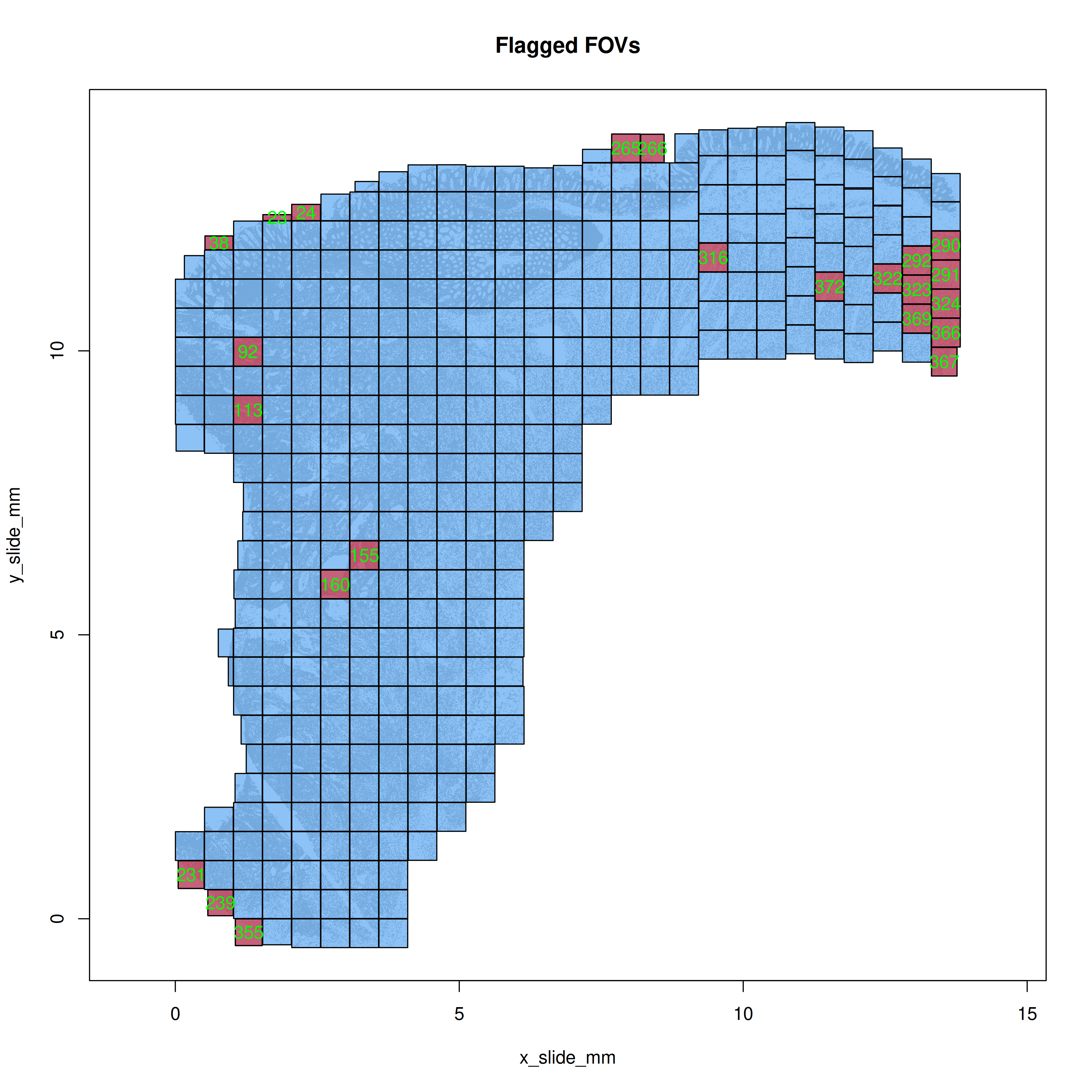
Plot the flagged FOVs in R simply with `mapFlaggedFOVs(res)` function to get the
spatial layout of any FOVs that were flagged. In this case (@fig-qc-fov-1), you
can see some FOVs that were flagged along the tissue perimeter.
```{r}
#| label: plot-flagged-fovs
#| eval: false
#| echo: false
#| code-summary: "R Code"
#| message: false
#| warning: false
png(file.path(qc_dir, "flagged_fovs.png"),
width=10, height=10, res=350, units = "in", type = "cairo")
mapFlaggedFOVs(res)
dev.off()
```
```{r}
#| label: fig-qc-fov-1
#| message: false
#| warning: false
#| echo: false
#| fig.width: 6
#| fig.height: 6
#| fig-cap: "Spatial location of the flagged FOVs."
#| eval: true
render(file.path(analysis_asset_dir, "qc"), "flagged_fovs.png", qc_dir)
```
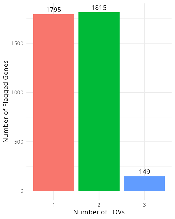
For the targets that were flagged, plot how many FOVs they were flagged in.
```{r}
#| label: fov-qc-2
#| eval: false
#| code-summary: "R Code"
#| message: false
#| warning: false
#| code-fold: show
flagged_genes <- res$flagged_fov_x_gene[,2]
flagged_genes <- flagged_genes[!is.na(flagged_genes)] # <1>
flagged_genes <- as.data.frame(rev(sort(table(flagged_genes))))
colnames(flagged_genes)[1] <- 'target'
df <- data.frame(target=py$adata$var_names$to_list())
df <- merge(df, flagged_genes, by="target", all.x=TRUE, all.y=FALSE)
df$Freq[is.na(df$Freq)] <- 0L
py$adata$var['fov_qc_flagged'] <- as.integer(df$Freq) # <2>
p <- ggplot(flagged_genes, aes(x = factor(Freq), fill = factor(Freq))) +
geom_bar() +
geom_text(stat='count', aes(label=after_stat(count)), vjust=-0.5) +
labs(x = "Number of FOVs", y = "Number of Flagged Genes") +
theme_minimal() +
scale_x_discrete(breaks = 1:13) +
theme(legend.position = "none")
ggsave(p, filename=file.path(qc_dir, "genes_impacted_in_flagged_fovs.png"),
width=4, height=5, dpi=150, type="cairo")
```
1. A value of NA here means the gene in a given FOV was _not_ flagged.
```{r}
#| label: fig-qc-fov-2
#| message: false
#| warning: false
#| echo: false
#| fig.width: 6
#| fig.height: 6
#| fig-cap: "Number of targets impacted in a given number of FOVs."
#| eval: true
render(file.path(analysis_asset_dir, "qc"), "genes_impacted_in_flagged_fovs.png", qc_dir)
```
In @fig-qc-fov-2, there are only a few genes (149) that were flagged in three FOVs.
If we found a set of genes that were systematically flagged in many FOVs, we may
consider removing the impacted FOVs. Alternatively we could remove the impacted
genes from all FOVs. In this sample, it's probably fine to
ignore this result.
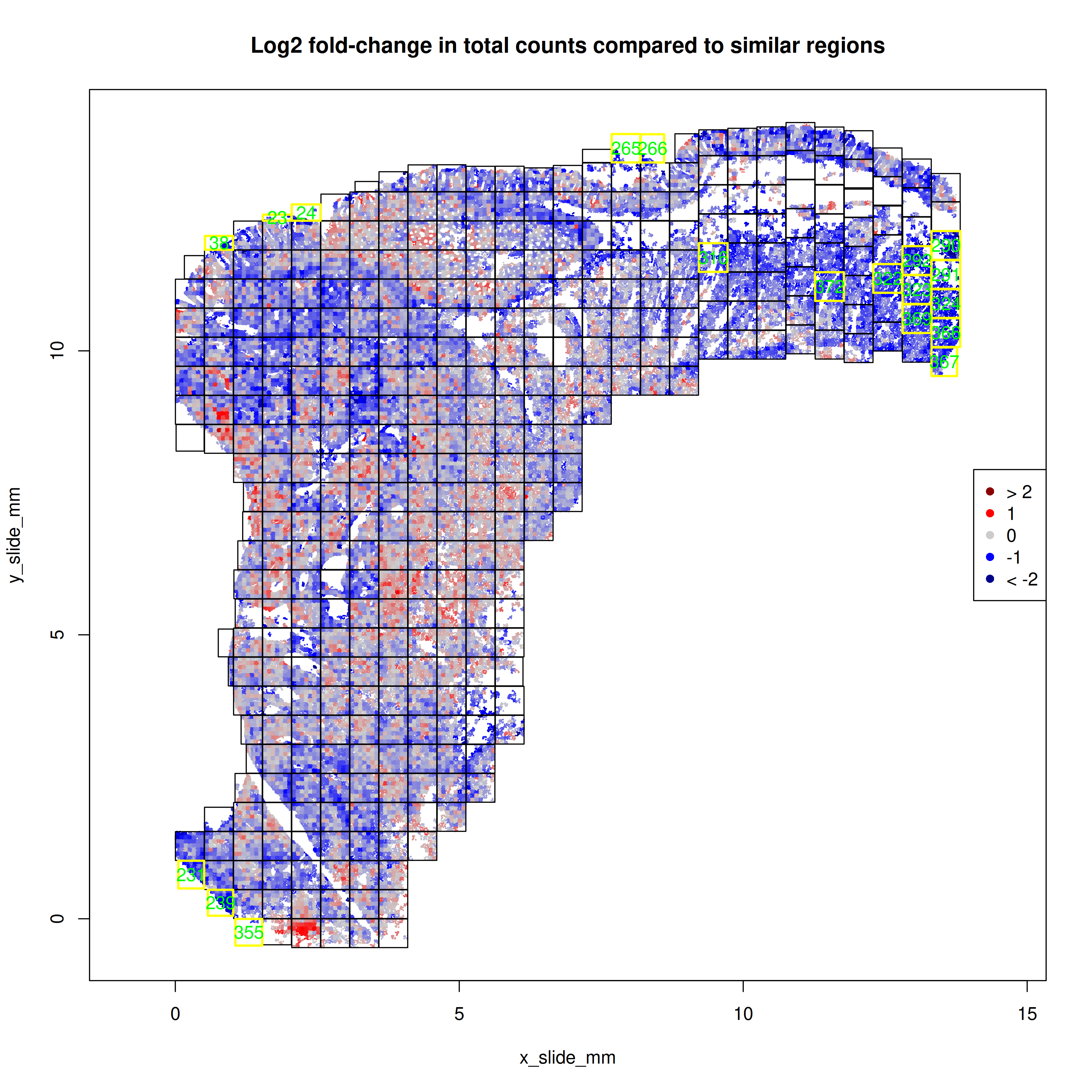
With the `FOVSignalLossSpatialPlot` function, we can gain a higher resolution
perspective by plotting the 7x7 sub-FOV grids across space and coloring these
sub-FOV grids by the change in our expected total counts. In @fig-qc-fov-3, our
focus is on FOVs that are solidly blue which would suggestion fewer transcripts
than other FOVs. In this example, eight of the FOVs flagged as low total counts
occured along the tissue border and were not complete 7x7 grids. The other section
in @fig-qc-fov-3 is contiguous and may
suggest a domain or type of tissue with lower overall transcripts.
```{r}
#| label: plot-signal-loss
#| eval: false
#| echo: false
#| code-summary: "R Code"
#| message: false
#| warning: false
png(file.path(qc_dir, "signal_loss_plot.png"),
width=10, height=10, res=350, units = "in", type="cairo")
FOVSignalLossSpatialPlot(res, shownames = TRUE)
dev.off()
```
```{r}
#| label: fig-qc-fov-3
#| message: false
#| warning: false
#| echo: false
#| fig.width: 10
#| fig.height: 10
#| fig-cap: "Number of genes impacted in a given number of FOVs."
#| eval: true
render(file.path(analysis_asset_dir, "qc"),"signal_loss_plot.png", qc_dir)
```
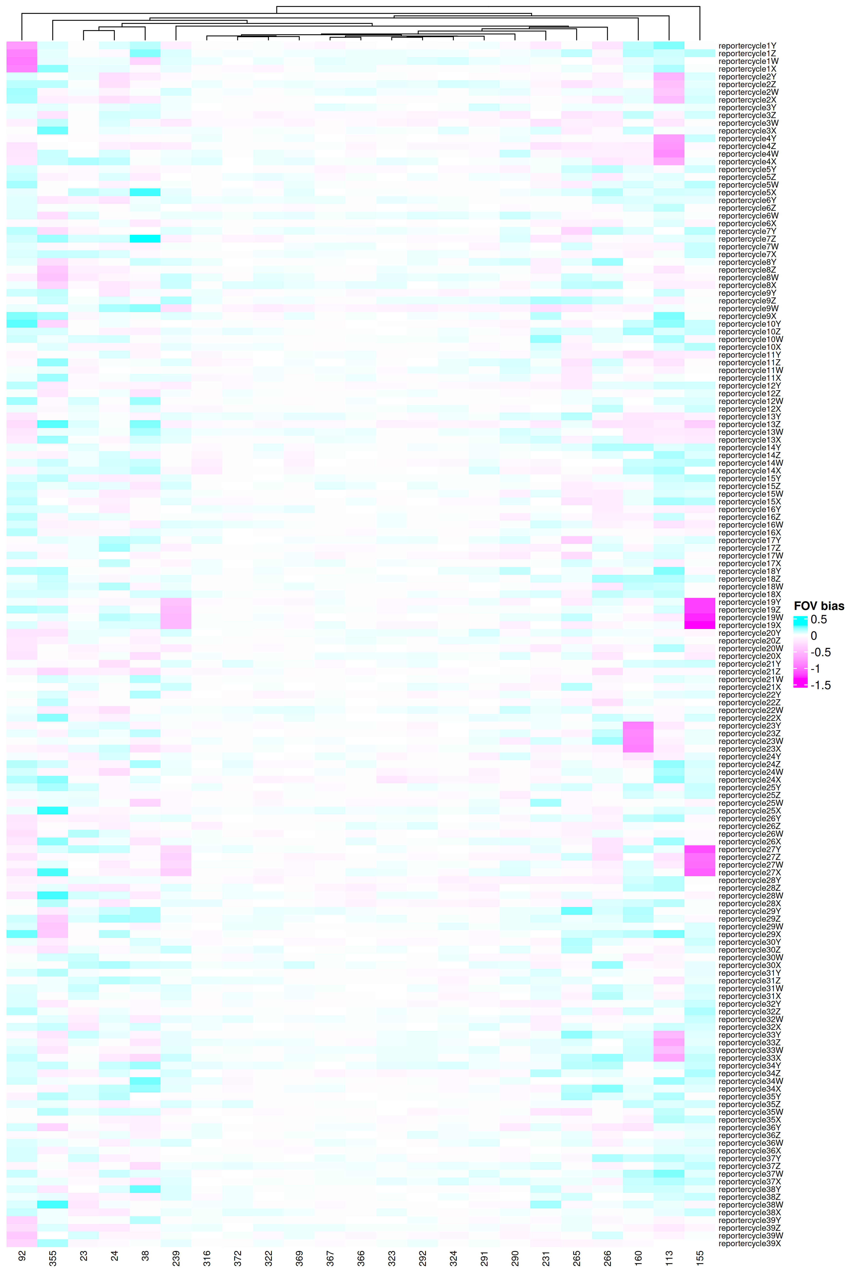
To see details how these FOVs might have been impacted, we can use the function
below to plot the signal lost
found for each cycle-by-reporter combination.
```{r}
#| label: plot-fov-effects
#| eval: false
#| code-summary: "R Code"
#| message: false
#| warning: false
#| code-fold: show
library(ComplexHeatmap)
library(circlize)

FOVEffectsHeatmap <- function(res, fovs=NULL,
                              cluster_rows = FALSE,
                              cluster_columns = TRUE) {
  if(is.null(fovs)){
    fovs <- rownames(res$fovstats$bias)
  }

  transposed_matrix <- t(res$fovstats$bias[fovs,])
  col_fun = colorRamp2(
    breaks = c(min(transposed_matrix), 0, max(transposed_matrix)),
    colors = c("magenta", "white", "cyan")
  )

  ht_obj <- ComplexHeatmap::Heatmap(
      matrix = transposed_matrix,
      name = "FOV bias",
      col = col_fun,
      cluster_rows = cluster_rows,
      cluster_columns = cluster_columns,
      show_row_dend = TRUE,
      show_column_dend = TRUE,
      row_names_gp = gpar(fontsize = 7),
      column_names_gp = gpar(fontsize = 8)
  )

  return(ht_obj)
}

png(file.path(qc_dir, "FOVEffectsHeatmap.png"),
    width=10, height=15, res=350, units = "in", type = 'cairo')
  draw(FOVEffectsHeatmap(res, fovs=res$flaggedfovs))
dev.off()

results_list$flaggedfovs <- res$flaggedfovs
saveRDS(results_list, results_list_file)
```
```{r}
#| label: fig-qc-fov-4
#| message: false
#| warning: false
#| echo: false
#| fig.width: 10
#| fig.height: 15
#| fig-cap: "Reporter-by-FOV combinations that were flagged."
#| eval: true
render(file.path(analysis_asset_dir, "qc"),"FOVEffectsHeatmap.png", qc_dir)
```
What we are checking for in @fig-qc-fov-4 is:
1. Any report cycles that show systematically reduced signal across many FOVs
2. Any FOVs that show underperforming multiple reporter cycles.
While we do see two reporter cycles (19 and 27) with two flagged FOVs (155 and 239),
each, there's no evidence of a systemic signal lost in any reporter cycle. If we did find
strong evidence, one could conservatively filter out the genes that are present
in that reporter cycle. This would be roughly 2,000 genes for a given reporter cycle.
Looking from the perspective of the FOVs (#2), we see only a handful
of FOVs showed one (or two) underperforming
reporter cycles. These include FOVs 92, 113, 155, 160, and 239. At this point,
one could remove all FOVs that were flagged (`length(res$flaggedfovs)`;
`r length(results_list$flaggedfovs)` in this case), just the five that we found
evidence of signal lost in one or more reporter cycles, or flag the cells within the impacted
FOVs and see if any downstream results are impacted.
If you wanted to be on the conservative
side, you would remove all flagged FOVs unless you have biological justification
that the signal difference isn't due to FOV effects.
For this analysis, I'll
simply do the "flag and monitor" approach.
```{r}
#| label: fov-qc-flag-impacted-cells
#| echo: true
#| eval: false
#| code-summary: "R Code"
#| code-fold: show
meta <- py$adata$obs
meta$fovqcflag <- ifelse(meta$fov %in% as.numeric(res$flaggedfovs), 1, 0)
py$adata$obs$fovqcflag <- meta$fovqcflag
```
## Cell-level QC
Where the previous section examined signal at the FOV level, this section examines
target counts at the cell level. The purpose of this filter is simple: to remove
_low signal outliers_ while keeping the _biology_. The cells in a given dataset comprise of a mix
of:
- viable, intact cells with high signal
- damaged or dying cells. These may have leaky membranes and may have reduced cytoplasmic RNA
- imperfect segmentation of cells -- especially around FOV borders
and so our aim is to filter out cells from the latter two scenarios.
Counts-based filtering has a trade-off. While several downstream "tertiary" analyses
account for low signal in a variety of ways (discussed later), many of the pre-processing
lenient cutoff can introduce low-quality cells in dimensional reductions like PCA and UMAP
and can break up clustering patterns (creating spurious clusters or merging
otherwise distinct clusters). On the other hand, a stringent cutoff can introduce
unexpected signal lost. This is because cell types vary in their transcript counts so
removing cells based on counts will distort the composition of cells in your data.
Best practice for counts based filtering of CosMx data includes:
- examining the distribution of transcript and gene counts
- choosing an initial permissive or lenient cutoff
- examining signal relative to background
- plotting the spatial distribution of flagged cells in space
- removing small cell artifacts around the FOV borders
- including plots of total transcripts in your downstream pre-processing steps
::: {.column-margin}
::: {.otherapproachesbox title="Alternative Approach"}
There are many cell-level attributes that one can use as a bases for filtering and
it is recommended to use metrics relevant to your tissue. For example, if you are
analyzing brain, you many want to incorporate or evaluate cell area, eccentricity, or
other morphological characteristics that are available in the metadata. For a list
of cell metadata column definitions, you can see
[this Scratch Space blog post](https://nanostring-biostats.github.io/CosMx-Analysis-Scratch-Space/posts/flat-file-exports/flat-files-compare.html#sec-meta)
:::
:::
### Counts and Features
For the distribution of transcript and gene counts, I like to look at the joint
distribution in addition to the univariate distributions. In the code below
I set a permissive, symmetrical threshold of 2.5 standard deviations (SDs) around
the mean (in log10 space) but this thresholding is sample-dependent so different
values might make more sense on your data.
```{r}
#| label: count-based-filtering
#| eval: false
#| code-summary: "R Code"
#| message: false
#| warning: false
# meta <- py$adata$obs
counts_min_threshold <- round(10^(mean(log10(meta$nCount_RNA)) - 2.5*sd(log10(meta$nCount_RNA))))
features_min_threshold <- round(10^(mean(log10(meta$nFeature_RNA)) - 2.5*sd(log10(meta$nFeature_RNA))))
counts_max_threshold <- round(10^(mean(log10(meta$nCount_RNA)) + 2.5*sd(log10(meta$nCount_RNA))))
features_max_threshold <- round(10^(mean(log10(meta$nFeature_RNA)) + 2.5*sd(log10(meta$nFeature_RNA))))

results_list['counts_min_threshold'] = counts_min_threshold
results_list['features_min_threshold'] = features_min_threshold
results_list['counts_max_threshold'] = counts_max_threshold
results_list['features_max_threshold'] = features_max_threshold


meta$counts_filter <- ifelse(
  meta$nFeature_RNA >= features_min_threshold &
         meta$nFeature_RNA <= features_max_threshold &
         meta$nCount_RNA >= counts_min_threshold &
         meta$nCount_RNA <= counts_max_threshold
  , "pass", "filtered")

results_list['prop_counts_based_filter'] <- sum(meta$counts_filter=="pass") / nrow(meta)
saveRDS(results_list, results_list_file)


library(scales)
p <- ggplot(
  data = meta,
  aes(x=nFeature_RNA, y=nCount_RNA, color=counts_filter)) +
  geom_point(alpha=0.002, pch=".") +
  scale_color_manual(values=c("pass"="dodgerblue", "filtered"="darkorange")) +
  geom_vline(xintercept = c(features_min_threshold, features_max_threshold), lty="dotted") +
  geom_hline(yintercept = c(counts_min_threshold, counts_max_threshold), lty="dotted") +
  scale_x_log10(
    breaks = trans_breaks("log10", function(x) 10^x),
    labels = trans_format("log10", math_format(10^.x))
  ) +
  scale_y_log10(
    breaks = trans_breaks("log10", function(x) 10^x),
    labels = trans_format("log10", math_format(10^.x))
  ) +
  theme_minimal() +
  coord_fixed() +
  theme(legend.position = "none")

p <- ggMarginal(p, type = "density")

ggsave(filename = file.path(qc_dir, "qc_joint_distribution.png"), p,
       width=8, height=8, type = 'cairo')

p1 <- ggplot(
      data=meta,
      aes(x=nCount_RNA)) +
      geom_density(alpha=0.01) +
      # scale_x_log10() +
      theme_minimal() +
      geom_vline(xintercept = c(counts_min_threshold, counts_max_threshold), lty="dotted")

ggsave(filename = file.path(qc_dir, "qc_dist_counts.png"), p1,
       width=8, height=8, type = 'cairo')

p2 <- ggplot(
      data=meta,
      aes(x=nFeature_RNA)) +
      geom_density(alpha=0.01) +
      # scale_x_log10() +
      theme_minimal() +
      geom_vline(xintercept = c(features_min_threshold, features_max_threshold), lty="dotted")

ggsave(filename = file.path(qc_dir, "qc_dist_features.png"), p2,
       width=8, height=8, type = 'cairo')

p3 <- ggplot(
        data=meta) +
      geom_point(
        aes(x=x_slide_mm, y=y_slide_mm, color=counts_filter),
        size=0.001, alpha=0.02) +
      coord_fixed() + theme_bw() +
      scale_color_manual(values=c("pass"="dodgerblue", "filtered"="darkorange")) + facet_wrap(~counts_filter) +
      guides(color = guide_legend(override.aes = list(size = 7, alpha = 1)))

ggsave(filename = file.path(qc_dir, "qc_xy_flagged.png"), p3,
       width=8, height=8, type = 'cairo')
```
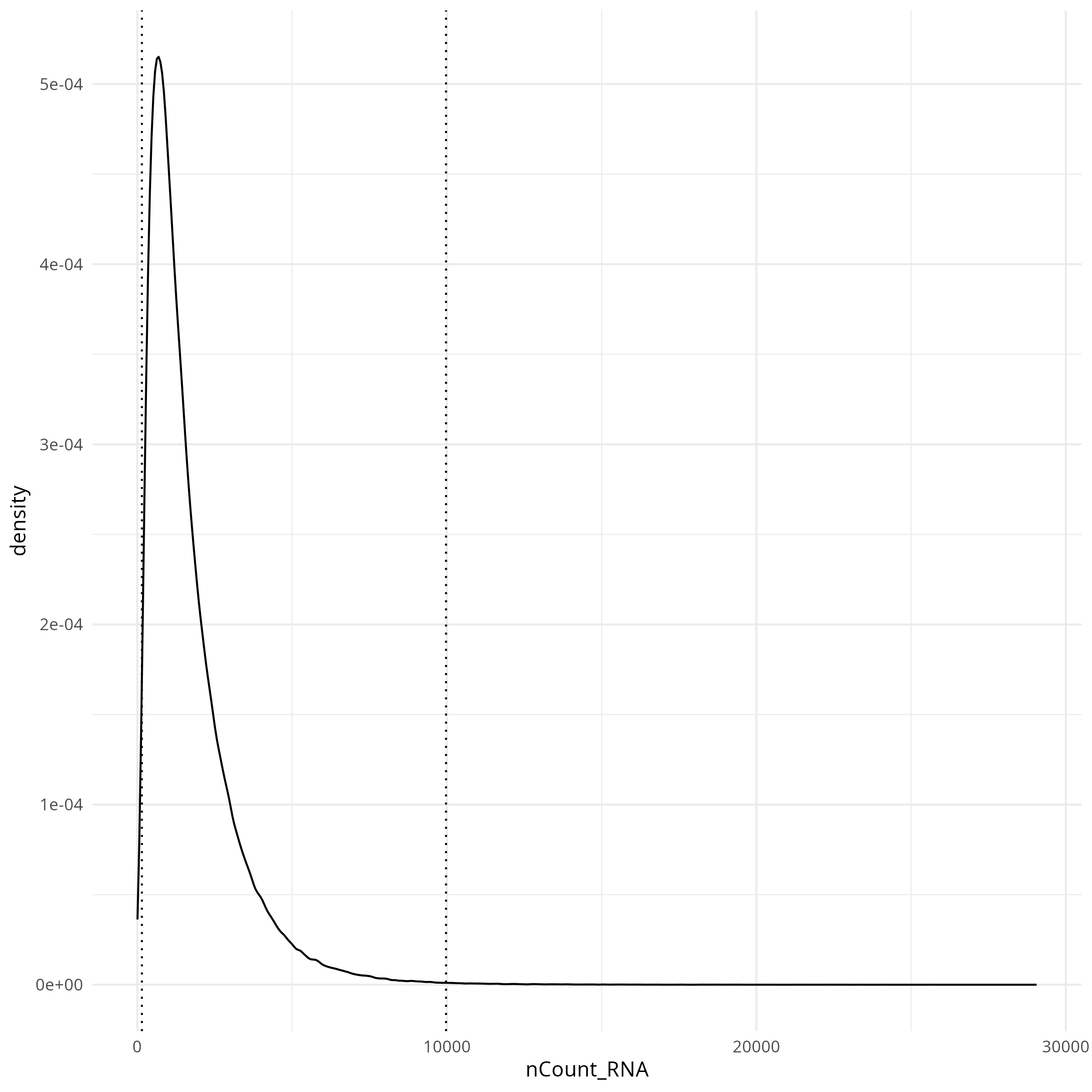
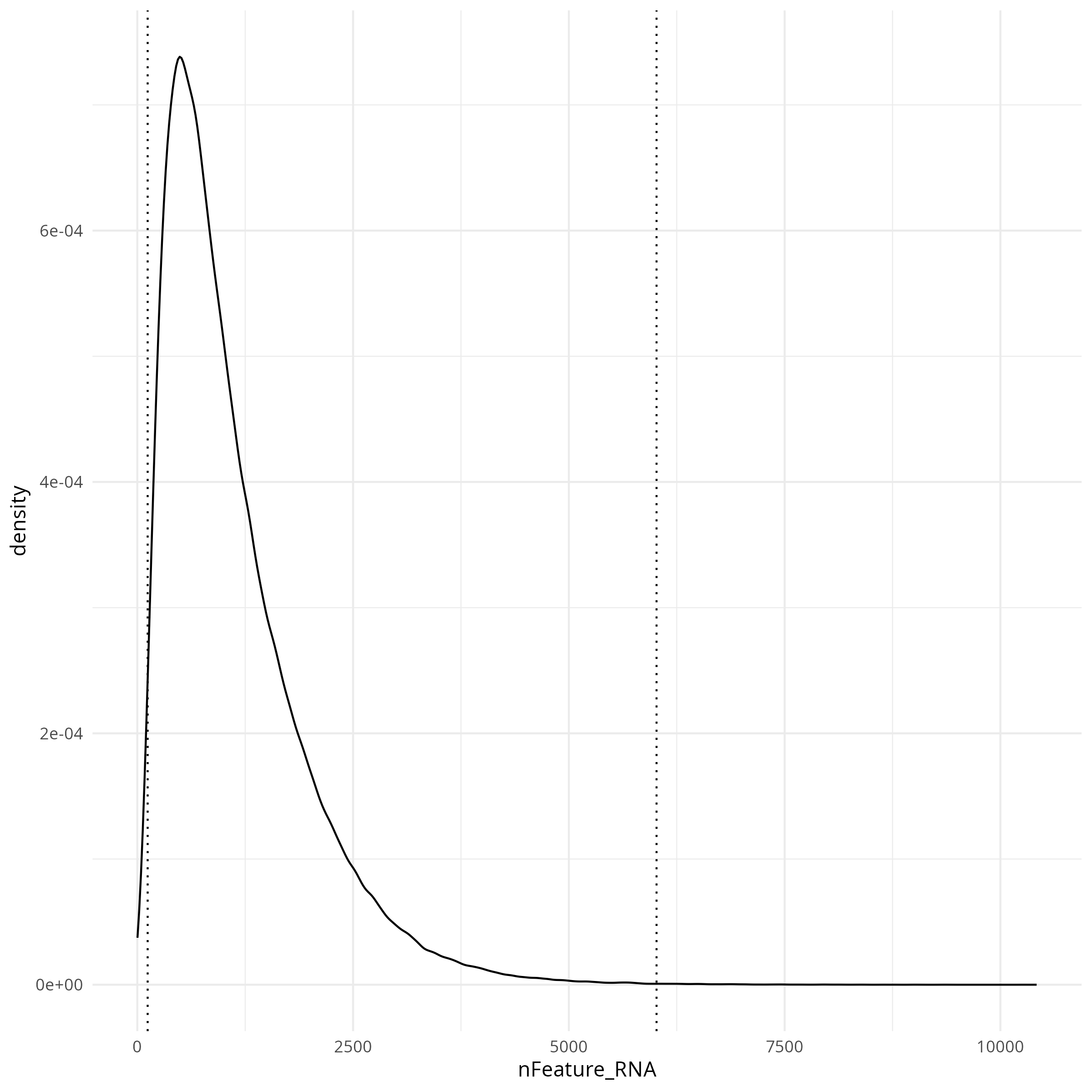
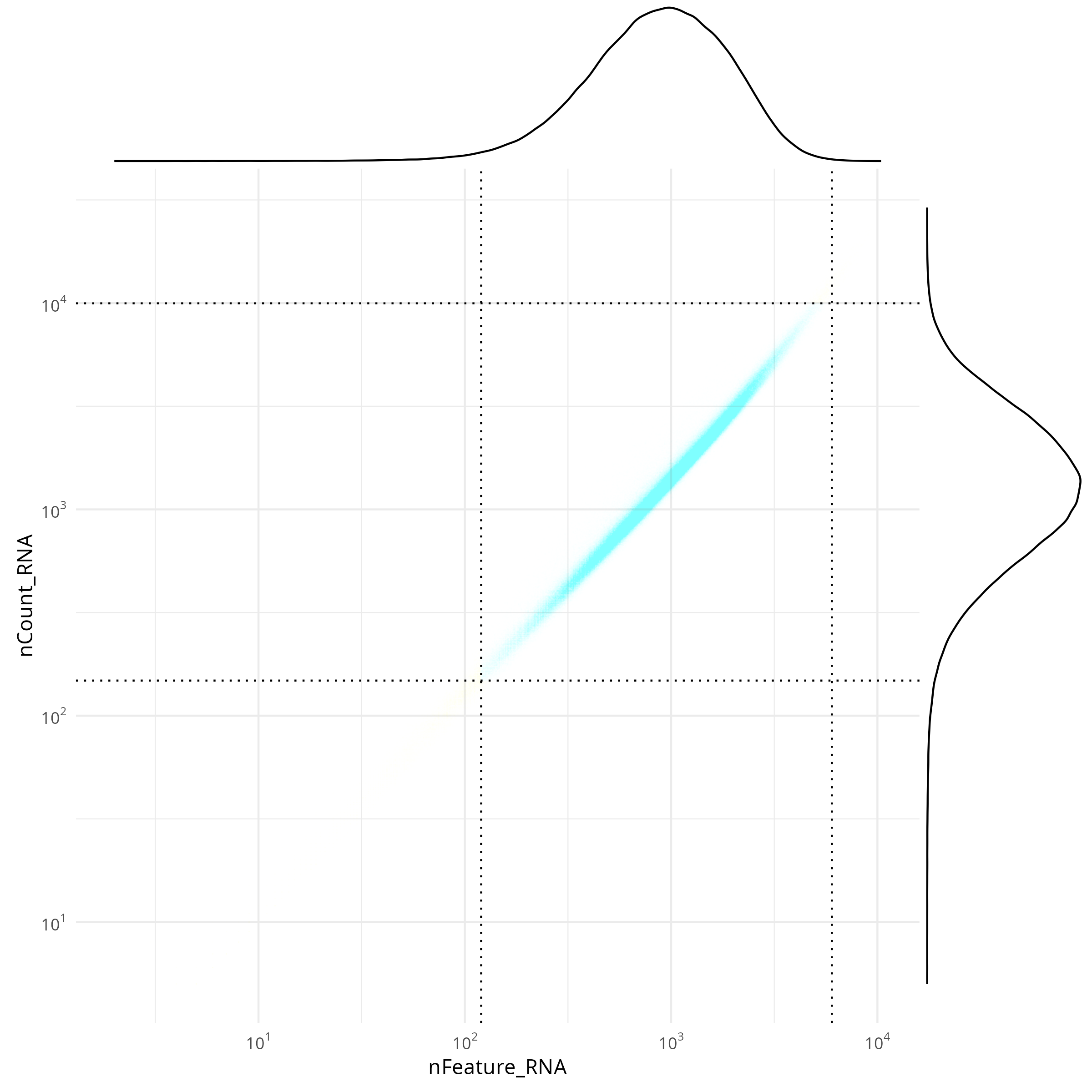
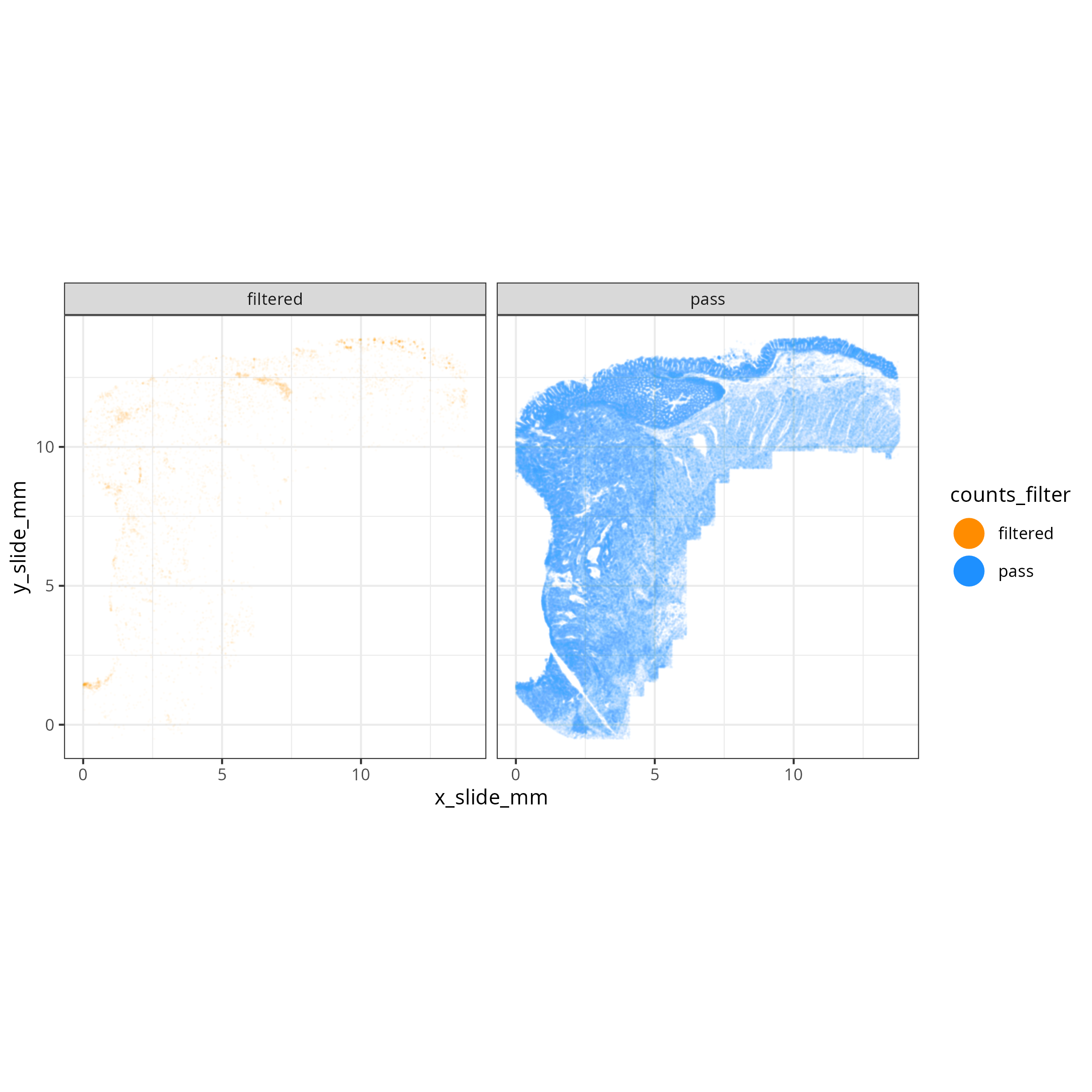
The tabs below show the summary plots. Based on the distributions, the following thresholds we derived from the data: `r paste0('min counts = ', results_list$counts_min_threshold, ', max counts = ', results_list$counts_max_threshold, ', min features = ', results_list$features_min_threshold, ', max features = ', results_list$features_max_threshold)`. This removes about `r round(100*(1 - results_list$prop_counts_based_filter))`% of the data. The spatial layout of these flagged
cells shows some concentration along the perimeter and epithelial regions.
No concentration within FOVs were observed (@fig-qc-xy-flagged).
::: {.panel-tabset}
#### Transcripts per cell
```{r}
#| label: fig-qc-dist-tx-per-cell
#| eval: true
#| code-summary: "R Code"
#| fig-cap: "Distribution of transcripts per cell."
#| fig-width: 4
#| fig-height: 4
render(file.path(analysis_asset_dir, "qc"), "qc_dist_counts.png", qc_dir)
```
#### Features per cell
```{r}
#| label: fig-qc-dist-featrues-per-cell
#| eval: true
#| echo: false
#| code-summary: "R Code"
#| fig-cap: "Distribution of features per cell."
#| fig-width: 4
#| fig-height: 4
render(file.path(analysis_asset_dir, "qc"), "qc_dist_features.png", qc_dir)
```
#### Joint Distribution
```{r}
#| label: fig-qc-joint
#| eval: true
#| echo: false
#| code-summary: "R Code"
#| fig-cap: "Joint distribution of targets (features vs counts)."
#| fig-width: 4
#| fig-height: 4
render(file.path(analysis_asset_dir, "qc"), "qc_joint_distribution.png", qc_dir)
```
#### Spatial Arrangement of flagged cells
```{r}
#| label: fig-qc-xy-flagged
#| eval: true
#| echo: false
#| code-summary: "R Code"
#| fig-cap: "Spatial arrangement of flagged cells."
render(file.path(analysis_asset_dir, "qc"), "qc_xy_flagged.png", file.path(qc_dir))
```
:::
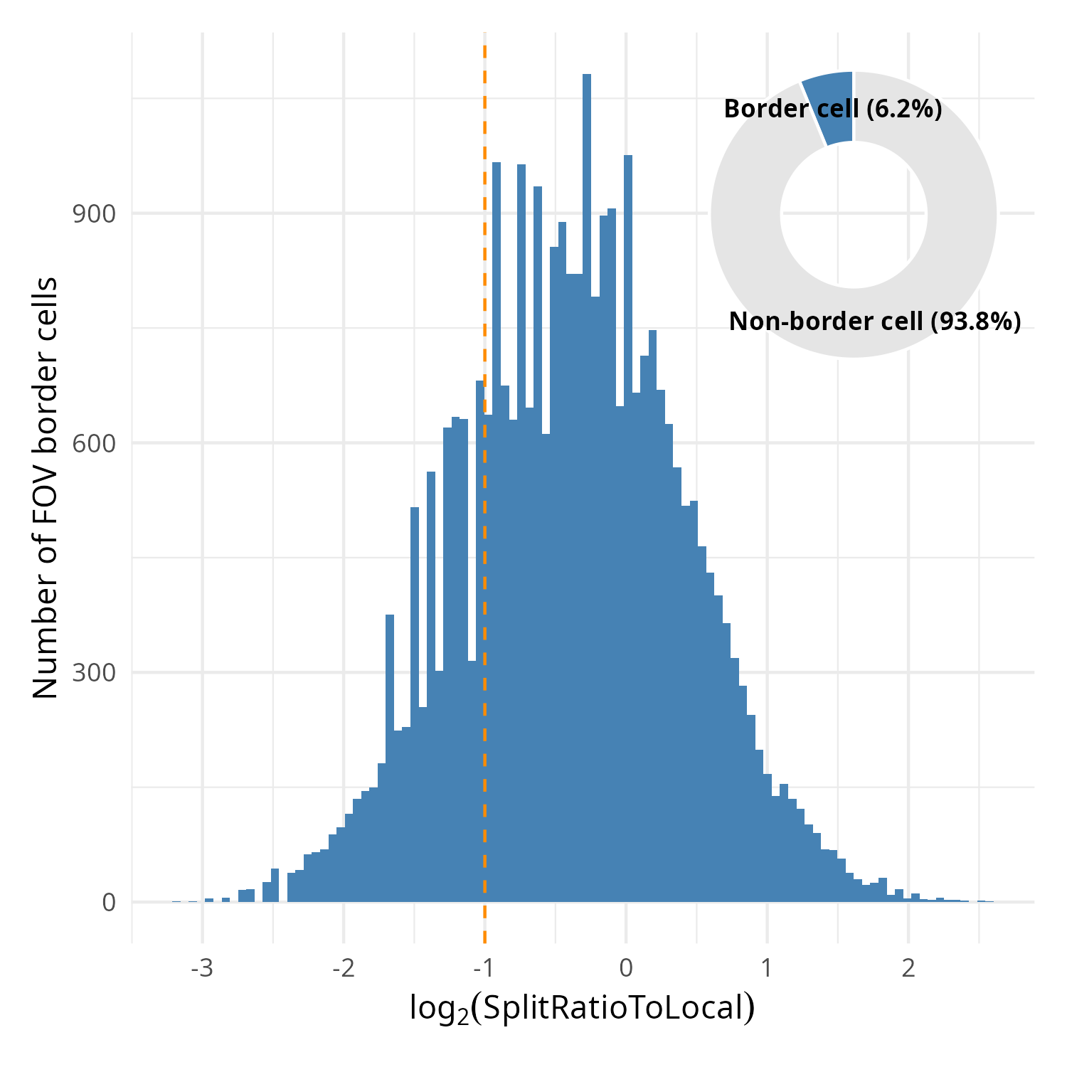
### (Optional) Cells Near FOV Borders
In this particular dataset, 6.2% of the cells were located on the border of FOVs (_i.e._,
touching the FOV edge). This is a minority of cells that in the analysis as a whole shouldn't
affect downstream analyses. For this reason this step is optional.
Within the metadata there is a column named `SplitRatioToLocal`. For cells that
are adjacent to the FOV boundaries, the `SplitRatioToLocal` metric measures the
cell area relative to the mean area of cells in the FOVs. For `0 < SplitRatioToLocal < 1`,
the cell is smaller than average and for `SplitRatioToLocal > 1` the cell is
larger than average. A value of 0 means the cell is not along the border. Let's
plot the distribution of boarder abutting cells (_i.e._, `SplitRatioToLocal > 0`)
and tentatively choose a cutoff of SplitRatioToLocal = 0.5 which translates to
removing cells that are 0.5 (50%) the average cell size. Since this is a ratio,
we'll plot in log2 space (`log2(SplitRatioToLocal) < -1`).
```{r}
#| eval: false
#| code-summary: "R Code"
#| message: false
#| warning: false
#| code-fold: show
results_list['SplitRatioToLocalThreshold'] <- 0.5
saveRDS(results_list, results_list_file)

# meta <- py$adata$obs

library(patchwork)
library(scales)

p_detail <- ggplot(
    data = meta %>% filter(SplitRatioToLocal != 0),
    aes(x = log2(SplitRatioToLocal))) +
    geom_histogram(bins = 100, fill = "steelblue") +
    labs(
      x = expression(log[2]("SplitRatioToLocal")),
      y = "Number of FOV border cells"
    ) +
    theme_minimal() +
    geom_vline(xintercept = log2(results_list[['SplitRatioToLocalThreshold']]),
               color = "darkorange", lty = "dashed")
pie_data <- meta %>%
  mutate(Category = if_else(SplitRatioToLocal > 0, "Border cell", "Non-border cell")) %>%
  count(Category) %>%
  mutate(
    Percentage = (n / sum(n)) * 100,
    Label = paste0(Category, " (", round(Percentage, 1), "%)")
  )

p_pie <- ggplot(pie_data, aes(x = 2, y = n, fill = Category)) +
  geom_bar(stat = "identity", width = 1, color = "white") +
  coord_polar("y", start = 0) +
  scale_fill_manual(values = c("Border cell" = "steelblue", "Non-border cell" = "gray90")) +
  geom_text(aes(label = Label),
            position = position_stack(vjust = 0.5),
            size = 3,
            fontface = "bold") +
  theme_void() +
  xlim(0.5, 2.5) +
  theme(legend.position = "none")

full_plot <- p_detail +
  inset_element(
    p_pie,
    left = 0.6, bottom = 0.6,
    right = 1.0,
    top = 1.0
  )

ggsave(filename = file.path(qc_dir, "qc_splitratiotolocal.png"), full_plot,
       width=5, height=5, type = 'cairo')
```
```{r}
#| label: fig-qc-split
#| eval: true
#| code-summary: "R Code"
#| fig-cap: "Distribution of SplitRatioToLocal for cells abutting an FOV border. Overlay: proportion of border cells relative to all cells."
#| fig-width: 5
#| fig-height: 5
#| echo: false
render(file.path(analysis_asset_dir, "qc"), "qc_splitratiotolocal.png", qc_dir, overwrite = T)
```
## Regional-level cell QC
It's possible that some regions of the tissue might have high background. We can
evaluate the total signal relative to the background. For this approach we
are interested in the Signal to Background Ratio (SBR) in neighborhoods or tissue
regions as opposed to cell-level measures or target-level measures. Since the number of targets is not comparable to the
number of negative probes, we'll consider the average target expression (S)
divided by the average background expression.
$$sbr = \frac{S}{\mu_{B}}$$
When passing the data through this equation, you'll likely find that many cells
have an undefined SBR due to the sparse nature of background counts. To mitigate
this effect, we can spatially smooth the transcript and background counts before applying this
equation. To do this we'll use the `liana` package that creates a connectivities
matrix based on a Gaussian kerneland then multiple this matrix by the negative
probe matrix and the expression matrix to get the spatially-weighted matrices for each.
For more information on this spatial smoothing see @sec-pathways.
```{python}
#| label: sbr-1
#| eval: false
#| code-summary: "Python Code"
#| message: false
#| warning: false
#| code-fold: show
import liana as li
li.ut.spatial_neighbors(
adata,
bandwidth=0.010, # <1>
cutoff=0.080, # <2>
kernel='gaussian',
set_diag=True,
key_added = 'liana',
standardize=True
)
connectivities = adata.obsp['liana_connectivities']
adata.obsm['counts_neg_spatially_smooth'] = connectivities @ adata.obsm['counts_neg']
adata.obsm['counts_spatially_smooth'] = connectivities @ adata.X
smoothed_mean_neg = np.ravel(adata.obsm['counts_neg_spatially_smooth'].mean(axis=1))
smoothed_mean_target = np.ravel(adata.obsm['counts_spatially_smooth'].mean(axis=1))
epsilon = 1e-9
SBR = smoothed_mean_target / (smoothed_mean_neg + epsilon)
```
1. use 10 µm bandwidth (this tunable)
2. anything below this value is considered 0 (this is tunable)
::: {.column-margin}
::: {.otherapproachesbox title="Alternative Approach"}
While not entirely equivalent, if you run into memory issues with creating a spatially-weighted
expression matrix, you can instead spatially smooth the total counts from the
metadata column `nCount_RNA`.
:::
:::
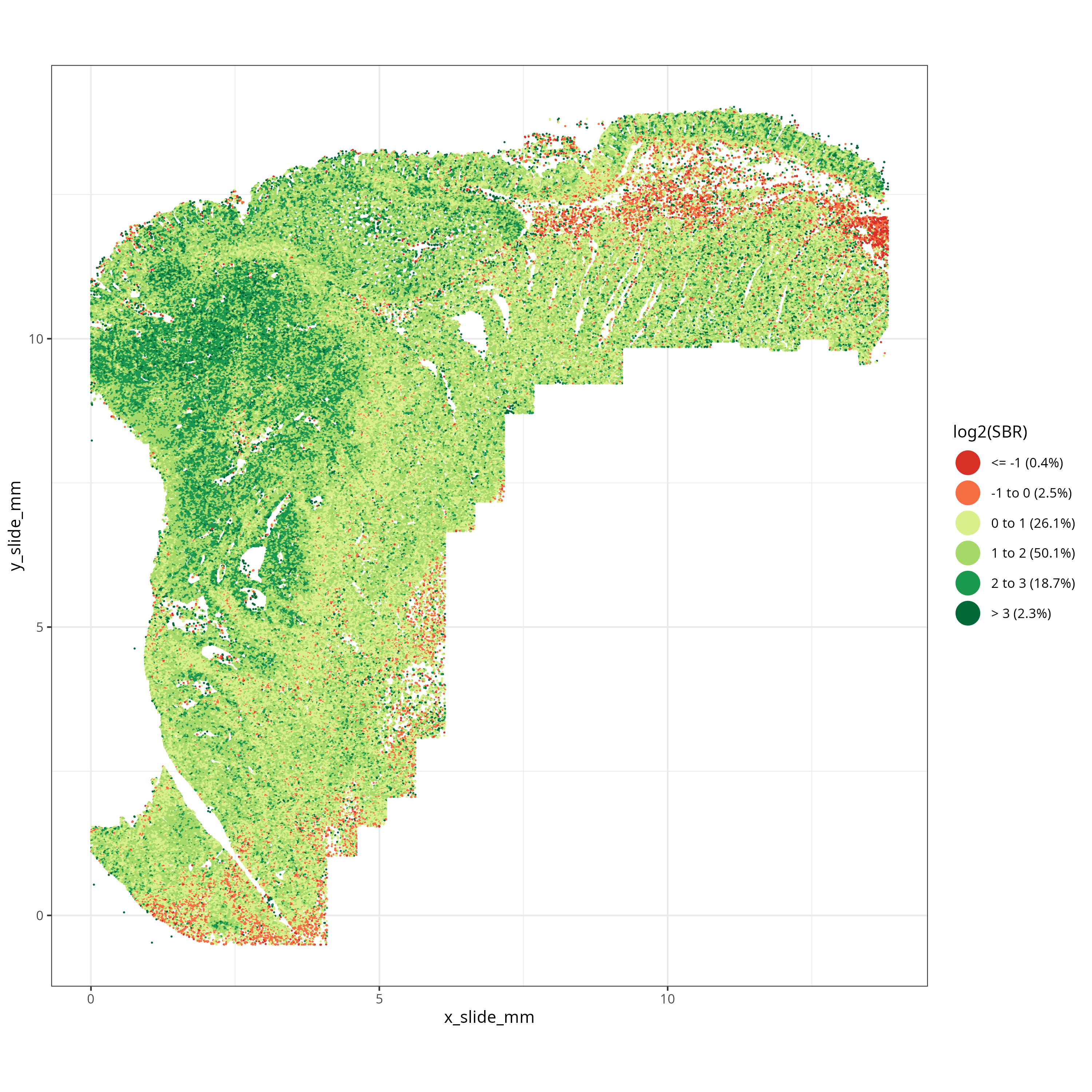
What we are looking for in SBR are larger tissue regions with low SBR -- not necessarily
individual cells with low SBR. Looking at @fig-qc-sbr we see a low SBR region on the top of the tissue just
below the epithelium. This region corresponds to an
area of smooth muscle and we'll see in the next section that this region partially
overlaps with an area flagged by the FOV-level QC. Since these low SBR cells (i.e., `log2(SBR) < 0`)
are concentrated spatially, we'll choose to flag them for removal.
```{r}
#| eval: false
#| code-summary: "R Code"
#| message: false
#| warning: false
#| code-fold: show
meta$SBR <- py$SBR

sbr_breaks <- c(-Inf, -1, 0, 1, 2, 3, Inf)

sbr_labels <- c("<= -1", "-1 to 0", "0 to 1", "1 to 2",
                "2 to 3", "> 3")
sbr_labels <- paste0(sbr_labels,
                     paste0(" (", round(100 * table(cut(log2(meta$SBR),
                                breaks = sbr_breaks)) / nrow(meta), 1), "%)"))

manual_colors <- c(
  "<= -1"   = "#D73027",  #
  "-1 to 0" = "#F46D43",  #
  "0 to 1"  = "#D9EF8B",  #
  "1 to 2"  = "#A6D96A",  #
  "2 to 3"  = "#1A9850",  #
  "> 3"     = "#006837"   #
)
names(manual_colors) <- sbr_labels

p <- ggplot(data = meta) +
  geom_point(
    aes(
      x = x_slide_mm,
      y = y_slide_mm,
      color = cut(log2(SBR), breaks = sbr_breaks, labels = sbr_labels)
    ),
    size = 0.001, alpha = 1
  ) +
  scale_color_manual(values = manual_colors) +
  guides(color = guide_legend(
    override.aes = list(size = 7, alpha = 1) # Sets legend points to size 5 and opaque
  )) +
  labs(color = "log2(SBR)") +
  coord_fixed() +
  theme_bw()

ggsave(filename = file.path(qc_dir, "qc_xy_sbr.png"), p,
       width=10, height=10, type = 'cairo')
```
```{r}
#| label: fig-qc-sbr
#| eval: true
#| code-summary: "R Code"
#| echo: false
#| fig-cap: "Spatially-smoothed Signal to Background for each cell."
#| fig-width: 10
#| fig-height: 10
render(file.path(analysis_asset_dir, "qc"), "qc_xy_sbr.png", qc_dir, overwrite=TRUE)
```
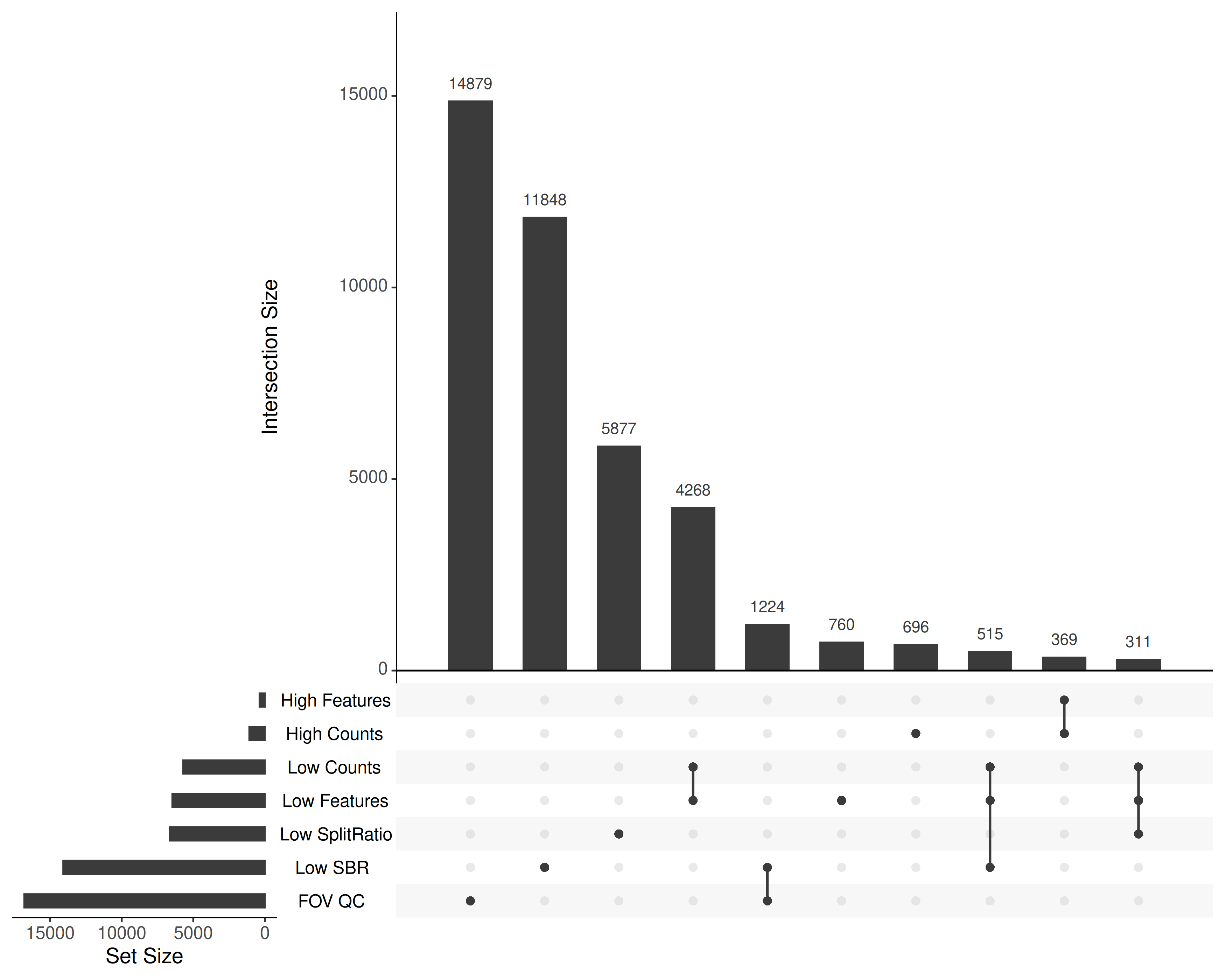
## Combining Flags
Taken together, what cells were flagged and why? @fig-qc-upset shows the
configuration of the flags.
```{r}
#| eval: false
#| code-summary: "R Code"
#| message: false
#| warning: false
#| code-fold: show
library(UpSetR)
filter_list <- list(
  `Low SplitRatio` = meta %>%
    filter(SplitRatioToLocal > 0 & SplitRatioToLocal < results_list[['SplitRatioToLocalThreshold']]) %>%
    pull(cell_ID),

  `Low Counts` = meta %>%
    filter(nCount_RNA < results_list[['counts_min_threshold']]) %>%
    pull(cell_ID),

  `High Counts` = meta %>%
    filter(nCount_RNA > results_list[['counts_max_threshold']]) %>%
    pull(cell_ID),

  `Low Features` = meta %>%
    filter(nFeature_RNA < results_list[['features_min_threshold']]) %>%
    pull(cell_ID),

  `High Features` = meta %>%
    filter(nFeature_RNA > results_list[['features_max_threshold']]) %>%
    pull(cell_ID),

  `Low SBR` = meta %>%
    filter(log2(SBR) < 0) %>%
    pull(cell_ID),

  `FOV QC` = meta %>%
    filter(fovqcflag == 1) %>%
    pull(cell_ID)
)

filter_list <- purrr::keep(filter_list, ~ length(.) > 0)

png(file.path(qc_dir, "flagged_cells.png"),
    width=10, height=8, res=350, units = "in", type = "cairo")
  upset(
  fromList(filter_list),
  nintersects = 10,
  order.by = "freq",
  nsets = length(filter_list),
  text.scale = 1.5)
dev.off()
```
```{r}
#| label: fig-qc-upset
#| eval: true
#| echo: false
#| code-summary: "R Code"
#| fig-cap: "Combinations of quality filters flagged in this study. Only the 10 most frequent sets are shown for clarity."
#| fig-width: 10
#| fig-height: 5
render(file.path(analysis_asset_dir, "qc"), "flagged_cells.png", qc_dir, overwrite=TRUE)
```
## Filtering
Now that we have flagged the cells, this section does the actual filtering and
saves data to disk so that we can use it in the pre-processing step.
In regular analyses, I simply filter the cells based on the chosen cutoffs and continue
with the pre-processing step. In this case, I am interested in showing the downstream
effects of leaving poor quality cells in versus filtering them. To that end, I'll
save two annData objects: unfiltered and filtered. In both datasets, I will add
a qc flag column to keep track of what QC conditions were flagged in any given cell.
To be efficient I'll make use of bitwise shifts to create the QC flag column.
```{r}
#| eval: false
#| code-summary: "R Code"
#| message: false
#| warning: false
#| code-fold: show
qc_masks <- list(
  LOW_COUNTS = bitwShiftL(1, 0),  # 1
  HIGH_COUNTS = bitwShiftL(1, 1), # 2
  LOW_FEAT = bitwShiftL(1, 2),    # 4
  HIGH_FEAT = bitwShiftL(1, 3),   # 8
  LOW_SPLIT = bitwShiftL(1, 4),   # 16
  FOV_QC = bitwShiftL(1, 5),      # 32
  LOW_SBR = bitwShiftL(1, 6),     # 64
  BLANK7 = bitwShiftL(1, 7)       # 128 (not used)
)

meta <- meta %>%
  mutate(
    qc_flag = (
      # Condition 1
      (nCount_RNA < results_list[['counts_min_threshold']]) * qc_masks$LOW_COUNTS +

      # Condition 2
      (nCount_RNA > results_list[['counts_max_threshold']]) * qc_masks$HIGH_COUNTS +

      # Condition 3
      (nFeature_RNA < results_list[['features_min_threshold']]) * qc_masks$LOW_FEAT +

      # Condition 4
      (nFeature_RNA > results_list[['features_max_threshold']]) * qc_masks$HIGH_FEAT +

      # Condition 5
      (SplitRatioToLocal > 0 & SplitRatioToLocal < results_list[['SplitRatioToLocalThreshold']]) * qc_masks$LOW_SPLIT +

      # Condition 6
      (fovqcflag == 1) * qc_masks$FOV_QC +

      # Condition 7
      (log2(SBR) < 0) * qc_masks$LOW_SBR

    )
  )

py$adata$obs$qcflag <- meta$qc_flag
results_list['n_cells_before_qc'] = py$adata$n_obs
```
Remove some of the intermediate matrices and save the annData to disk.
```{python}
#| eval: false
#| code-summary: "Python Code"
#| message: false
#| warning: false
#| code-fold: true
adata.obs['qcflag'] = adata.obs['qcflag'].astype('uint8')
del adata.obsp['liana_connectivities']
del adata.obsm['counts_neg_spatially_smooth']
del adata.obsm['counts_spatially_smooth']

filename = os.path.join(r.analysis_dir, "anndata-1-qc-flagged.h5ad")

adata.write_h5ad(
  filename,
  compression=hdf5plugin.FILTERS["zstd"],
  compression_opts=hdf5plugin.Zstd(clevel=5).filter_options
)
```
In addition to saving a copy of flagged data, let's filter out any cells with a
QC flag that is not "32" and save that "filtered" dataset to disk.
```{python}
#| eval: false
#| code-summary: "Python Code"
#| message: false
#| warning: false
#| code-fold: show
adata.obs['qcflag'] = adata.obs['qcflag'].astype('uint8')

adata = adata[adata.obs['qcflag'].isin([0, 32]), :].copy()

filename = os.path.join(r.analysis_dir, "anndata-1-qc-filtered.h5ad")
adata.write_h5ad(
  filename,
  compression=hdf5plugin.FILTERS["zstd"],
  compression_opts=hdf5plugin.Zstd(clevel=5).filter_options
)
```
Save project-level results.
```{r}
#| eval: false
#| code-summary: "R Code"
#| message: false
#| warning: false
#| code-fold: true
results_list['n_cells_after_qc'] = py$adata$n_obs
saveRDS(results_list, results_list_file)
```
After filtering, we have `r results_list$n_cells_after_qc`
(`r round(100 * results_list$n_cells_after_qc / results_list$n_cells_before_qc, 1)`
%) that are ready to analyze. Note that we did not do any gene-level filtering.
My primary reason for leaving all genes in the data at this point is primarily
because -- while we do not expect every gene to be highly expressed in every cell -- there are rare cells that may express genes that would considered
"below background" in the rest of the data. My general approach is to keep all
targets in the data and identify which of these are highly variable and use those
genes when appropriate (_e.g._, PCA, UMAP, Leiden).