---
author:
- name: Evelyn Metzger
orcid: 0000-0002-4074-9003
affiliations:
- ref: bsb
- ref: eveilyeverafter
- name: Claire Williams
orcid: 0000-0001-5467-149X
affiliations:
- ref: bsb
- ref: crwilliams11
execute:
eval: false
freeze: auto
message: true
warning: false
self-contained: false
code-fold: false
code-tools: true
code-annotations: hover
engine: knitr
prefer-html: true
format: live-html
---
{{< include ./_extensions/r-wasm/live/_knitr.qmd >}}
# Pathways {#sec-pathways}
```{r}
#| label: Preamble
#| eval: true
#| echo: true
#| message: false
#| code-fold: true
#| code-summary: "R code"
source("./preamble.R")
library(ggplot2)
library(stringr)
reticulate::source_python("./preamble.py")
analysis_dir <- file.path(getwd(), "analysis_results")
input_dir <- file.path(analysis_dir, "input_files")
output_dir <- file.path(analysis_dir, "output_files")
analysis_asset_dir <- "./assets/analysis_results" # <1>
ct_dir <- file.path(output_dir, "ct")
pw_dir <- file.path(output_dir, "pathways")
if(!dir.exists(pw_dir)){
dir.create(pw_dir, recursive = TRUE)
}
results_list_file = file.path(analysis_dir, "results_list.rds")
if(!file.exists(results_list_file)){
results_list <- list()
saveRDS(results_list, results_list_file)
} else {
results_list <- readRDS(results_list_file)
}
# results_list$run_explainer <- TRUE
source("./helpers.R")
library(ComplexHeatmap)
library(circlize)
```
## Introduction
In the previous chapters, we defined "who" is in the tissue (cell
types) and where they are located (spatial domains). The next logical step is to
ask: "what are they doing?". This is a particularly exciting and open-ended question.
Since we have access to the whole transcriptome, we can measure biological activity
with unparalleled precision and down to the subcellular level, if desired.[^1]
[^1]: To keep this primer clear and tractable, we'll focus on a smaller pathway database
at the single-cell level.
Pathway analysis allows us to move beyond simple
identity markers to infer the active biological processes driving the tissue's
organization. For example, identifying a cell as a "fibroblast" tells us its
lineage, but pathway analysis tells us if that fibroblast is actively building
scar tissue (TGF-$\beta$ signaling) or recruiting immune cells (NF-$\kappa$B
signaling).
While we can measure thousands of pathways from any number of databases, in this
primer we'll keep things tractable and estimate the activity of 14 cancer-relevant
signaling pathways using the PROGENy @progeny database (see below).
Here is our approach:
1. Smoothing: We will apply nearest neighbor smoothing to borrow
information from similar cells, overcoming the sparsity of single-cell data.
2. Scoring: We will calculate an activity score for each
pathway in every single cell using the python package decoupler @decoupler.
3. Inference: We will aggregate these scores by cell type and spatial domain to
interpret signaling landscapes that define dominant biological programs and
their spatial context within the tissue.
This workflow will allow us to answer questions like:
- Is the tumor driving angiogenesis, or is the stroma?
- Which immune cells are actively inflamed versus suppressed?
- Does the "Desmoplastic Stroma" domain have a distinct signaling signature?
## Processing
Read the annData object.
```{python}
if 'adata' not in dir():
filename = os.path.join(r.analysis_dir, "anndata-7-domain_annotations.h5ad")
adata = ad.read_h5ad(filename)
adata.obsm['spatial'][:,1] *= -1 # <1>
```
1. flipping the y-axis so that the tissue is in the same orientation as the
rest of the analysis.
We'll use the PROGENy (Pathway RespOnsive GENes) @progeny database available within decoupler @decoupler to estimate
the single cell enrichment
scores of each of the 14 cancer-relevant pathways and their significant values.
PROGENy is a resource that estimates pathway activity by analyzing the downstream
genes known to change in response to perturbation experiments across a wide variety
of human cancer cell lines. I find that it is useful in a wide range of cancer samples
but it might not be ideal for, say, transplant or viral infection samples.
The code below adapts [decoupler's tutorial](https://decoupler.readthedocs.io/en/latest/notebooks/scell/rna_pstime.html#progeny-pathway-genes){target="_blank"} which uses the [univarte linear model method (ulm) function](https://decoupler.readthedocs.io/en/latest/api/generated/decoupler.mt.ulm.html){target="_blank"}.
PROGENy can provide a high-level overview of the tissue's
molecular functions distilled down to a handful of pathways -- which is relatively
quick. For non-cancer systems, or if greater resolution is desired, other databases
can be used with the `ulm` approach. If you are interested in exploring other
databases within decoupler, run `decoupler.op.show_resources()`.
Here's a description of those pathways from decoupler's website.
```
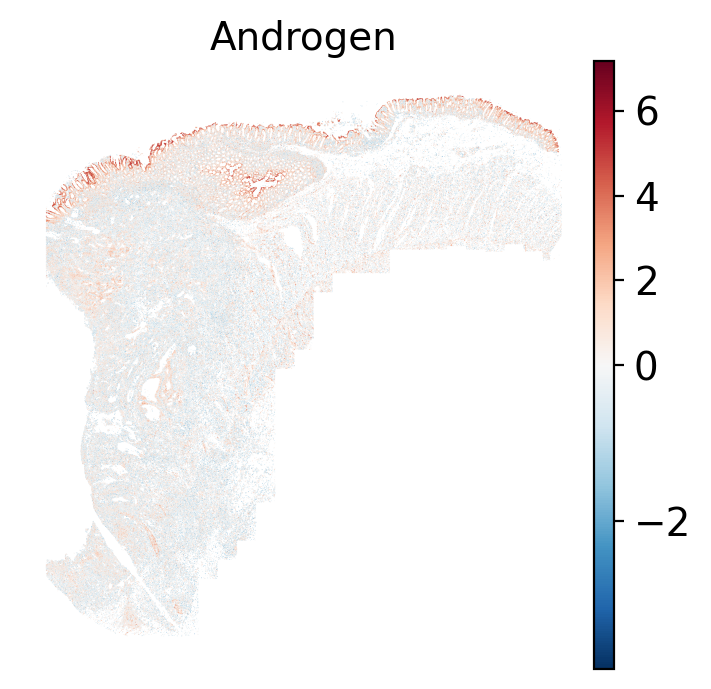
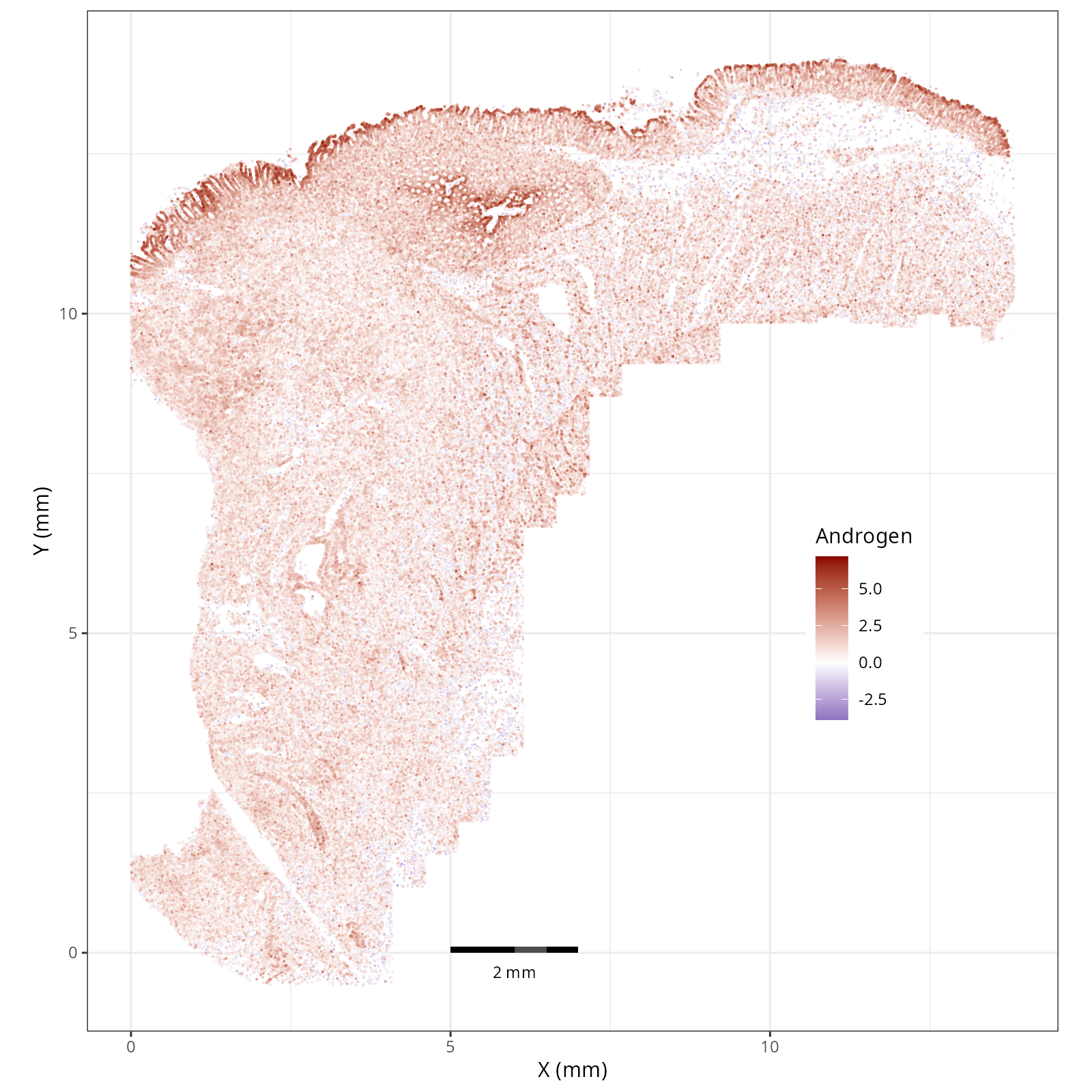
- Androgen: involved in the growth and development of the male reproductive organs.
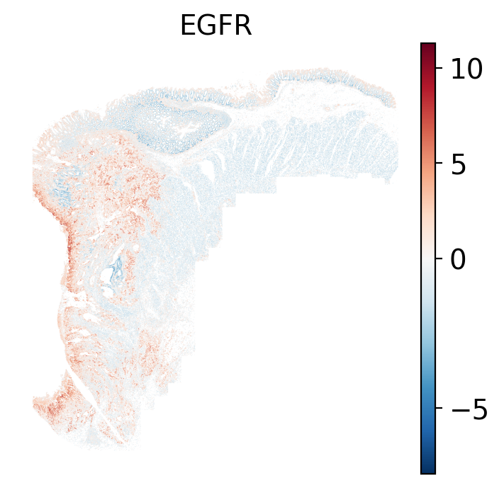
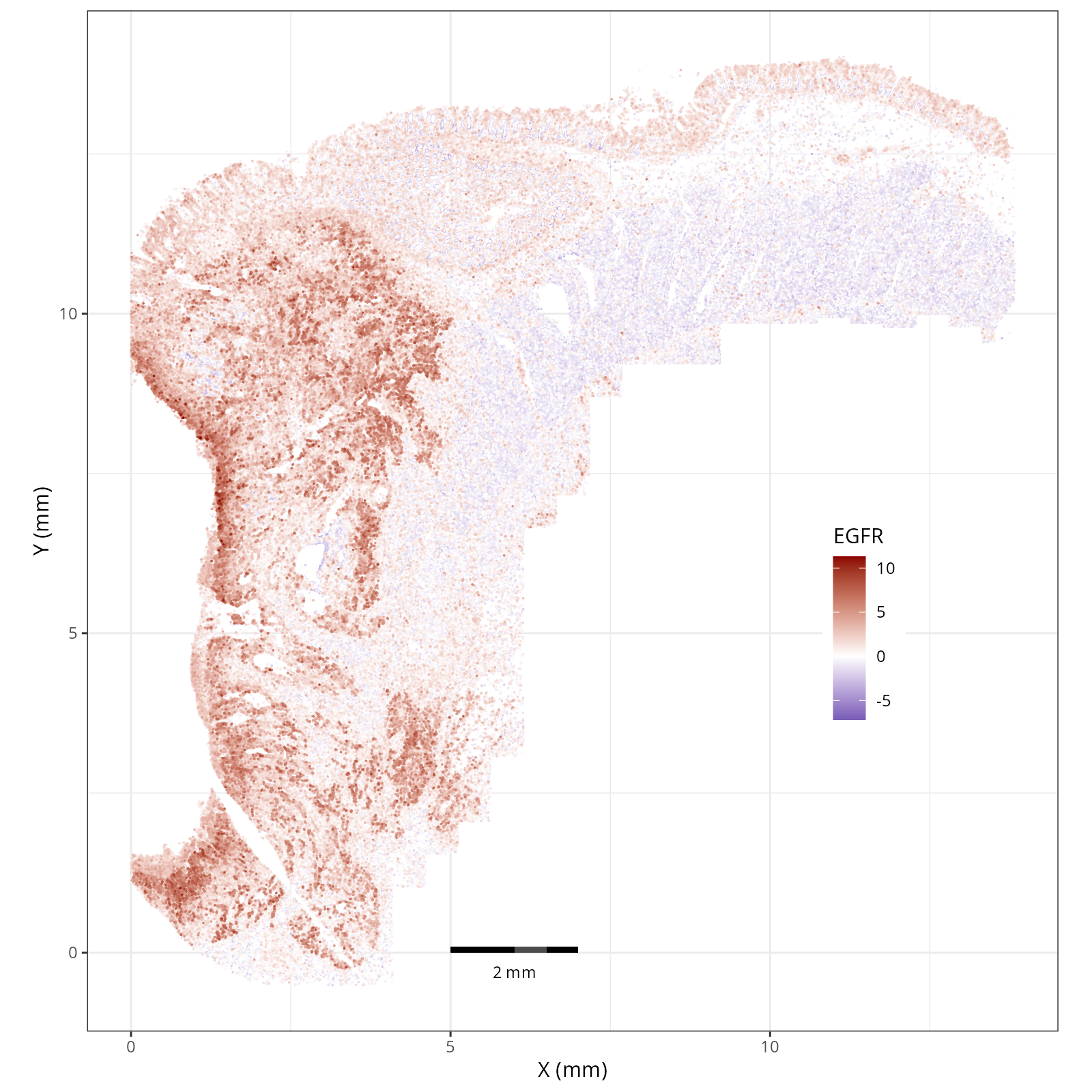
- EGFR: regulates growth, survival, migration, apoptosis, proliferation, and differentiation in mammalian cells
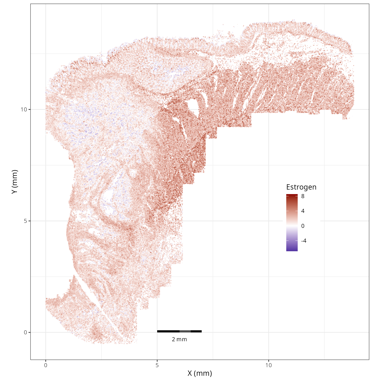
- Estrogen: promotes the growth and development of the female reproductive organs.
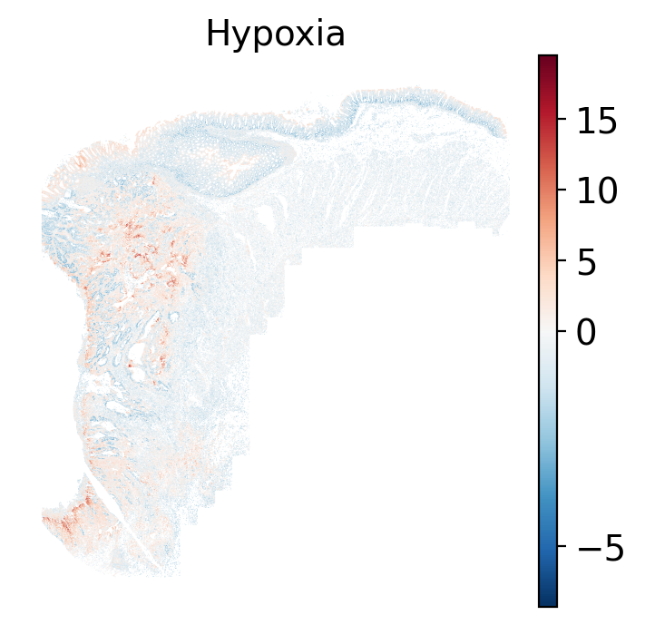
- Hypoxia: promotes angiogenesis and metabolic reprogramming when O2 levels are low.
- JAK-STAT: involved in immunity, cell division, cell death, and tumor formation.
- MAPK: integrates external signals and promotes cell growth and proliferation.
- NFkB: regulates immune response, cytokine production and cell survival.
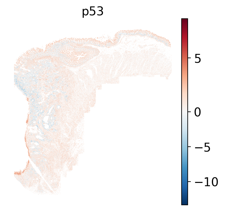
- p53: regulates cell cycle, apoptosis, DNA repair and tumor suppression.
- PI3K: promotes growth and proliferation.
- TGFb: involved in development, homeostasis, and repair of most tissues.
- TNFa: mediates haematopoiesis, immune surveillance, tumour regression and protection from infection.
- Trail: induces apoptosis.
- VEGF: mediates angiogenesis, vascular permeability, and cell migration.
- WNT: regulates organ morphogenesis during development and tissue repair.
```
Let's load the PROGENy dataset.
```{python}
#| label: load-progeny
#| eval: false
#| code-summary: "Python Code"
#| message: false
#| warning: false
#| code-fold: true
import decoupler as dc

progeny = dc.op.progeny(organism='human', top=500, license="commercial")
progeny_genes = progeny['target'].unique()
```
```{r}
results_list['n_progeny_genes'] = length(py$progeny_genes)
saveRDS(results_list, results_list_file)
```
For the analysis below we'll need normalized data. As we saw in @sec-preprocessing,
we bypassed the creation of the dense Pearson Residuals normalization matrix
and used the PCs instead for nearest neighbors calculations, Leiden, _etc_.
The main reason for this was computational tractability (>400,000 cells by _ca_. 19,000 targets).
That issue is still present here. There are only `r as.numeric(results_list['n_progeny_genes'])` genes
in the pathway database that we chose and so we do not necessarily need to normalized
the entire matrix. Scanpy has a method for Pearson Residuals normalization
(`sc.experimental.pp.normalize_pearson_residuals`) but there's a catch: ideally we
would _not_ run Pearson Normalization on a subset of features. Instead, we would like
the non-truncated transcript totals to factor into the normalization procedure.
We can achieve this by creating a custom code.
```{python}
#| label: normalize
#| eval: false
#| code-summary: "Python Code"
#| message: false
#| warning: false
#| code-fold: show
# 1. Get valid genes
# these are the ones that are in BOTH the progeny dataset and in the anndata, adata
valid_genes = [g for g in progeny_genes if g in adata.var_names]

# 2. Get GLOBAL Stats (before subsetting)
counts_layer = adata.layers['counts'] if 'counts' in adata.layers else adata.X
global_cell_sums = np.array(counts_layer.sum(axis=1)).flatten() # or just from nCount_RNA
total_count = global_cell_sums.sum() # i.e., sum(obs$nCount_RNA)

# 3. Get GENE Stats (Just for the subset is all that's necessary)
gene_indices = [adata.var_names.get_loc(g) for g in valid_genes]
subset_gene_sums = np.array(counts_layer.sum(axis=0)).flatten()[gene_indices]

# 4. Create the Subset
adata_sub = adata[:, valid_genes].copy()
# Ensure we are using raw counts for the calculation
if 'counts' in adata_sub.layers:
    adata_sub.X = adata_sub.layers['counts'].copy()

# 5. Expected counts based on global depth (from the full dataset)
mu = np.outer(global_cell_sums, subset_gene_sums) / total_count

# Pearson Residuals: (Observed - Expected) / StdDev
theta = 100
observed = adata_sub.X.toarray()
residuals = (observed - mu) / np.sqrt(mu + mu**2 / theta)

# Clip outliers (similar to what scanpy does)
clip_val = np.sqrt(adata_sub.shape[0])
residuals = np.clip(residuals, -clip_val, clip_val)

# 6. Save results
adata_sub.X = residuals
del adata
adata = adata_sub

# Clean up
import gc
del adata_sub, mu, observed, residuals, global_cell_sums, subset_gene_sums
gc.collect()
```
At this point the anndata object has many components that are not needed.
Let's reduce the size of this object to reduce the memory footprint.
```{python}
#| label: trim
#| eval: false
#| code-summary: "Python Code"
#| message: false
#| warning: false
#| code-fold: show
# Clean up obsm
obsm_delete = ['X_pca_TC', 'counts_neg', 'counts_sys', 'umap_TC']
for x in obsm_delete:
if x in adata.obsm:
del adata.obsm[x]
# Clean up obsp
obsp_delete = ['neighbors_TC_connectivities', 'neighbors_TC_distances']
for x in obsp_delete:
if x in adata.obsp:
del adata.obsp[x]
gc.collect()
adata.layers['pr_norm'] = adata.X.astype('float32').copy() # <1>
```
1. Convert from float 64 bit to float 32 bit Optional step for systems with less RAM.
## Smoothing Expression
One attribute of all spatial single cell datasets relative to non-spatial method
is sparsity. Even for technologies with high-sensitivity detection, individual cells
may lack the detection of every transcript required to precisely score pathways.
To overcome this, tools like decoupler and liana @Dimitrov2022 @Dimitrov2024 utilize _smoothing_ -- a
process of borrowing information from neighboring cells to impute missing values
and stabilize pathway scores. However, the term "neighbor" here can be ambiguous.
Many of the existing tutorials for these tools were developed with spot-based
technologies (like Visium) in mind where _spatial smoothing_ is used because spots
are already multi-cellular mixtures. For single-cell resolution data like CosMx
SMI, the choice of using spatial smoothing depends on the types of biological
questions you have @tbl-smoothing-choices. For pathway analysis, we recommend smoothing
based on nearest expression neighbors (NN). Check back later when we release a
chapter on ligand-receptor analysis for an example of spatial smoothing.
| Feature | Nearest Expression Neighbors (NN) | Spatial Neighbors (SN) |
| :--- | :--- | :--- |
| **Definition** | Averages signal from cells with similar gene expression profiles (_e.g._, neighbors in PCA space). | Averages signal from cells physically touching or near the target cell (XY space). |
| **Primary Benefit** | **Preserves Cell Identity.** A T cell is smoothed with other T cells, maintaining lineage-specific signals. | **Visualizes Zones.** Highlights continuous tissue gradients and regional (_i.e._, multiple domain) behaviors. **Analyzing Larger Spatial Patterns** When examining zonal, regional (_e.g._, hypoxia), or other larger effects, cells are responding by an interaction of their lineage and their spatial position. Spatial smoothing in this scenario can aid in quantifying the metabolic spatial neighborhood by denoising cells with sparse data. **Ligand Receptor Analysis.** While we might not want to spatially smooth a CD4 T cell with, say, a Tumor cell, for certain analyses, this computational approach can be effective in analyzing [ligand-receptor relationships](https://liana-py.readthedocs.io/en/latest/notebooks/bivariate.html#bivariate-ligand-receptor-relationships). Essentially, if we borrow the receptor expression of nearby cells, we can then test if that receptor is correlated with the focal cells' corresponding ligand receptor expression. |
| **Drawback** | May erode any cell type by specific local/regional interaction effect. | **Signal Bleeding** Can artificially blend high-expression markers (e.g., *PTPRC*) into neighboring negative cells (e.g., Tumor). **Tuning** The degree (_e.g._, radius, Gaussian kernel) that is used for spatial smoothing is a tuning parameter that, ideally, should align the observational scale with the functional scale. |
| **Best Use Case** | Lineage-specific pathways (e.g., TCR signaling, Cell Cycle, B cell activation). | Environmental gradients that occur at regional levels not captured by expression-based domain assignments (e.g., Hypoxia, Nutrient Deprivation, pH levels). |
| **Example** | See @sec-path-enrichment below | See upcoming ligand-receptor chapter (expected early 2026) |
: Two types of smoothing and when to use them. {#tbl-smoothing-choices}
Let's apply nearest neighbor smoothing.
Recall in @sec-preprocessing we created a neighbor graph based on pearson residuals PC
values derived using the scPearsonPCA package. This produced the `neighbors_pr_connectivities`
connectivity matrix in `obsp`. We'll use this to smooth our cells' expression.
```{python}
#| eval: false
#| code-summary: "Python Code"
#| message: false
#| warning: false
#| code-fold: show
adata.layers['nn_smooth'] = adata.obsp['neighbors_pr_connectivities'] @ adata.layers['pr_norm']
```
## Pathway Enrichment {#sec-path-enrichment}
Run the univariate linear model from `decoupler` using
the PROGENy database with this smoothed expression matrix to generate pathway
scores. Save the results.
```{python}
#| label: nn-run-ulm
#| eval: false
#| code-summary: "Python Code"
#| message: false
#| warning: false
#| code-fold: show
dc.mt.ulm(
  data=adata,
  net=progeny,
  verbose=True,
  layer=f'nn_smooth',
  bsize=80000
  )

filename = os.path.join(r.analysis_dir, "anndata-8-pathways-nn.h5ad")
adata.write_h5ad(
  filename,
  compression=hdf5plugin.FILTERS["zstd"],
  compression_opts=hdf5plugin.Zstd(clevel=5).filter_options
)
```
## Visualizing Pathway Enrichment
We'll visualize the pathways "locally" on the tissue as well as "globally" by creating
heatmaps per cell type and domain.
### Local: spatial visualizations {#sec-local-path-plots}
The local plots provide fine-resolution maps of pathway scores on the tissue.
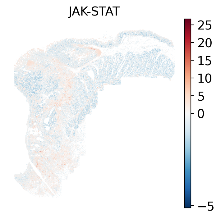
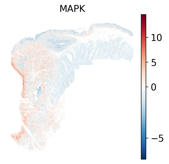
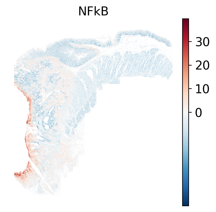
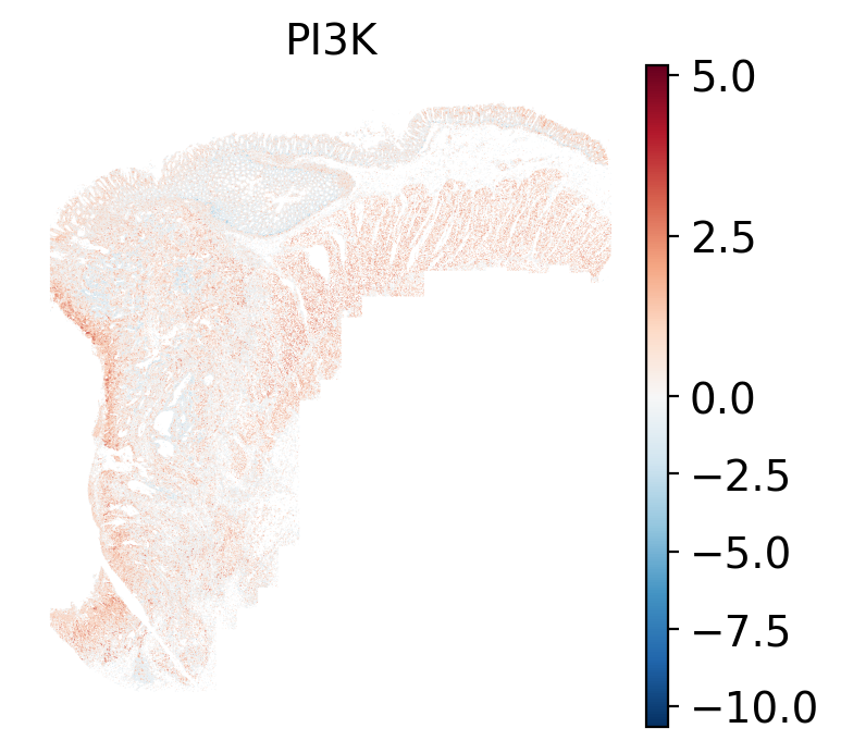
The simplest way to do this is to use scanpy's `pl.spatial` method. If you want
greater flexibility in the plotting aesthetics, we can use the `plotDots` function
in R that we have used throughout this book. Below we'll show code and results
for both approaches.
::: {.panel-tabset}
#### Using Scanpy's built-in spatial plotting function
We can convert the scores themselves into a new annData object and then use
scanpy's functions to plot the individual pathways (features).
```{python}
#| label: nn-scanp-basic-plots
#| eval: false
#| code-summary: "Python Code"
#| message: false
#| warning: false
#| code-fold: true
sc.settings.figdir = r.pw_dir
sc.settings.set_figure_params(dpi_save=200, frameon=False)

nn_pwdata = dc.pp.get_obsm(adata=adata, key=f'score_ulm')
nn_pwdata.obsm[f'padj_ulm'] = adata.obsm[f'padj_ulm']

for x in nn_pwdata.var_names:
  sc.pl.spatial(
      nn_pwdata,
      color=[x],
      cmap='RdBu_r',
      vcenter=0,
      size=1.5,
      spot_size=0.01, show=False,
      save="_nn_pathway_Scanpy_" + str(x) + "_xy.png",
      alpha_img=1
  )
```
::: {.panel-tabset}
```{r}
#| output: asis
#| eval: true
files <- Sys.glob(file.path(pw_dir, "show_nn_pathway_Scanpy_*.png"))
res <- purrr::map_chr(files, \(a_file) {
path = gsub('_xy.png', '', strsplit(basename(a_file), split='show_nn_pathway_Scanpy_')[[1]][2])
label = paste0('Path: ', path)
fig_label = paste0('#| label: fig-', gsub(": ", "-", label), '-scanpy')
fig_cap = paste0('#| fig-cap: \"Local ', path ,' pathway scores plotted with sc.pl.spatial.\"')
knitr::knit_child(text = c(
"##### `r paste0('Path: ', gsub('_xy.png', '', strsplit(basename(a_file), split='show_nn_pathway_Scanpy_')[[1]][2]))`",
"",
"```{r eval=TRUE}",
"#| echo: false",
fig_label,
fig_cap,
"render(file.path(analysis_asset_dir, 'pathways'), basename(a_file), pw_dir, overwrite=TRUE)",
"```",
"",
""
), envir = environment(), quiet = TRUE)
})
cat(res, sep = '\n')
```
:::
#### Using `plotDots` in R
This block runs the `plotDots` function that we have used in previous chapters
on the objects that we create in the previous subsection, `nn_pwdata`.
```{r}
#| label: plotDots-visuals
#| eval: false
#| code-summary: "R Code"
#| message: false
#| warning: false
#| code-fold: true
py$nn_pwdata$obsm['spatial'][,2] <- py$nn_pwdata$obsm['spatial'][,2] * -1 # <1>
features <- py$nn_pwdata$var_names$to_list()
for(feature in features){
plotDots(py$nn_pwdata, color_by=feature,
plot_global = TRUE,
facet_by_group = FALSE,
additional_plot_parameters = list(
geom_point_params = list(
size=0.001
),
scale_bar_params = list(
location = c(5, 0),
width = 2,
n = 3,
height = 0.1,
scale_colors = c("black", "grey30"),
label_nudge_y = -0.3
),
directory = pw_dir,
fileType = "png",
dpi = 200,
width = 8,
height = 8,
prefix=paste0("plotDots_", feature)
),
additional_ggplot_layers = list(
theme_bw(),
scale_color_gradient2(low = "darkblue", mid = "white", high = "darkred", midpoint = 0),
xlab("X (mm)"),
ylab("Y (mm)"),
coord_fixed(),
theme(legend.position = c(0.8, 0.4))
)
)
}
```
1. Flipping the y-axis back.
::: {.panel-tabset}
```{r}
#| output: asis
#| eval: true
files <- Sys.glob(file.path(pw_dir, "plotDots_*__spatial__*.png"))
res <- purrr::map_chr(files, \(a_file) {
path = gsub('plotDots_', '', strsplit(basename(a_file), split='__')[[1]][1])
label = paste0('Path: ', path)
fig_label = paste0('#| label: fig-', gsub(": ", "-", label))
fig_cap = paste0('#| fig-cap: \"Local ', path ,' pathway scores plotted with the plotDots function.\"')
knitr::knit_child(text = c(
"##### `r paste0('Path: ', gsub('plotDots_', '', strsplit(basename(a_file), split='__')[[1]][1]))`",
"",
"```{r eval=TRUE}",
"#| echo: false",
fig_label,
fig_cap,
"render(file.path(analysis_asset_dir, 'pathways'), basename(a_file), pw_dir, overwrite=TRUE)",
"```",
"",
""
), envir = environment(), quiet = TRUE)
})
cat(res, sep = '\n')
```
:::
:::
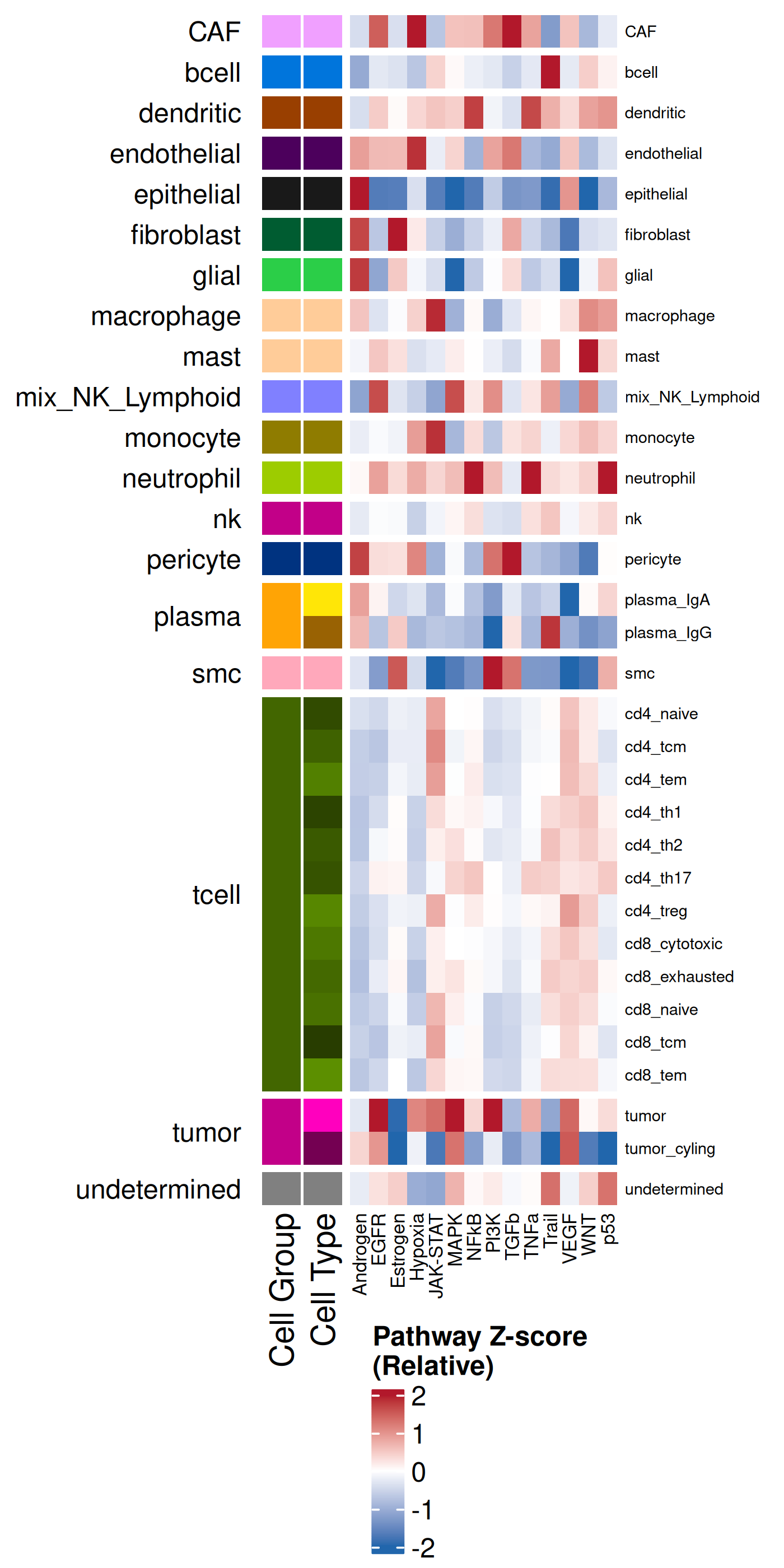
### Global: Per Cell Type
In addition to plotting the local pathway scores in space with scanpy or `plotDots`,
we can visualize the results summarized across each cell type or each domain.
These next two subsections do just that. We'll
use the plotting functionality within the `complexHeatmap` R package. It can be
helpful to plot the average enrichment as well as the Z-scores. The former helps
with us understand the overall sense of what is being enriched whereas the latter
helps to compare a particular effect size relative to other cell types.
```{r}
#| label: celltype-summary
#| eval: false
#| code-summary: "R Code"
#| message: false
#| warning: false
#| code-fold: true
df <- py$nn_pwdata$obs %>% select(cell_ID, celltype_broad, celltype_fine)
expr <- py$nn_pwdata$X
colnames(expr) <- py$nn_pwdata$var_names$to_list()
df <- cbind(df, expr)
pathway_cols <- setdiff(names(df), c("cell_ID", "celltype_broad", "celltype_fine"))
min_obs = 50
mean_enrich_by_ct <- df %>%
group_by(celltype_broad, celltype_fine) %>%
summarise(
n = n(),
across(all_of(pathway_cols), mean, .names = "{.col}_mean"),
.groups = 'drop'
) %>%
filter(n >= min_obs) %>%
arrange(celltype_broad, celltype_fine)
scaled_enrich_by_ct <- mean_enrich_by_ct %>%
mutate(across(ends_with("_mean"), ~as.numeric(scale(.)))) %>%
arrange(celltype_broad, celltype_fine)
celltype_broad_colors <- results_list[['celltype_broad_colors']]
names(celltype_broad_colors) <- results_list[['celltype_broad_names']]
celltype_fine_colors <- results_list[['celltype_fine_colors']]
names(celltype_fine_colors) <- results_list[['celltype_fine_names']]
# Shared Row Annotation
row_ha <- HeatmapAnnotation(
"Cell Group" = scaled_enrich_by_ct$celltype_broad,
"Cell Type" = scaled_enrich_by_ct$celltype_fine,
col = list(
"Cell Group" = celltype_broad_colors,
"Cell Type" = celltype_fine_colors
),
show_legend = c("Cell Group" = FALSE, "Cell Type" = FALSE),
which = "row"
)
zscore_col_fun <- colorRamp2(c(-2, 0, 2), c("#2166AC", "white", "#B2182B"))
heatmap_matrix_z <- scaled_enrich_by_ct %>%
select(ends_with("_mean")) %>%
as.matrix()
rownames(heatmap_matrix_z) <- scaled_enrich_by_ct$celltype_fine
colnames(heatmap_matrix_z) <- gsub("_mean", "", colnames(heatmap_matrix_z))
ht_z <- Heatmap(
heatmap_matrix_z,
name = "Pathway Z-score\n(Relative)",
col = zscore_col_fun,
left_annotation = row_ha,
show_row_names = TRUE,
row_names_gp = gpar(fontsize = 6),
cluster_columns = FALSE, # <1>
column_names_gp = gpar(fontsize = 7),
row_split = scaled_enrich_by_ct$celltype_broad,
cluster_row_slices = TRUE,
cluster_rows = FALSE,
row_title_rot = 0,
row_title_gp = gpar(fontsize = 10)
)
svglite::svglite(file.path(pw_dir, "heatmap_by_cell_type_zscore.svg"), width = 3.5, height = 6)
draw(
ht_z,
heatmap_legend_side = "bottom",
annotation_legend_side = "bottom",
merge_legend = TRUE
)
dev.off()
png(file.path(pw_dir, "heatmap_by_cell_type_zscore.png"),
width=4, height=8, res=350, units = "in", type = 'cairo')
draw(
ht_z,
heatmap_legend_side = "bottom",
annotation_legend_side = "bottom",
merge_legend = TRUE
)
dev.off()
heatmap_matrix_mean <- mean_enrich_by_ct %>%
select(ends_with("_mean")) %>%
as.matrix()
rownames(heatmap_matrix_mean) <- mean_enrich_by_ct$celltype_fine
colnames(heatmap_matrix_mean) <- gsub("_mean", "", colnames(heatmap_matrix_mean))
quantile_limit <- 0.95
limit <- as.numeric(quantile(abs(as.vector(heatmap_matrix_mean)), quantile_limit, na.rm = TRUE))
mean_col_fun <- colorRamp2(c(-limit, 0, limit), c("#2166AC", "white", "#B2182B"))
ht_mean <- Heatmap(
heatmap_matrix_mean,
name = "PROGENy Score\n(Mean)",
col = mean_col_fun,
left_annotation = row_ha,
show_row_names = TRUE,
row_names_gp = gpar(fontsize = 6),
cluster_columns = FALSE,
column_names_gp = gpar(fontsize = 7),
row_split = mean_enrich_by_ct$celltype_broad,
cluster_row_slices = TRUE,
cluster_rows = FALSE,
row_title_rot = 0,
row_title_gp = gpar(fontsize = 10)
)
svglite::svglite(file.path(pw_dir, "heatmap_by_cell_type_mean.svg"), width = 3.5, height = 6)
draw(
ht_mean,
heatmap_legend_side = "bottom",
annotation_legend_side = "bottom",
merge_legend = TRUE
)
dev.off()
png(file.path(pw_dir, "heatmap_by_cell_type_mean.png"),
width=4, height=8, res=350, units = "in", type = 'cairo')
draw(
ht_mean,
heatmap_legend_side = "bottom",
annotation_legend_side = "bottom",
merge_legend = TRUE
)
dev.off()
```
1. Set to FALSE to make it easier to compare the mean and the Z-score heatmaps. Set to TRUE to make it easier to group similar pathway signatures.
::: {.panel-tabset}
#### Mean
```{r}
#| label: fig-heatmap-paths-by-celltypes-m
#| eval: true
#| echo: false
#| code-summary: "R Code"
#| fig-cap: "Average pathway enrichment scores by cell type."
#| fig-align: center
#| out-width: "70%"
render(file.path(analysis_asset_dir, 'pathways'), "heatmap_by_cell_type_mean.png", source_parent_folder=pw_dir, overwrite=TRUE)
```
#### Z-score
```{r}
#| label: fig-heatmap-paths-by-celltypes-z
#| eval: true
#| echo: false
#| code-summary: "R Code"
#| fig-cap: "Average pathway enrichment scores (z-score) by cell type."
#| fig-align: center
#| out-width: "70%"
render(file.path(analysis_asset_dir, 'pathways'), "heatmap_by_cell_type_zscore.png", source_parent_folder=pw_dir, overwrite=TRUE)
```
:::
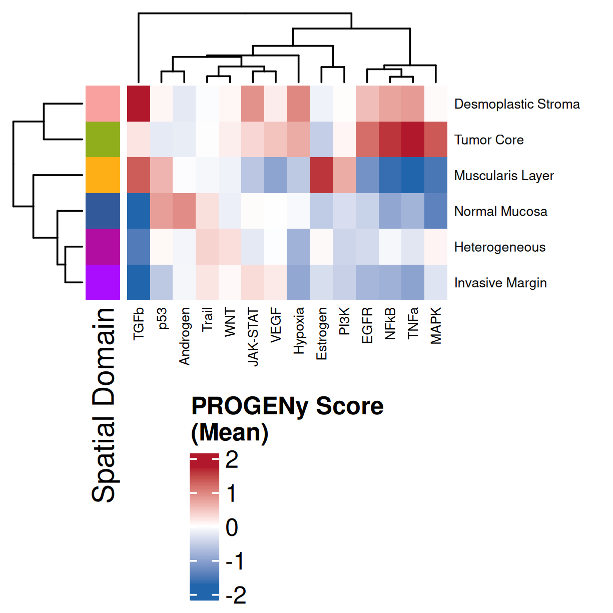
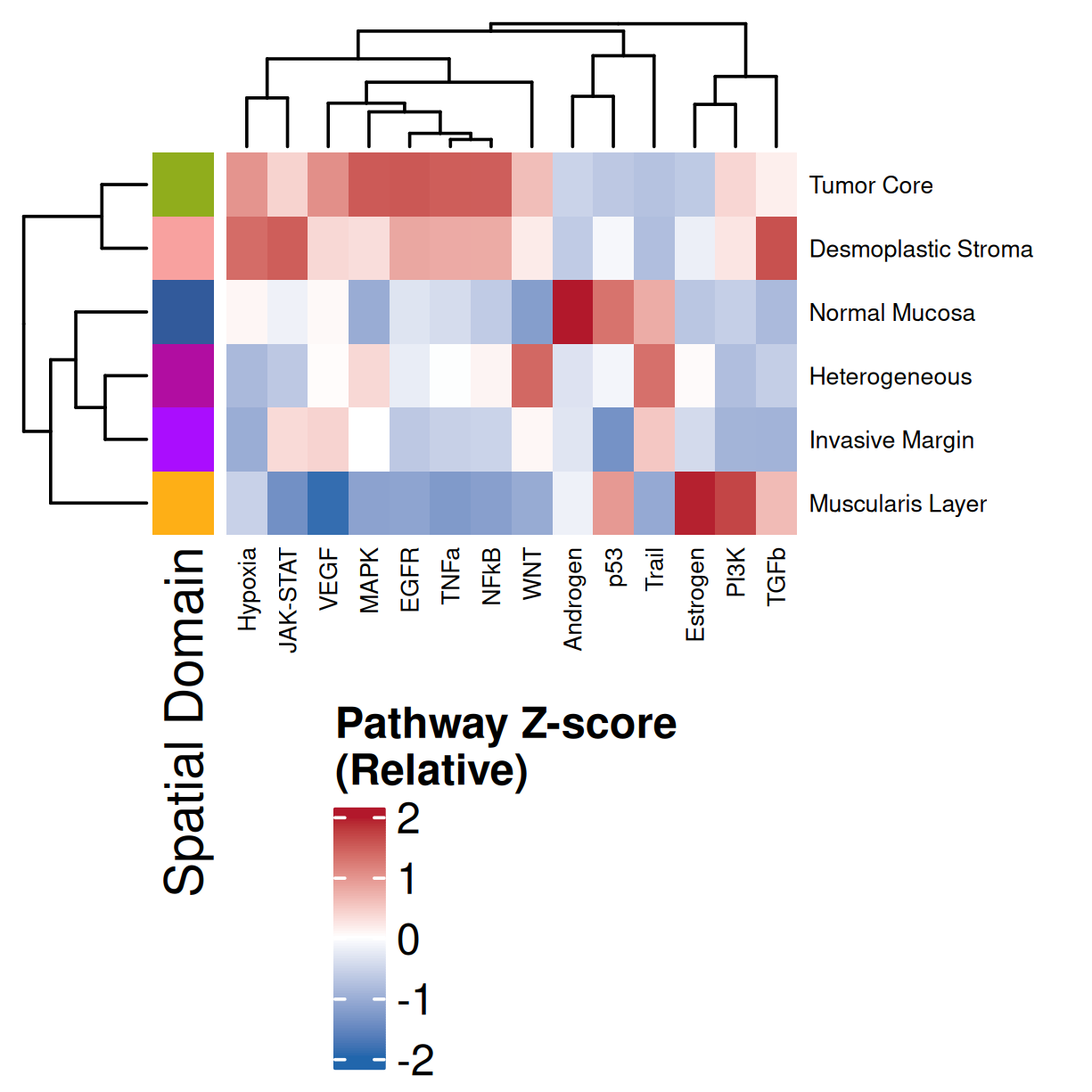
### Global: Per Domain
This follows a similar procedure as above but summarized across spatial domains.
```{r}
#| label: domain-summary
#| eval: false
#| code-summary: "R Code"
#| message: false
#| warning: false
#| code-fold: true
df <- merge(df, py$nn_pwdata$obs %>% select(cell_ID, annotated_domain), by="cell_ID")
df <- filter(df, !is.na(annotated_domain))
min_obs = 50

# Calculate Mean Scores
mean_enrich_by_domain <- df %>%
  group_by(annotated_domain) %>%
  summarise(
    n = n(),
    across(all_of(pathway_cols), mean, .names = "{.col}_mean"),
    .groups = 'drop'
  ) %>%
  filter(n >= min_obs, !is.na(annotated_domain)) %>%
  arrange(annotated_domain)

# Calculate Z-scores (Scale the means)
scaled_enrich_by_domain <- mean_enrich_by_domain %>%
  mutate(across(ends_with("_mean"), ~as.numeric(scale(.)))) %>%
  arrange(annotated_domain)

# Colors
domain_colors_df  <- results_list[['domain_colors']]
domain_colors <- domain_colors_df$domain_color
names(domain_colors) <- domain_colors_df$domain_description

# Common Row Annotation
row_ha <- HeatmapAnnotation(
  "Spatial Domain" = mean_enrich_by_domain$annotated_domain,
  col = list("Spatial Domain" = domain_colors),
  show_legend = c("Spatial Domain" = FALSE),
  which = "row"
)

# Color Functions
zscore_col_fun <- colorRamp2(c(-2, 0, 2), c("#2166AC", "white", "#B2182B"))

# Z-Score Heatmap
heatmap_matrix_z <- scaled_enrich_by_domain %>%
  select(ends_with("_mean")) %>%
  as.matrix()
rownames(heatmap_matrix_z) <- scaled_enrich_by_domain$annotated_domain
colnames(heatmap_matrix_z) <- gsub("_mean", "", colnames(heatmap_matrix_z))

ht_z <- Heatmap(
  heatmap_matrix_z,
  name = "Pathway Z-score\n(Relative)",
  col = zscore_col_fun,
  left_annotation = row_ha,
  show_row_names = TRUE,
  row_names_gp = gpar(fontsize = 5.5),
  cluster_columns = TRUE,
  column_names_gp = gpar(fontsize = 5.5),
  row_title_rot = 0,
  row_title_gp = gpar(fontsize = 8)
)

svglite::svglite(file.path(pw_dir, "heatmap_by_domain_zscore.svg"), width = 3.5, height = 3)
  draw(ht_z, heatmap_legend_side = "bottom", annotation_legend_side = "bottom", merge_legend = TRUE)
dev.off()

png(file.path(pw_dir, "heatmap_by_domain_zscore.png"), width=3.5, height=3.5, res=350, units = "in", type = 'cairo')
  draw(ht_z, heatmap_legend_side = "bottom", annotation_legend_side = "bottom", merge_legend = TRUE)
dev.off()


# Mean Score Heatmap
heatmap_matrix_mean <- mean_enrich_by_domain %>%
  select(ends_with("_mean")) %>%
  as.matrix()
rownames(heatmap_matrix_mean) <- mean_enrich_by_domain$annotated_domain
colnames(heatmap_matrix_mean) <- gsub("_mean", "", colnames(heatmap_matrix_mean))

quantile_limit <- 0.95
limit <- as.numeric(quantile(abs(as.vector(heatmap_matrix_mean)), quantile_limit, na.rm = TRUE))
mean_col_fun <- colorRamp2(c(-limit, 0, limit), c("#2166AC", "white", "#B2182B"))

ht_mean <- Heatmap(
  heatmap_matrix_mean,
  name = "PROGENy Score\n(Mean)",
  col = mean_col_fun,
  left_annotation = row_ha,
  show_row_names = TRUE,
  row_names_gp = gpar(fontsize = 5.5),
  cluster_columns = TRUE,
  column_names_gp = gpar(fontsize = 5.5),
  row_title_rot = 0,
  row_title_gp = gpar(fontsize = 8)
)

svglite::svglite(file.path(pw_dir, "heatmap_by_domain_mean.svg"), width = 3.5, height = 3)
  draw(ht_mean, heatmap_legend_side = "bottom", annotation_legend_side = "bottom", merge_legend = TRUE)
dev.off()

png(file.path(pw_dir, "heatmap_by_domain_mean.png"), width=3.5, height=3.5, res=350, units = "in", type = 'cairo')
  draw(ht_mean, heatmap_legend_side = "bottom", annotation_legend_side = "bottom", merge_legend = TRUE)
dev.off()
```
::: {.panel-tabset}
#### Mean
```{r}
#| label: fig-heatmap-paths-by-domains-m
#| eval: true
#| echo: false
#| code-summary: "R Code"
#| fig-cap: "Average pathway enrichment scores by spatial domain. Colors correspond to domains in @fig-xy-domains. Note: columns were clustered and so will have a difference order than that found in @fig-heatmap-paths-by-domains-z."
#| fig-align: center
#| out-width: "70%"
render(file.path(analysis_asset_dir, 'pathways'), "heatmap_by_domain_mean.png",
source_parent_folder=pw_dir, overwrite=TRUE)
```
#### Z-score
```{r}
#| label: fig-heatmap-paths-by-domains-z
#| eval: true
#| echo: false
#| code-summary: "R Code"
#| fig-cap: "Average pathway enrichment scores (z-score) by spatial domain. Colors correspond to domains in @fig-xy-domains. Note: columns were clustered and so will have a difference order than that found in @fig-heatmap-paths-by-domains-m."
#| fig-align: center
#| out-width: "70%"
render(file.path(analysis_asset_dir, 'pathways'), "heatmap_by_domain_zscore.png",
source_parent_folder=pw_dir, overwrite=TRUE)
```
:::
Examining and comparing the spatial plots in @sec-local-path-plots with the
global heatmaps @fig-heatmap-paths-by-celltypes-m,
@fig-heatmap-paths-by-celltypes-z,
@fig-heatmap-paths-by-domains-m, and
@fig-heatmap-paths-by-domains-z reveals several findings in this tissue.
For example:
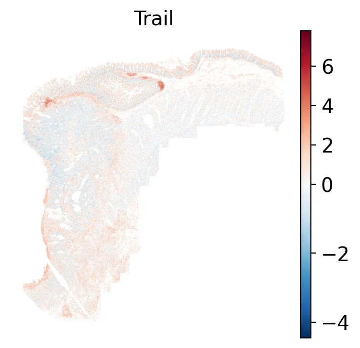
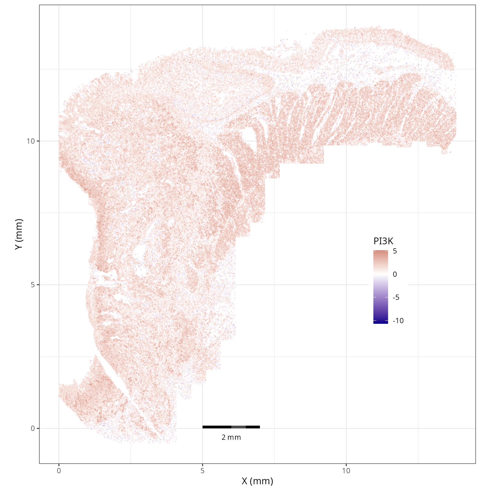
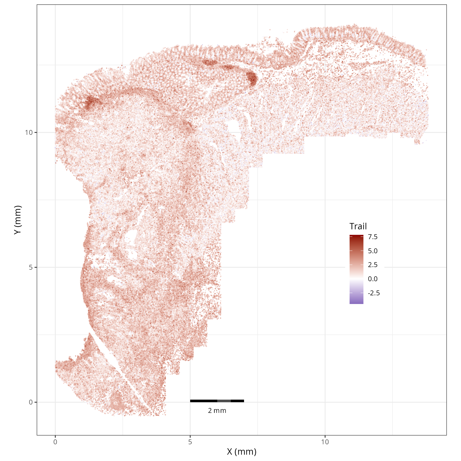
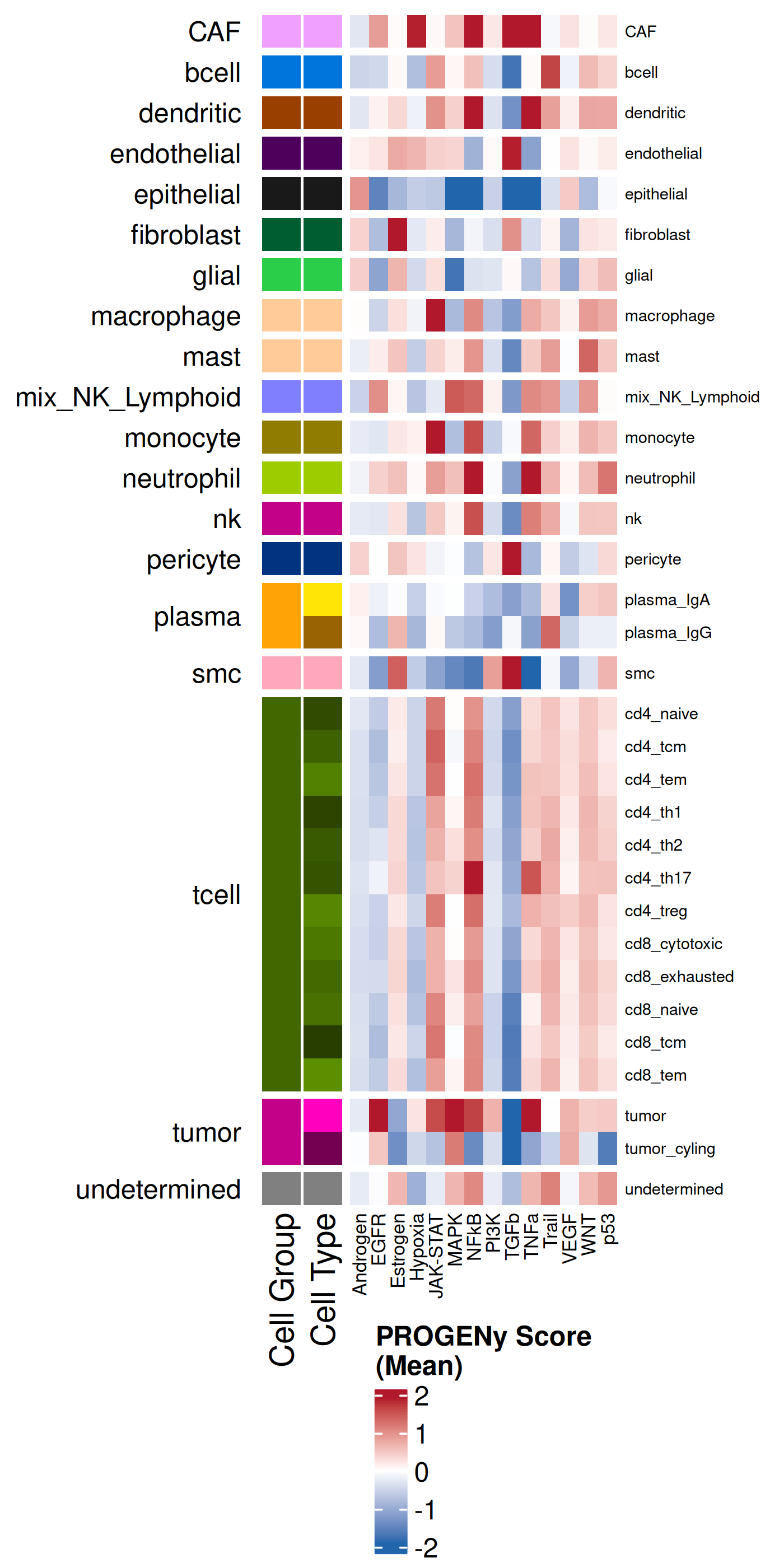
- In the tumor cells we see little enrichment of the
pro-apoptotic TRAIL pathway (mean = 0.0; Z-score = -1.1) but high EGFR
enrichment (mean = 2.6; Z-score = 3.7), a pattern associated with increased cell
invasion and metastasis @Sasaki2013.
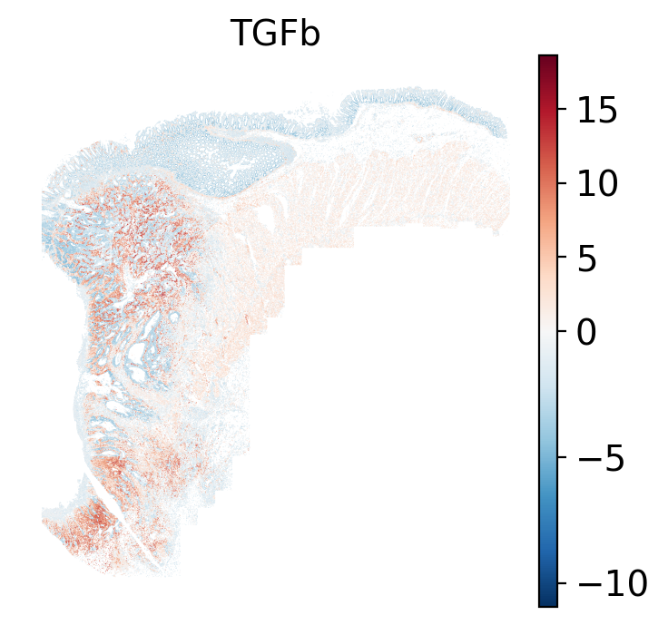
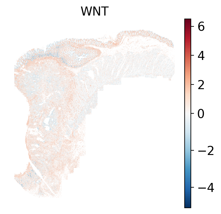
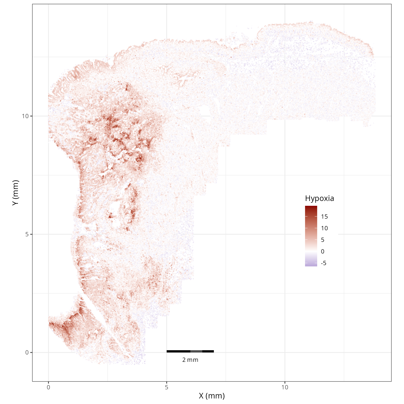
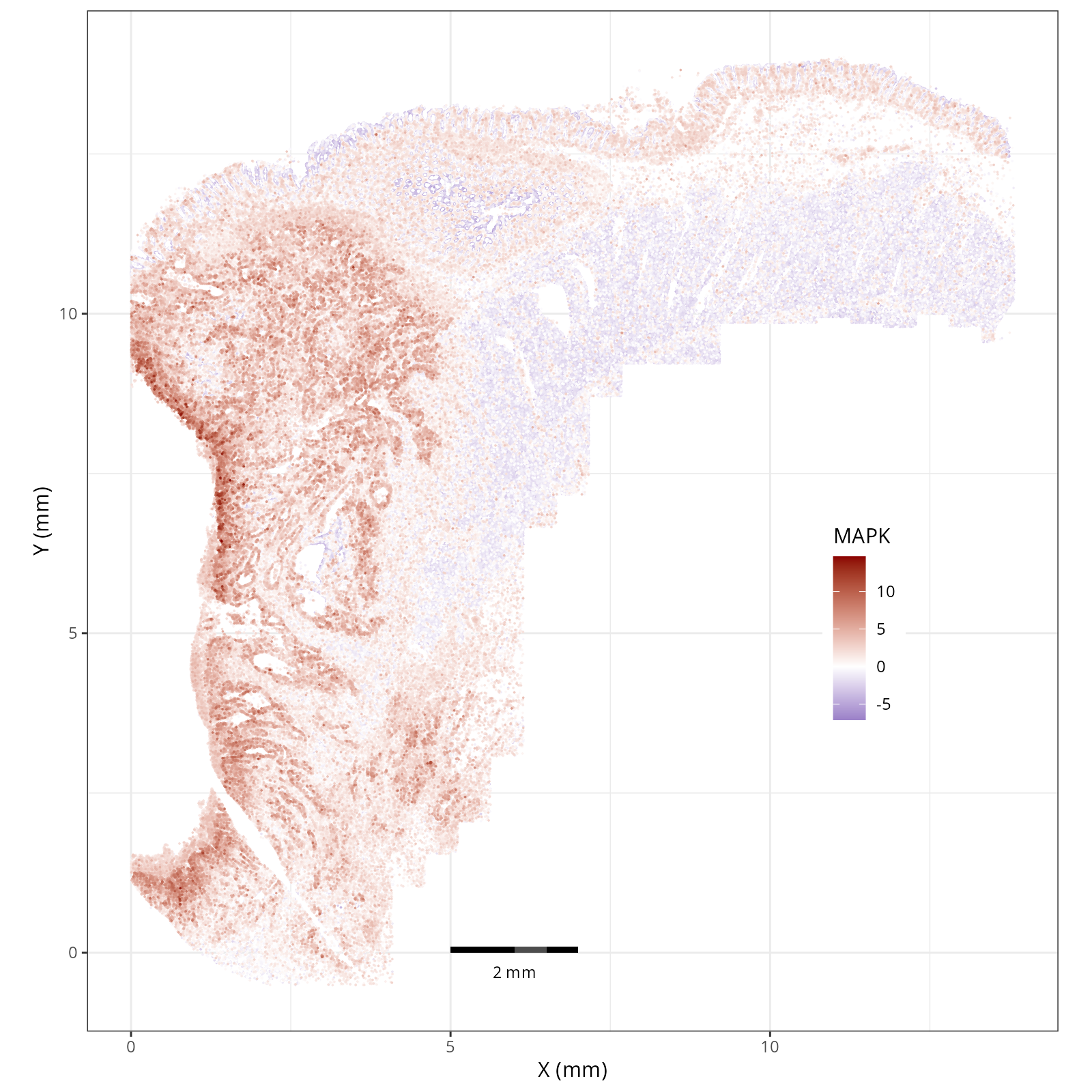
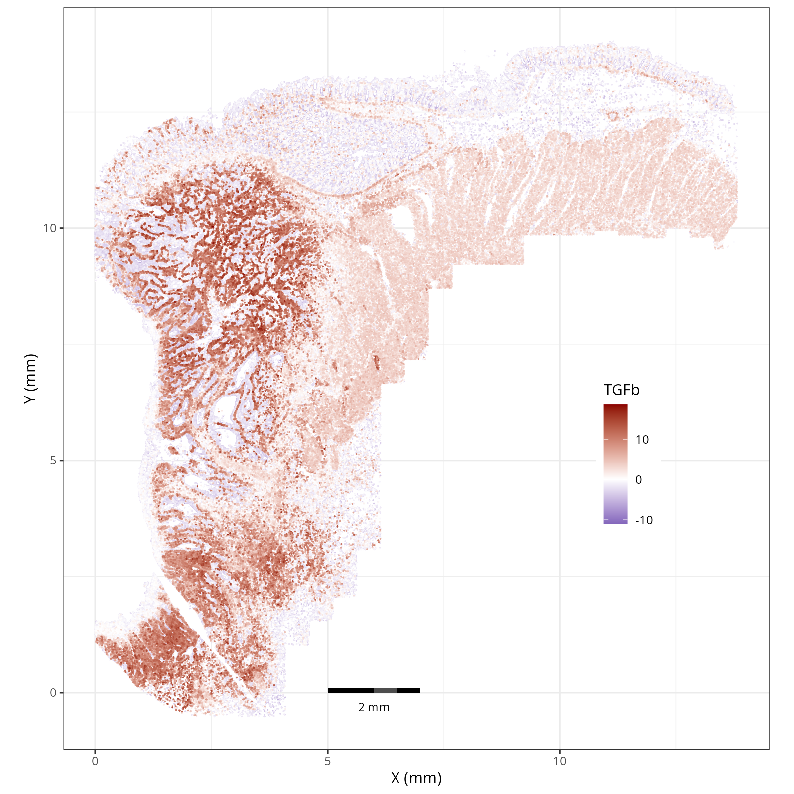
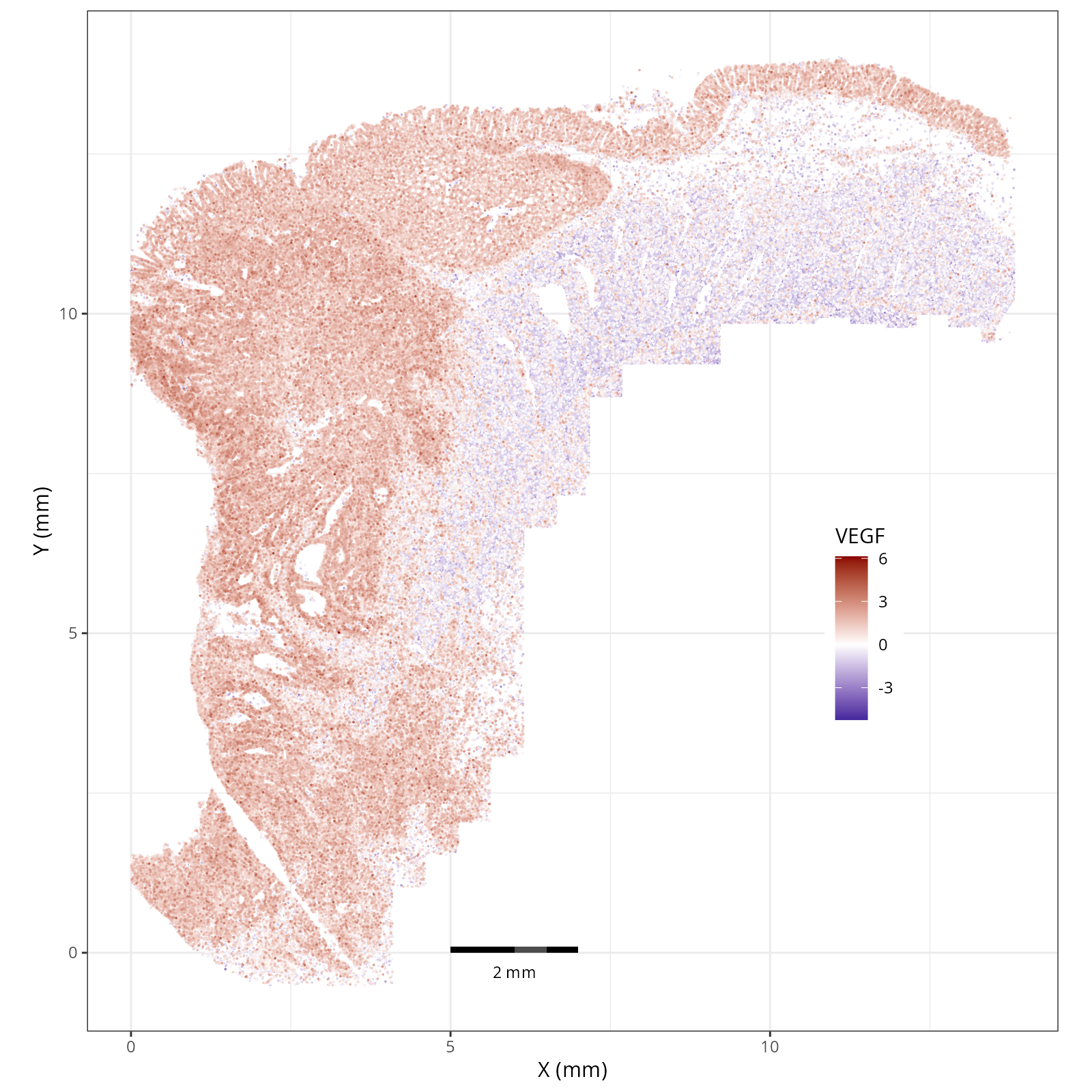
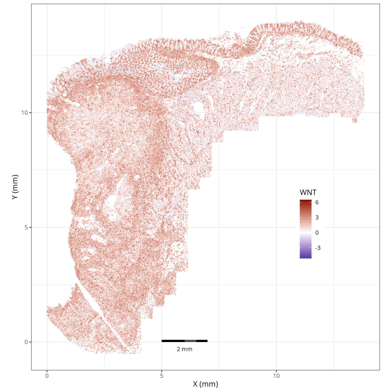
- Tumor cells are likely a "CMS4" or mesenchymal colon cancer phenotype. The three signatures of this phenotype are 'prominent transforming growth factor–β activation, stromal invasion and angiogenesis' @Guinney2015. Looking at growth regulation, tumor cells themsevles show little enrichment of TGF-$\beta$ (mean = -2.3; Z-score = -0.85); however, the CAFs show the highest levels in the dataset (mean = 7.0; Z-score = 3.9). This pattern mirrors the TGF-$\beta$ exclusion phenotype described in the literature, where stromal activation drives poor prognosis in colon cancer @Calon2015 @Ma2024. For stromal invasion, we can see from the spatial plots both at the cell type-level @fig-xy-celltype-broad and the domain-level (@fig-xy-domains) that CAFs and tumors are found in interdigitated domains. And finally, we found a signature of angiogenesis in tumor cells and tumor and stromal domains with the enrichment of VEGF @Duffy2004.
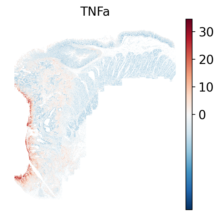
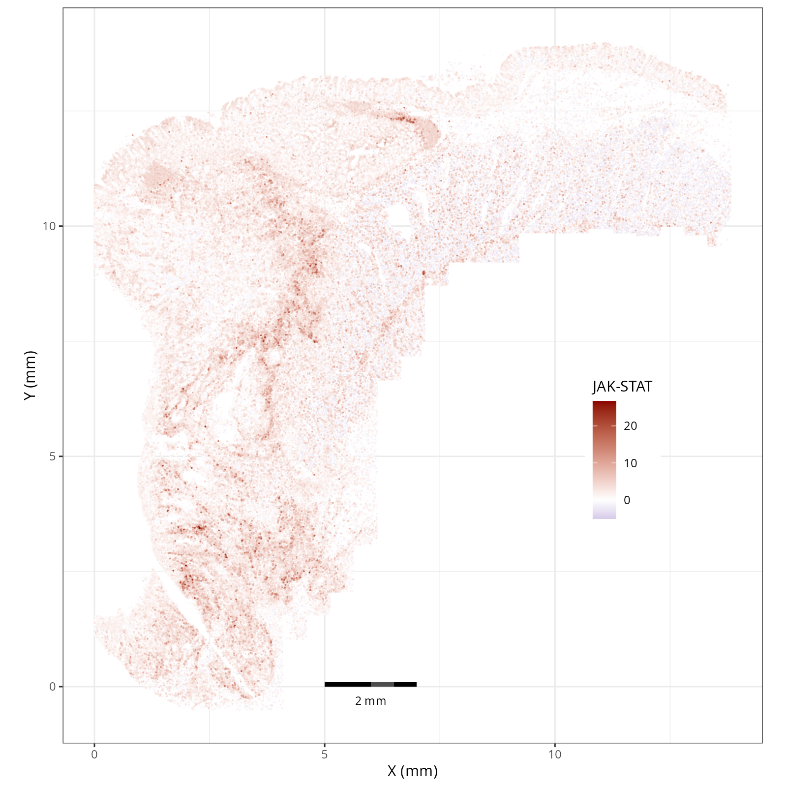
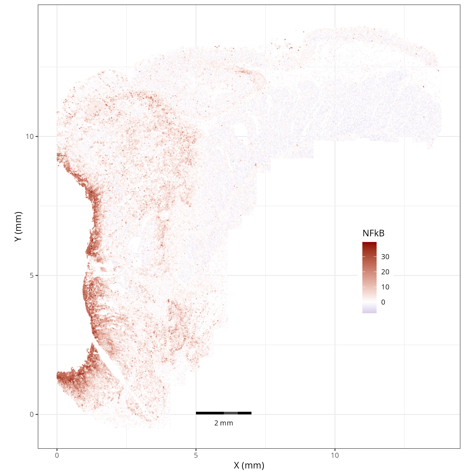
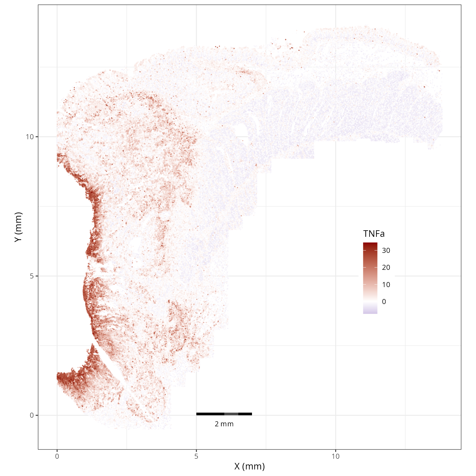
- There is a strong enrichment of TNF-$\alpha$ and NF-$\kappa$B on the left side
of the tissue that is still unresolved. The left side of the tissue is part of the
"Heterogeneous" spatial domain that is found throughout (@sec-domains) that contains
a high proportion of undetermined cell types (@fig-contingency-table). Perhaps
a follow up analysis would include isolating the cells within this "sub-domain"
to understand which cells might be driving the reduction of apoptosis and preventing
an effective immune response. This could be done with lasso selecting the region
(see our [blog post on lasso selecting with napari](https://nanostring-biostats.github.io/CosMx-Analysis-Scratch-Space/posts/napari-rois/cosmx-rois.html){target="_blank"}).
## Summary
In this chapter, we showed a simple nearest-neighbor smoothing technique and
scored pathways using one of the available databases (PROGENy; for others see
`decoupler.op.show_resources()`). Then we showed a few ways to pivot the data
and visualize the local scores or global aggregates these scores across cell types
and spatial domains to guide our inference.