---
subtitle: Pre-processing – From Counts to Clusters
author:
- name: Evelyn Metzger
orcid: 0000-0002-4074-9003
affiliations:
- ref: bsb
- ref: eveilyeverafter
execute:
eval: true
freeze: auto
message: true
warning: false
self-contained: false
code-fold: false
code-tools: true
code-annotations: hover
engine: knitr
prefer-html: true
format: live-html
webr:
packages:
- dplyr
- duckdb
repos:
- https://r-lib.r-universe.dev
resources:
- assets/interactives/umap_explore.parquet
- assets/interactives/umap_explore_qc_flags.parquet
---
{{< include ./_extensions/r-wasm/live/_knitr.qmd >}}
# Normalization, Reduction, and Clustering {#sec-preprocessing}
```{r}
#| label: Preamble
#| eval: true
#| echo: true
#| message: false
#| code-fold: true
#| code-summary: "R code"
source("./preamble.R")
reticulate::source_python("./preamble.py")
analysis_dir <- file.path(getwd(), "analysis_results")
input_dir <- file.path(analysis_dir, "input_files")
output_dir <- file.path(analysis_dir, "output_files")
analysis_asset_dir <- "./assets/analysis_results" # <1>
qc_dir <- file.path(output_dir, "qc")
if(!dir.exists(qc_dir)){
dir.create(qc_dir, recursive = TRUE)
}
pp_dir <- file.path(output_dir, "processing")
if(!dir.exists(pp_dir)){
dir.create(pp_dir, recursive = TRUE)
}
results_list_file = file.path(analysis_dir, "results_list.rds")
if(!file.exists(results_list_file)){
results_list <- list()
saveRDS(results_list, results_list_file)
} else {
results_list <- readRDS(results_list_file)
}
source("./helpers.R") # contains the plotDots function
```
Our quality control steps in @sec-quality-processing identified the analyzable
cells, but these their raw counts need further processing to reveal biological
patterns. This chapter covers the essential pre-processing steps to make the
data interpretable.
First, normalization adjusts counts to account for technical factors like cell
area (_i.e._, larger cells typically have more counts), enabling fair comparisons
between cells. Second, dimensionality reduction (using PCA and UMAP) helps
reduce the total number of dimensions in the data (almost 19,000) to a
manageable representation that captures key biological variation and allows
visualization. Finally, clustering leverages this reduced space to group cells
with similar expression profiles, which can be a foundation for downstream
analyses like cell typing.
By the end of this chapter, we will have transformed the filtered count matrix
into a clustered, low-dimensional dataset and classified cells into groups which,
taken together, form our foundation for
biological interpretation and spatial analysis. I often get asked "What is the
best parameter combination for CosMx data?" and I hope by the end of this chapter
you're able to understand how parameter adjustments impact many of these processing
steps.
Let's begin by loading the data.
```{python}
#| label: load-anndata
#| eval: false
#| code-summary: "Python Code"
#| message: true
#| warning: false
#| code-fold: show
adata = ad.read_h5ad(os.path.join(r.analysis_dir, "anndata-1-qc-filtered.h5ad"))
```
## Two pre-processing workflows
There are two different pre-processing workflows that I use. The first one
is borrowed from spatially-unaware scRNA-seq. The
main advantage of this approach is that it is fast, the normalization matrix can
remain sparse, the values are easy to understand (_e.g.,_ counts of gene X per 10,000 or
some transformation of such), and often times for WTX data provides the basis for good clustering
of cells in downstream UMAP. Moreover, Scanpy and Seurat each have built-in methods
for these steps which make it relatively low friction. However, there are cases were
this standard ("legacy") workflow provides unexpected results. One reason is that total
counts-based normalization might have unstable variance @Hafemeister2019 such that
high-expressing housekeeping genes might have high variance and disproportionately
effect downstream dimensional reduction and clustering.
The second, newer
workflow that I have been using is based on normalization using Pearson Residuals (PR).
The approach itself is not new and scanpy has a built-in method for it
(_i.e._, `scanpy.experimental.pp.normalize_pearson_residuals`).
Until recently the main disadvantage for using PR
is that it doesn't scale well to large number of cells that are typical in CosMx SMI[^1]
and it creates a large, dense normalization matrix that can make analysis and read/writing
slower. Fortunately, in many cases I do not need to compute and store such a dense
matrix. For example, Dan McGuire recently created the R package
[scPearsonPCA](https://nanostring-biostats.github.io/CosMx-Analysis-Scratch-Space/posts/pearsonpca)
that can estimate the Principle Components (PCs) of the PR normalized data
without needing to convert and use very dense matrices (which we will show below).
While this workflow involves converting data between python and R, I generally
find the clusters that are derived from such data are comparable to the standard
workflow or superior and so I recommend this workflow overall.
In this chapter, I'll run both the standard and recommended workflows on the colon
cancer dataset to provide code for both approaches. I will also do a deep-dive
on the choice of UMAP parameters.
This particular dataset is a case where the results are more-or-less
comparable and I'll pick the PR data to use throughout the rest of the colon
analysis.
Let's begin. Both options begin the same way: computing the highly variable genes (HVGs).
I have found that the `pearson_residulas` method to
detect HVGs (not to be confused with PR normalization) provides stable results for a variety of CosMx
SMI WTX experiments.
```{python}
#| label: RNA-preprocessing
#| eval: false
#| code-summary: "Python Code"
#| message: false
#| warning: false
#| code-fold: show
adata.layers["counts"] = adata.X.copy()
sc.experimental.pp.highly_variable_genes( # <1>
adata,
flavor='pearson_residuals',
n_top_genes=4000, # <2>
layer='counts'
)
```
1. the pearson_residuals 'flavor' implement in this function is not the same as the
pearson residuals _normalization method_ (see below).
2. generally 3000-5000 is a good starting point here.
::: {.column-margin}
::: {.otherapproachesbox title="Alternative Approach"}
The pre-processing workflow presented here can be considered a good overall
starting point towards understanding the structure of the data.
As such I have omitted more complex workflows and tasks such
as integrating morphology-based and/or protein-based PCs into the analysis. For
a more involved workflow, see our upcoming WTX paper.
:::
:::
The tabs below show both of these workflows. In each workflow, I set the umap
parameters to be identical (40 PCs, 15 nearest neighbors, spread = 2 and minimum
distance = 0.02). While these are fixed here, see the box `Choosing UMAP Parameters`
below to see how these
parameters effect the UMAP visual and the Leiden cluster assignments.
::: {.panel-tabset}
### Total Counts Workflow {#sec-tc-workflow}
> Workflow: Total counts-based normalization > log transformation > PCA
The procedure below adapts a standard `scanpy` [pipeline](https://scanpy.readthedocs.io/en/stable/tutorials/basics/clustering.html#normalization).
We'll first normalize each
cell the median total counts
and then log tranform the data.
With this approach I find that scaling the log1p data tends to generate more distinct
and biologically relevant clusters so I add that step.
Thus, we'll focus our analysis on the most variable
genes found in the dataset. After subsetting down to only these 4000 HVGs, we'll scale
each gene, run PCA, and put these HVG-derivied PCs into the full annData object.
On this dataset (`r results_list$n_cells_after_qc` cells), this whole process took
about a minute.
```{python}
#| label: TC-1
#| eval: false
#| code-summary: "Python Code"
#| message: false
#| warning: false
#| code-fold: show
sc.pp.normalize_total(adata)
sc.pp.log1p(adata) # -> adata.X
adata.layers['TC'] = adata.X.copy()

# Subset to HVGs and get PCs
adata_hvg = adata[:, adata.var.highly_variable].copy()
sc.pp.scale(adata_hvg) # -> adata.X
sc.tl.pca(adata_hvg, svd_solver='auto')
adata.obsm['X_pca_TC'] = adata_hvg.obsm['X_pca']
```
Run UMAP and Leiden with the top 40 PCs.
```{python}
#| label: TC-2
#| eval: false
#| code-summary: "Python Code"
#| message: false
#| warning: false
#| code-fold: show
sc.pp.neighbors(adata, n_neighbors=15, n_pcs=40, metric = 'cosine',
  use_rep='X_pca_TC', key_added='neighbors_TC')

UMAP = sc.tl.umap(adata, min_dist=0.02, spread=2, neighbors_key='neighbors_TC', copy=True)

adata.obsm['umap_TC'] = UMAP.obsm['X_umap']
adata.uns['umap_TC_params'] = UMAP.uns['umap']

sc.tl.leiden(adata, resolution=0.5,
  key_added='leiden_tc', flavor='igraph',
  n_iterations=2, neighbors_key='neighbors_TC')
```
### Pearson Residuals Workflow
> Workflow: Py to R > scPearsonPCA
The `scPearsonPCA` package estimates the PCs of the PR data without computing
and storing a dense normalized matrix.
Since it is written in R, we'll add it to this workflow
via `reticulate` after converting a few objects.
```{python}
#| label: PR-1
#| eval: false
#| code-summary: "Python Code"
#| message: false
#| warning: false
#| code-fold: show
total_counts_per_cell = adata.layers['counts'].sum(axis=1)
total_counts_per_cell = np.asarray(total_counts_per_cell).flatten()

total_counts_per_target = adata.layers['counts'].sum(axis=0)
total_counts_per_target = np.asarray(total_counts_per_target).flatten()

target_frequencies = total_counts_per_target / total_counts_per_target.sum()

adata_hvg = adata[:, adata.var.highly_variable].copy()
hvgs_counts = adata_hvg.layers['counts'].copy().astype(np.int64)
```
Convert relevant data to R.
```{r}
#| label: PR-2
#| eval: false
#| code-summary: "R Code"
#| message: true
#| warning: false
#| code-fold: show
library(Matrix)
hvgs_counts <- py$hvgs_counts
rownames(hvgs_counts) <- py$adata_hvg$obs_names$to_list()
colnames(hvgs_counts) <- py$adata_hvg$var_names$to_list()

# the approach we use below expects a sparse matrix with genes (rows) by cells (columns)
t_hvgs_counts <- Matrix::t(hvgs_counts)
t_hvgs_counts <- as(t_hvgs_counts, "CsparseMatrix")
```
Install the scPearsonPCA package (and remotes), if needed.
```{r}
#| label: PR-3
#| eval: false
#| code-summary: "R Code"
#| message: true
#| warning: false
#| code-fold: show
remotes::install_github("Nanostring-Biostats/CosMx-Analysis-Scratch-Space",
                         subdir = "_code/scPearsonPCA", ref = "Main")
```
Run Seurat-style PCA using scPearsonPCA.
```{r}
#| label: PR-4
#| eval: false
#| code-summary: "R Code"
#| message: true
#| warning: false
#| code-fold: show
library(scPearsonPCA)

total_counts_per_cell <- py$total_counts_per_cell

target_frequencies <- py$target_frequencies
names(target_frequencies) <- py$adata$var_names$to_list()

pcaobj <- sparse_quasipoisson_pca_seurat(
              x = t_hvgs_counts,
              totalcounts = total_counts_per_cell,
              grate = target_frequencies[rownames(t_hvgs_counts)],
              scale.max = 10,
              do.scale = TRUE,
              do.center = TRUE,
              ncores = 5
          )
pca <- pcaobj$reduction.data@cell.embeddings
```
Add these PCs to the annData object in Python. Run UMAP and Leiden with the top 40 PCs.
```{python}
#| label: PR-6
#| eval: false
#| code-summary: "Python Code"
#| message: false
#| warning: false
#| code-fold: show
adata.obsm["X_pca_pr"] = r.pca

sc.pp.neighbors(adata, n_neighbors=15, n_pcs=40, metric = 'cosine',
  use_rep='X_pca_pr', key_added='neighbors_pr')

UMAP = sc.tl.umap(adata, min_dist=0.02, spread=2, neighbors_key='neighbors_pr', copy=True)
adata.obsm['umap_pr'] = UMAP.obsm['X_umap']
adata.uns['umap_pr_params'] = UMAP.uns['umap']

sc.tl.leiden(adata, resolution=0.5,
  key_added='leiden_pr', flavor='igraph',
  n_iterations=2, neighbors_key='neighbors_pr')
```
:::
Save the annData object.
```{python}
#| label: save-anndata
#| eval: false
#| code-summary: "Python Code"
#| message: false
#| warning: false
#| code-fold: show
adata.write_h5ad(
  os.path.join(r.analysis_dir, "anndata-2-leiden.h5ad"),
  compression=hdf5plugin.FILTERS["zstd"],
  compression_opts=hdf5plugin.Zstd(clevel=5).filter_options
)
```
## Visualizations
Now that we have the UMAP embeddings and the Leiden cluster assignments in the
annData object, we can plot the results of the two methods and compare.
The easiest way to plot the Leiden clusters in UMAP space is with scnapy's built-in
method, [`sc.pl.umap`](https://scanpy.readthedocs.io/en/stable/generated/scanpy.tl.umap.html); however, since we have non-typical `obsm` keys, we'll use the
more generic [`sc.pl.embedding`](https://scanpy.readthedocs.io/en/latest/api/generated/scanpy.pl.embedding.html) method.
```{python}
#| label: make-umap-figs
#| code-summary: "Python Code"
#| code-fold: show
#| message: false
#| warning: false
#| echo: true
#| eval: false
import matplotlib.pyplot as plt
sc.settings.figdir = r.pp_dir
save_dir = r.pp_dir

adata.obs['log10_nCount_RNA'] = np.log10(adata.obs['nCount_RNA'] + 1)
adata.obs['qcflag'] = adata.obs['qcflag'].astype('category')

fig, ((ax1, ax2), (ax3, ax4), (ax5, ax6)) = plt.subplots(3, 2, figsize=(15, 10))

sc.pl.embedding(adata,
                basis='umap_TC',
                color='leiden_tc',
                title='Total Counts (leiden_tc)',
                palette=sc.pl.palettes.default_20,
                ax=ax1,
                show=False)

sc.pl.embedding(adata,
                basis='umap_pr',
                color='leiden_pr',
                title='Pearson Residuals (leiden_pr)',
                palette=sc.pl.palettes.default_20,
                ax=ax2,
                show=False)

sc.pl.embedding(adata,
                basis='umap_TC',
                color='log10_nCount_RNA',
                title='Total Counts (log10_nCount_RNA)',
                ax=ax3,
                show=False)

sc.pl.embedding(adata,
                basis='umap_pr',
                color='log10_nCount_RNA',
                title='Pearson Residuals (log10_nCount_RNA)',
                ax=ax4,
                show=False)

sc.pl.embedding(adata,
                basis='umap_TC',
                color='qcflag',
                title='Total Counts (FOV QC Flag)',
                palette=sc.pl.palettes.default_20,
                ax=ax5,
                show=False)

sc.pl.embedding(adata,
                basis='umap_pr',
                color='qcflag',
                title='Pearson Residuals (FOV QC Flag)',
                palette=sc.pl.palettes.default_20,
                ax=ax6,
                show=False)

plt.tight_layout()
filename = "umap_umap_compare.png"
save_path = os.path.join(save_dir, filename)
plt.savefig(save_path)
```
```{r}
#| label: fig-umap-leiden-simple
#| message: false
#| warning: false
#| echo: false
#| fig.width: 8
#| fig.height: 12
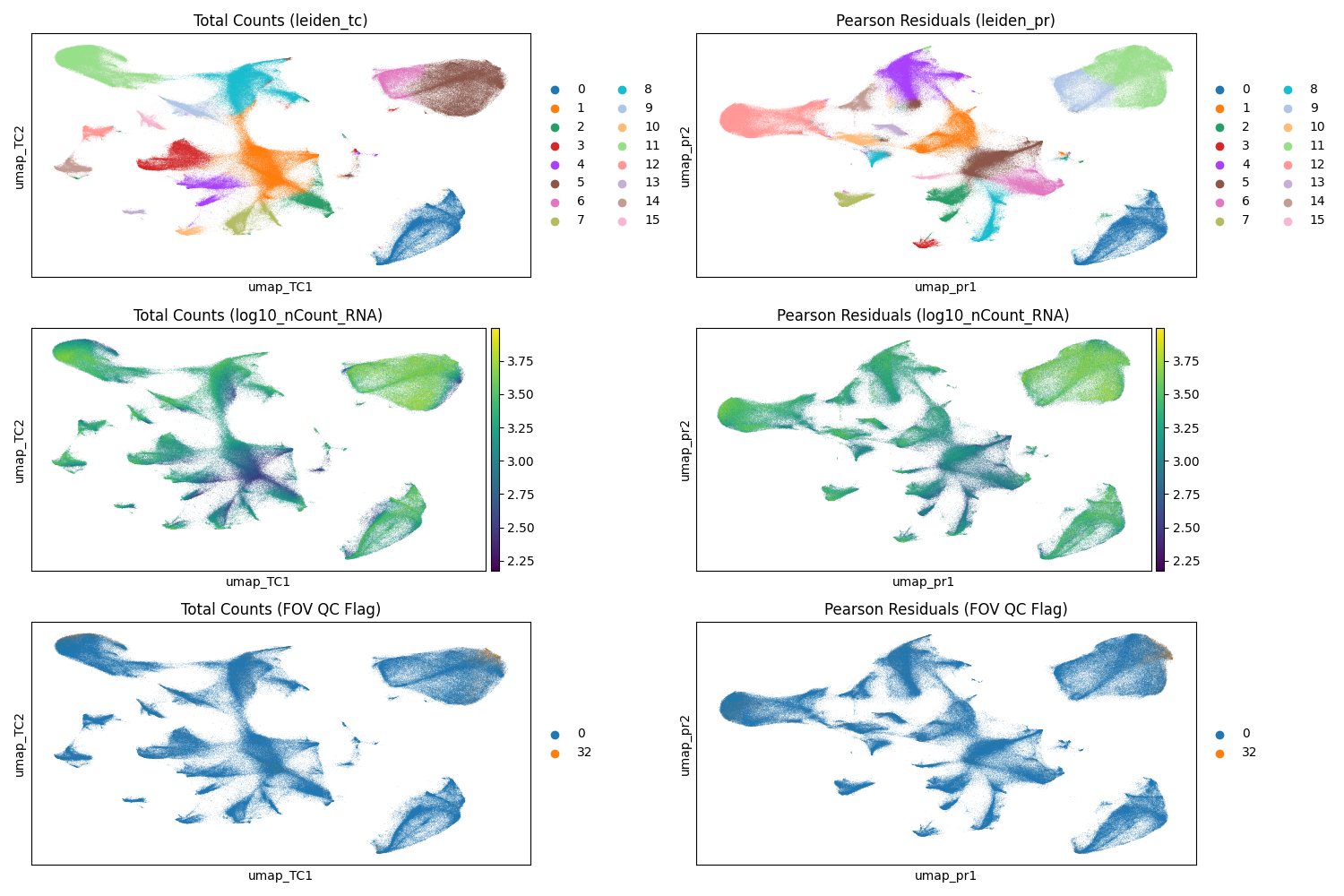
#| fig-cap: "UMAP with Leiden clusters from total counts normalization (left) and scPearsonPCA PCs (right). Note that a given cluster label in one plot is not the same as that label in the other plot. Top: Leiden clusters. Middle: cells colored by their total counts. Bottom: cells colored by their QC flag (0 = no flag; 32 = FOV flag; no other flaggeed cells were processed)."
#| eval: true
render(file.path(analysis_asset_dir, "preprocessing"), "umap_umap_compare.png", pp_dir, overwrite=TRUE)
```
Both normalization methods demonstrate effective cluster separation
(@fig-umap-leiden-simple). When evaluating these visualizations, it is important
to watch for artifacts, particularly sub-clustering driven primarily by total
transcript counts, which can signal suboptimal normalization. Additionally,
because we retained cells flagged by FOV QC (flag 32), we must verify that these
cells do not aggregate into spurious "satellite" clusters which could
indicate technical artifacts rather than biological signal. In this dataset,
while FOV QC-flagged cells are present in the upper right cluster (Leiden 5 in
the total counts workflow and Leiden 11 in the Pearson Residuals workflow), they
do not form a distinct artifactual group. Instead, they appear integrated with
the dominant cell population, suggesting their distribution is driven by the
biology of that region -- a hypothesis we will elucidate further in
@sec-celltyping.
We can compare which combination of Leiden clusters a given cell was assigned to:
```{python}
#| echo: true
#| eval: false
import pandas as pd
import seaborn as sns

crosstab = pd.crosstab(
    adata.obs['leiden_tc'],
    adata.obs['leiden_pr']
)

crosstab_norm = crosstab.div(crosstab.sum(axis=1), axis=0)

plt.figure(figsize=(12, 10))
sns.heatmap(
    crosstab_norm,
    annot=True,
    fmt=".2f", cmap="viridis",
    linewidths=.5
)

plt.title("Comparison of Leiden clusters derived from TC or PR workflows", fontsize=16)
plt.ylabel("Total Counts (leiden_tc)", fontsize=12)
plt.xlabel("Pearson Residuals (leiden_pr)", fontsize=12)
filename = "leiden_compare_crosstab.png"
save_path = os.path.join(save_dir, filename)
plt.savefig(save_path)
```
```{r}
#| label: fig-umap-leiden-compare
#| message: false
#| warning: false
#| echo: false
#| fig.width: 12
#| fig.height: 12
#| fig-cap: "Proportion of cells classified with the pure scanpy-based approach compared to the scPearsonPCA-based appraoch."
#| eval: true
render(file.path(analysis_asset_dir, "preprocessing"), "leiden_compare_crosstab.png", pp_dir, overwrite=TRUE)
```
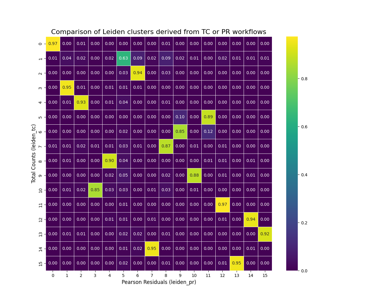
@fig-umap-leiden-compare shows a relationship between the clusters derived
from our two normalization approaches.
Most (15 of 16) Leiden clusters with the total counts
approach have more than 85% of cells that are found in a single Leiden cluster
for the Pearson Residuals method (e.g., 95% of tc_3 cells mapped to pr_1). One
cluster in the total counts approach (tc_1) "split" amongst PR clusters (primarily
clusters pr_5, pr_6, and pr_8).
So which is _better_? With this particular dataset the two approaches are comparable.
For the majority of my CosMx SMI WTX analyses I have found the Pearson
Residual-based normalization to provide more meaningful biological clusters
consistently across datasets so
that might be a good overall recommendation -- especially if you are working within
the R ecosystem. If you are looking for a quick analysis, then the total counts-based
approach may work in many cases.
:::{.column-body-outset}
:::{.noteworthybox title="Choosing UMAP Parameters" collapse="true"}
## Choosing UMAP Parameters
UMAP helps visualize how groups of cells relate to each other in
high-dimensional space. While there isn't one "correct" UMAP layout, some
embeddings are more effective than others at revealing underlying biological
structure. We have seen in this chapter how having choice in normalization
alone (via PCA) can alter the shape of a UMAP plot even when all other parameters
are identical (@fig-umap-leiden-simple).
This section explores how commonly adjusted parameters and inputs other than
the choice of normalization influence the
resulting UMAP visualization, aiming to build intuition for how to tune these
parameters effectively in your dataset.
Let's systematically vary five key factors:
- **The quality filtering applied to the input cells.** Using only high-quality
cells often leads to clearer, tighter clusters representing core biological populations.
If filtering was too stringent then entire cell populations might be unrepresented.
- **The number of Principal Components (PCs) used.** Using a lower number will concetrate
on the strongest axes of variation at the cost of reducing any distinction between
cell subtypes if that distinction is found in higher PCs. Choosing a higher number
of PCs can potentially resolve finer subtypes but also risks incorporating noise,
which might slightly blur cluster boundaries or create small, potentially spurious groupings.
- **The number of nearest neighbors (n_neighbors).** Lower `n_neighbors` tends to
emphasize local cluster separation while higher `n_neigbhors` tends to form broader
clusters.
- **The distance metric (metric).** Defines the rule for calculating "closeness"
between cells. Euclidean measures straight-line distance while cosine measures
the angle between gene expression profiles. Since changing this alters
which cells are considered "neighbors," the parameter can have large impacts on
the global shape. Euclidean is the default many packages but cosine often provides
more biologically meaningful clusters for CosMx SMI data.
- **The minimum distance parameter (min_dist).** Controls how tightly packed points
are within a cluster. Higher values tend to make more diffuse clusters.
- **The spread parameter (spread).** Controls the separation between clusters. Lower
`spread` tends to bring clusters closer together.
This list isn't exhaustive, but varying these while keeping others constant will
illustrate their core effects. To make this exploration computationally
feasible, we will use a representative subsample of 50,000 cells from our
quality-flagged dataset. And to make visualization smooth, we'll only plot at most
500 cells.
Click the radio buttons below to see what effect these parameter have on the UMAP
visualization. Some of these changes are gradual while some dramatically alter
the shape and configuration of the UMAP embeddings. You'll note that filtering out
the poor quality cells doesn't merely remove the cells from the UMAP; instead,
the inclusion of poorer-quality data can effect the entire UMAP topology. I have
also included the Leiden clusters for these cells. The number of PCs and the
number of neighbors effect Leiden cluster cell assignment while `spread` and
`min_dist` do not.
Encouragingly, in this dataset there doesn't appear to be any UMAP clusters that
appear to be made up of cells that were flagged in our FOV QC analysis (@sec-fov-qc). If this
_was_ the case, it would suggest that we would want to remove the cells in the
effected FOVs.
```{python}
#| eval: false
#| echo: false
# This section is for the example only -- not part of a regular analysis
import itertools
import pandas as pd
import numpy as np
import pyarrow as pa
import pyarrow.parquet as pq
import scanpy as sc
import os
bdata = sc.read_h5ad(os.path.join(r.analysis_dir, "anndata-1-qc-flagged.h5ad"))
n_subsample = 50000
random_seed = 98103
sc.pp.subsample(bdata, n_obs=n_subsample, random_state=random_seed)
# Define Parameters
qc_levels = {
"no QC filter": None,
"include FOV QC cells": [0, 32],
"filter all flags": [0]
}
# Graph Parameters (affect the topology/connections)
graph_params = list(itertools.product(
[10, 20, 30, 40, 50], # n_pcs
[15, 30, 50], # n_neighbors
['euclidean', 'cosine'] # metric
))
# Layout Parameters (affect only the visualization)
layout_params = list(itertools.product(
[0.01, 0.05, 0.2, 0.5], # min_dist
[0.5, 1.0, 2.0] # spread
))
all_embeddings_list = []
for qc_level, qc_flags in qc_levels.items():
print(f"--- Starting QC Level: {qc_level} ---")
# Create base object for this QC level
if qc_level != "no QC filter":
adata_qc = bdata[bdata.obs['qcflag'].isin(qc_flags), :].copy()
else:
adata_qc = bdata.copy()
# Preprocessing
adata_qc.layers["counts"] = adata_qc.X.copy()
sc.pp.normalize_total(adata_qc)
sc.pp.log1p(adata_qc)
sc.experimental.pp.highly_variable_genes(
adata_qc, flavor='pearson_residuals', n_top_genes=4000, layer='counts'
)
adata_qc = adata_qc[:, adata_qc.var.highly_variable].copy()
sc.pp.scale(adata_qc)
sc.tl.pca(adata_qc, svd_solver='auto')
for n_pcs, n_neighbors, metric in graph_params:
print(f"----- Starting graph_params: {n_pcs} {n_neighbors} {metric} ---")
adata_graph = adata_qc.copy()
try:
sc.pp.neighbors(
adata_graph,
n_pcs=n_pcs,
n_neighbors=n_neighbors,
use_rep='X_pca',
metric=metric,
random_state=random_seed
)
for min_dist, spread in layout_params:
param_string = f"qc_{qc_level}_pcs_{n_pcs}_nn_{n_neighbors}_met_{metric}_md_{min_dist}_sp_{spread}"
print(f"Running: {param_string}")
sc.tl.umap(adata_graph, min_dist=min_dist, spread=spread, random_state=random_seed)
sc.tl.leiden(adata_graph, resolution=0.5, key_added='leiden', flavor='igraph', n_iterations=2)
embedding_df = pd.DataFrame(
adata_graph.obsm['X_umap'],
index=adata_graph.obs.index,
columns=['umap_1', 'umap_2']
)
# Add metadata
embedding_df['leiden'] = adata_graph.obs['leiden']
embedding_df['qc'] = qc_level
embedding_df['n_pcs'] = n_pcs
embedding_df['n_neighbors'] = n_neighbors
embedding_df['metric'] = metric
embedding_df['min_dist'] = min_dist
embedding_df['spread'] = spread
embedding_df = embedding_df.reset_index().rename(columns={'index': 'cell_id'})
all_embeddings_list.append(embedding_df)
except Exception as e:
print(f"!!! Error params ({n_pcs}, {n_neighbors}, {metric}): {e}")
df = pd.concat(all_embeddings_list, ignore_index=True)
n_subsubsample = 500
random_seed = 98103
umap_output_file = f"./assets/interactives/umap_explore{str(n_subsubsample)}.parquet"
qc_flags_output_file = f"./assets/interactives/umap_explore_qc_flags{str(n_subsubsample)}.parquet"
np.random.seed(random_seed)
unique_cell_ids = df['cell_id'].unique()
cell_ids_pick = np.random.choice(
unique_cell_ids,
size=n_subsubsample,
replace=False
)
cell_ids_pick_set = set(cell_ids_pick)
df_filtered = df[df['cell_id'].isin(cell_ids_pick_set)].copy()
pq.write_table(pa.Table.from_pandas(df_filtered), umap_output_file)
pq.write_table(pa.Table.from_pandas(df_filtered), "./assets/interactives/umap_explore.parquet")
bmeta = bdata.obs.loc[bdata.obs.index.isin(cell_ids_pick_set), ['cell_ID', 'qcflag']].copy()
bmeta['cell_id'] = bmeta.index
bmeta_filtered = bmeta.loc[bmeta['qcflag'] != 0, ['cell_id', 'qcflag']].reset_index(drop=True)
pq.write_table(pa.Table.from_pandas(bmeta_filtered), qc_flags_output_file)
pq.write_table(pa.Table.from_pandas(bmeta_filtered), "./assets/interactives/umap_explore_qc_flags.parquet")
```
:::: {.columns}
::: {.column width="40%"}
```{webr}
#| echo: false
#| eval: true
#| edit: false
#| define:
#| - qc_flags_data
# This block fetches the QC
# flag codes for the cell ids (numeric) so that it can be merged in the plots
# and tables.
qc_flags_file <- "assets/interactives/umap_explore_qc_flags.parquet"
qc_flags_data <- data.frame(cell_id = character(), qcflag = integer())
con <- tryCatch({ dbConnect(duckdb()) }, error = function(e) { print(e); NULL })
if (!is.null(con)) {
if (file.exists(qc_flags_file)) {
# print("Loading QC flags data...")
qc_flags_data <- tryCatch({
dbGetQuery(con, paste0("SELECT * FROM '", qc_flags_file, "'"))
}, error = function(e) {
# print("Error reading QC flags parquet:")
print(e)
qc_flags_data # Return default empty
})
# print(paste("Loaded", nrow(qc_flags_data), "QC flag entries."))
} else {
print(paste("QC flags file not found:", qc_flags_file))
}
dbDisconnect(con, shutdown = TRUE)
}
```
```{ojs}
//| eval: true
//| echo: false
viewof qc_level = Inputs.radio(["no QC filter", "include FOV QC cells", "filter all flags"], {label: "QC Level", value: "include FOV QC cells"})
viewof n_pcs = Inputs.radio([10, 20, 30, 40, 50], {label: "PCs", value: 30})
viewof n_neighbors = Inputs.radio([15, 30, 50], {label: "Neighbors", value: 30})
viewof metric = Inputs.radio(["euclidean", "cosine"], {label: "Metric", value: "cosine"})
viewof mdist = Inputs.radio([0.01, 0.05, 0.2, 0.5], {label: "Min. distance", value: 0.2})
viewof spread = Inputs.radio([0.5, 1.0, 2.0], {label: "Spread", value: 2.0})
viewof colorby = Inputs.radio(["QC", "Leiden"], {label: "Color by", value: "QC"})
```
```{webr}
#| echo: false
#| eval: true
#| edit: false
#| input:
#| - qc_level
#| - n_pcs
#| - n_neighbors
#| - metric
#| - mdist
#| - spread
#| - colorby
#| define:
#| - query_data
# connection to an in-memory DuckDB database.
con <- dbConnect(duckdb())
# build the SQL query
query <- paste0(
"SELECT * FROM 'assets/interactives/umap_explore.parquet' WHERE qc = '",
qc_level,
"' AND n_pcs = '",
n_pcs,
"' AND n_neighbors = '",
n_neighbors,
"' AND metric = '",
metric,
"' AND min_dist = '",
mdist,
"' AND spread = '",
spread, "'"
)
query_data <- tryCatch({
dbGetQuery(con, query)
}, error = function(e) {
print("--- SQL Query Error ---")
print("Query that failed:")
print(query)
print("Error message:")
print(e)
data.frame(
cell_id = character(),
umap_1 = numeric(),
umap_2 = numeric()
)
})
dbDisconnect(con, shutdown = TRUE)
```
<!-- static QC flag legend and defs -->
```{ojs}
//| echo: false
//| eval: true
//| output: false
// Define the meaning of each bit
qcMasks = ({
  LOW_COUNTS: 1 << 0,
  HIGH_COUNTS: 1 << 1,
  LOW_FEAT: 1 << 2,
  HIGH_FEAT: 1 << 3,
  LOW_SPLIT: 1 << 4,
  FOV_QC: 1 << 5,
  LOW_SBR: 1 << 6
})

flagNames = Object.keys(qcMasks).sort((a, b) => qcMasks[a] - qcMasks[b]);
qcFlagMap = new Map(qc_flags_data.map(d => [d.cell_id, d.qcflag]));

flagColors = {
  const uniqueFlagsInData = Array.from(new Set(qc_flags_data.map(d => d.qcflag))).sort((a, b) => a - b);
  const uniqueFlagsWithZero = Array.from(new Set([0, ...uniqueFlagsInData])).sort((a,b)=> a-b);
  const colors = d3.schemeTableau10;
  const map = {};
  let colorIndex = 0;
  uniqueFlagsWithZero.forEach(flagValue => {
    if (flagValue === 0) { map[flagValue] = "black"; }
    else { map[flagValue] = colors[colorIndex++ % colors.length]; }
  });
  return map;
}

qcColorScale = (flagValue) => flagColors[flagValue ?? 0];
```
::: {.columns}
::: {.column width="70%"}
<!-- QC legend -->
```{ojs}
//| echo: false
//| eval: true
//| output: true
qcFlagLegend = {
  try {
    const uniqueFlagsWithZero = Object.keys(flagColors).map(Number).sort((a,b)=> a-b);
    const tableRows = uniqueFlagsWithZero.map(flagValue => {
      const flagColor = flagColors[flagValue]; // Use static map
      const circles = flagNames.map(name => {
         const mask = qcMasks[name];
         const isSet = (flagValue & mask) > 0;
         const circleFill = isSet ? flagColor : "#e0e0e0";
         const circleSvg = `<svg width="15" height="15"><circle cx="7.5" cy="7.5" r="6" fill="${circleFill}" stroke="${isSet ? 'black' : '#ccc'}" stroke-width="1"></circle></svg>`;
         return `<td style="text-align: center;">${circleSvg}</td>`;
      }).join('');
      const rowHeader = `<th scope="row" style="text-align: right; padding-right: 10px; white-space: nowrap;">
                           <span style="display: inline-block; width: 12px; height: 12px; background-color: ${flagColor}; border: 1px solid #555; margin-right: 5px; vertical-align: middle;"></span>
                           ${flagValue === 0 ? 'Passed' : flagValue}
                         </th>`;
      return `<tr>${rowHeader}${circles}</tr>`;
    }).join('');
    const headerCells = flagNames.map(name =>
      `<th style="height: 100px; text-align: center; vertical-align: bottom; padding-bottom: 5px; font-size: 0.8em; white-space: nowrap;">
         <span style="writing-mode: vertical-lr; transform: rotate(180deg);">${name.replace(/_/g, ' ')}</span>
       </th>`
    ).join('');
    const tableHeader = `<thead><tr><th style="vertical-align: bottom;">Flag Value</th>${headerCells}</tr></thead>`;
    return html`<table style="border-collapse: collapse; margin-top: 10px; font-size: 0.9em; table-layout: fixed;">
                   ${tableHeader}<tbody>${tableRows}</tbody>
                 </table>`;
   } catch (error) {
     console.error("Error generating QC Legend:", error);
     return html`<div>Error generating QC Legend</div>`;
   }
}
```
:::
::: {.column width="3%"}
<!-- empty column to create gap -->
:::
::: {.column width="27%"}
```{ojs}
//| echo: false
//| eval: true
//| output: true
leidenScaleAndLegend = {
  let scale, legend;
  try { // Add try...catch
    // Check if query_data is ready and has 'leiden'
    if (!query_data || query_data.length === 0 || !query_data[0].hasOwnProperty('leiden')) {
        console.warn("Leiden data (query_data) not ready for legend/scale.");
        scale = d3.scaleOrdinal().domain(["0"]).range(["grey"]); // Placeholder scale
        legend = html`<div><ul style="list-style: none; padding-left: 0; margin-top: 10px; font-size: 0.9em;">
                        <li style="margin-bottom: 2px;"><span style="display: inline-block; width: 12px; height: 12px; background-color: grey; border: 1px solid #555; margin-right: 5px; vertical-align: middle;"></span> Cluster 0</li>
                      </ul>(Loading...)</div>`; // placeholder
    } else {
        const uniqueClusters = Array.from(new Set(query_data.map(d => d.leiden))).sort((a, b) => a - b);
        scale = d3.scaleOrdinal(d3.schemeTableau10).domain(uniqueClusters);

        const legendItems = uniqueClusters.map(cluster => {
           const color = scale(cluster);
           const clusterLabel = String(cluster);
           return `<li style="margin-bottom: 2px;"><span style="display: inline-block; width: 12px; height: 12px; background-color: ${color}; border: 1px solid #555; margin-right: 5px; vertical-align: middle;"></span> Cluster ${clusterLabel}</li>`;
        }).join('');
        legend = html`<ul style="list-style: none; padding-left: 0; margin-top: 10px; font-size: 0.9em;">${legendItems}</ul>`;
    }
  } catch(error) {
     console.error("Error generating Leiden Legend:", error);
     scale = () => 'grey';
     legend = html`<div>Error generating Leiden Legend</div>`;
  }
  return { scale, legend };
}

leidenColorScale = leidenScaleAndLegend.scale
leidenLegendHtml = leidenScaleAndLegend.legend
```
:::
:::
:::
::: {.column width="5%"}
:::
::: {.column width="55%"}
```{ojs}
//| echo: false
//| eval: true
//| message: false
//| output: false
d3 = require("d3@7")

width = 500
height = 500
marginTop = 20
marginRight = 20
marginBottom = 30
marginLeft = 40

xScale = d3.scaleLinear().domain([0, 1]).range([marginLeft, width - marginRight])
yScale = d3.scaleLinear().domain([0, 1]).range([height - marginBottom, marginTop])

svg = d3.create("svg")
    .attr("width", width)
    .attr("height", height)
    .attr("viewBox", [0, 0, width, height])
    .attr("style", "max-width: 100%; height: auto;");

xAxis = d3.axisBottom(xScale)
    .ticks(width / 80)
    .tickSizeOuter(0)
    .tickSizeInner(-(height - marginTop - marginBottom));

yAxis = d3.axisLeft(yScale)
    .ticks(height / 40)
    .tickSizeOuter(0)
    .tickSizeInner(-(width - marginLeft - marginRight));

gx = svg.append("g")
    .attr("class", "x-axis")
    .attr("transform", `translate(0,${height - marginBottom})`)
    .call(xAxis);

gy = svg.append("g")
    .attr("class", "y-axis")
    .attr("transform", `translate(${marginLeft},0)`)
    .call(yAxis);

svg.selectAll(".tick line")
   .attr("stroke-opacity", 0.1);
svg.append("text")
    .attr("x", width - marginRight)
    .attr("y", height - marginBottom - 4)
    .attr("fill", "currentColor")
    .attr("text-anchor", "end")
    .text("UMAP 1 →");
svg.append("text")
    .attr("x", marginLeft + 4)
    .attr("y", marginTop)
    .attr("fill", "currentColor")
    .attr("text-anchor", "start")
    .attr("dominant-baseline", "hanging")
    .text("↑ UMAP 2");
-
svg.append("clipPath")
    .attr("id", "clip")
  .append("rect")
    .attr("x", marginLeft)
    .attr("y", marginTop)
    .attr("width", width - marginLeft - marginRight)
    .attr("height", height - marginTop - marginBottom);
pointGroup = svg.append("g")
    .attr("fill", "black")
    .attr("clip-path", "url(#clip)");
```
```{ojs}
//| echo: false
//| eval: true
//| message: false
{ // Reactive block
  const updateVisualization = () => {
    const duration = 750;

    const currentScale = colorby === "QC" ? qcColorScale : leidenColorScale;

    if (!currentScale) {
        console.error("Scale missing");
        return;
    }

    if (!query_data || query_data.length === 0) {
       console.warn("No data available for plotting.");
       pointGroup.selectAll("circle").transition().duration(duration).attr("opacity", 0).remove();
       return;
    }

    const xExtent = d3.extent(query_data, d => d.umap_1);
    const yExtent = d3.extent(query_data, d => d.umap_2);

    const xPad = (xExtent[1] - xExtent[0]) * 0.05;
    const yPad = (yExtent[1] - yExtent[0]) * 0.05;

    xScale.domain([xExtent[0] - xPad || -1, xExtent[1] + xPad || 1]);
    yScale.domain([yExtent[0] - yPad || -1, yExtent[1] + yPad || 1]);

    svg.select(".x-axis")
      .transition().duration(duration)
      .call(xAxis)
      .on("start", () => {
         svg.selectAll(".x-axis .tick line").attr("stroke-opacity", 0.1);
      });

    svg.select(".y-axis")
      .transition().duration(duration)
      .call(yAxis)
      .on("start", () => {
         svg.selectAll(".y-axis .tick line").attr("stroke-opacity", 0.1);
      });

    pointGroup.selectAll("circle")
      .data(query_data, d => d.cell_id)
      .join(
        enter => enter.append("circle")
            .attr("cx", d => xScale(d.umap_1))
            .attr("cy", d => yScale(d.umap_2))
            .attr("r", 2.5)
            .attr("fill", d => {
                try {
                    const valueToColor = colorby === "QC" ? qcFlagMap.get(d.cell_id) : d.leiden;
                    return currentScale(valueToColor) || 'grey';
                } catch(e) { return 'grey'; }
            })
            .attr("opacity", 0)
            .call(enter => enter.transition().duration(duration).attr("opacity", 0.8)),

        update => update
            .call(update => update.transition().duration(duration)
                .attr("cx", d => xScale(d.umap_1))
                .attr("cy", d => yScale(d.umap_2))
                .attr("fill", d => {
                    try {
                        const valueToColor = colorby === "QC" ? qcFlagMap.get(d.cell_id) : d.leiden;
                        return currentScale(valueToColor) || 'grey';
                    } catch(e) { return 'grey'; }
                })
                .attr("opacity", 0.8)
             ),

        exit => exit
            .call(exit => exit.transition().duration(duration).attr("opacity", 0).remove())
      );
  };

  try {
    updateVisualization();
  } catch(error) {
    console.error("Error during D3 updateVisualization:", error);
  }

  return svg.node();
}
```
In the dot plot on the bottom left provides a QC flag legend. For example, QC flag '5' represents cells that were flagged for having low counts and low features whereas QC flag '96' represents cells that wee flagged for FOV QC as wells as low SBR.
:::
::::
If you want to further explore this subset, you can examine the `query_data`
and `qc_flags_data` dataframes below.
```{webr}
#| autorun: true
#| input:
#| - query_data
#| - qc_flags_data
head(query_data)
head(qc_flags_data)
```
:::
:::
For the remainder of this chapter, I will focus on the PR-based
method.
I find it's helpful to:
1. Have more control of the plotting aesthetics and label multiple sub-clusters
of a given Leiden cluster for clarity and
2. isolate the Leiden clusters and visualize them in both
UMAP space and physical (XY) space to see if there are regions in the tissue that
might provide clues about the cell types.
Instead of the default `plotDots` colors, let's define our own.
```{r}
#| label: V-1
#| eval: false
#| code-summary: "R Code"
#| code-fold: true
# define colors semi-manually instead of using the default colors
column <- 'leiden_pr'
column_levels <- levels(py$adata$obs[[column]])
n_levels <- length(column_levels)

if(n_levels<27){
  colors_use <- pals::alphabet(n_levels)
} else if(n < 53){
  colors_use <- c(pals::alphabet(26), pals::alphabet2(n_levels-26))
} else {
  stop("consider fewer groups")
}

names(colors_use) <- column_levels

# saving colors for later
results_list[['leiden_global_names']] <- names(colors_use)
results_list[['leiden_global_colors']] <- as.character(colors_use)
saveRDS(results_list, results_list_file)
```
Plot the cells in XY space and UMAP space and color based on `leiden_pr`.
```{r}
#| label: V-2
#| eval: false
#| code-summary: "R Code"
#| code-fold: true
group_prefix <- "leiden" # <1>
pp_assets_dir <- file.path(analysis_asset_dir, "preprocessing")
# XY (global only)
plotDots(py$adata, color_by='leiden_pr',
plot_global = TRUE,
facet_by_group = FALSE,
additional_plot_parameters = list(
geom_point_params = list(
size=0.001
),
scale_bar_params = list(
location = c(5, 0),
width = 2,
n = 3,
height = 0.1,
scale_colors = c("black", "grey30"),
label_nudge_y = -0.3
),
directory = pp_assets_dir,
fileType = "png",
dpi = 200,
width = 8,
height = 8,
prefix=group_prefix
),
additional_ggplot_layers = list(
theme_bw(),
xlab("X (mm)"),
ylab("Y (mm)"),
coord_fixed(),
scale_color_manual(values = colors_use),
theme(legend.position = c(0.8, 0.4)),
guides(color = guide_legend(
title="Leiden (PR)",
override.aes = list(size = 3) ) )
)
)
# XY (facets only)
plotDots(py$adata, color_by='leiden_pr',
plot_global = FALSE,
facet_by_group = TRUE,
additional_plot_parameters = list(
geom_point_params = list(
size=0.001
),
scale_bar_params = list(
location = c(5, 0),
width = 2,
n = 3,
height = 0.1,
scale_colors = c("black", "grey30"),
label_nudge_y = -0.3
),
directory = pp_assets_dir,
fileType = "png",
dpi = 100,
width = 5,
height = 5,
prefix=group_prefix
),
additional_ggplot_layers = list(
theme_bw(),
xlab("X (mm)"),
ylab("Y (mm)"),
coord_fixed(),
scale_color_manual(values = colors_use),
theme(legend.position = c(0.8, 0.4)),
guides(color = guide_legend(
title="Leiden (PR)",
override.aes = list(size = 3) ) )
)
)
# UMAP (global only)
plotDots(py$adata,
obsm_key = "umap_pr",
color_by='leiden_pr',
plot_global = TRUE,
facet_by_group = FALSE,
additional_plot_parameters = list(
geom_point_params = list(
size=0.001, alpha=0.1
),
geom_label_params = list(
size = 4
),
labels_on_plot = data.frame(),
directory = pp_assets_dir,
fileType = "png",
dpi = 200,
width = 8,
height = 8,
prefix=group_prefix
),
additional_ggplot_layers = list(
theme_bw(),
xlab("UMAP 1"),
ylab("UMAP 2"),
coord_fixed(),
scale_color_manual(values = colors_use),
# guides(color = guide_legend(
# title="Cell Type",
# override.aes = list(size = 3) ) ),
theme(legend.position = "none")
)
)
# UMAP (facets only)
plotDots(py$adata,
obsm_key = "umap_pr",
color_by='leiden_pr',
plot_global = FALSE,
facet_by_group = TRUE,
additional_plot_parameters = list(
geom_point_params = list(
size=0.001, alpha=0.1
),
geom_label_params = list(
size = 2
),
labels_on_plot = data.frame(),
directory = pp_assets_dir,
fileType = "png",
dpi = 100,
width = 5,
height = 5,
prefix=group_prefix
),
additional_ggplot_layers = list(
theme_bw(),
xlab("UMAP 1"),
ylab("UMAP 2"),
coord_fixed(),
scale_color_manual(values = colors_use),
guides(color = guide_legend(
title="Cell Type",
override.aes = list(size = 3) ) )
)
)
```
1. in the plotting below, we will use this name to parse out files.
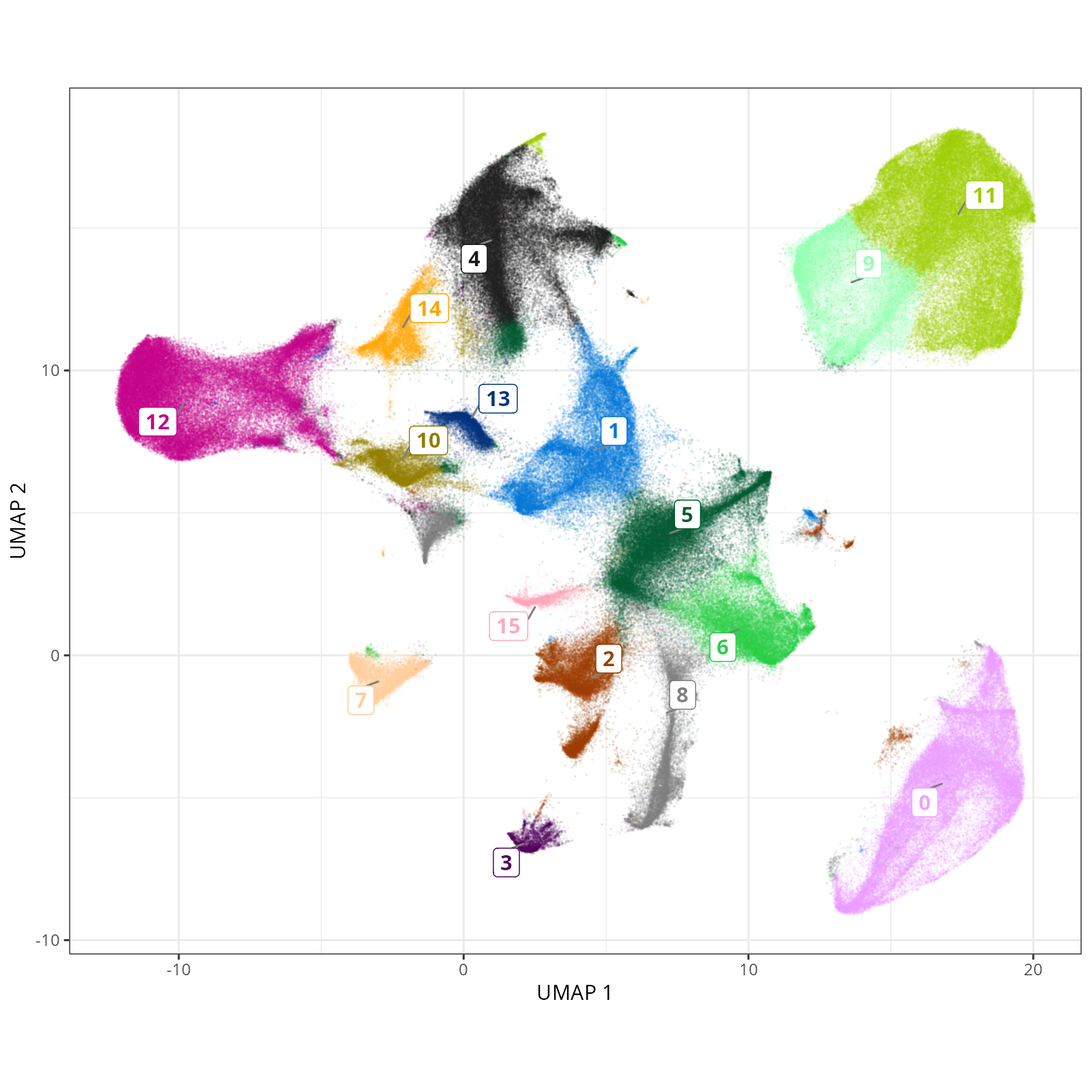
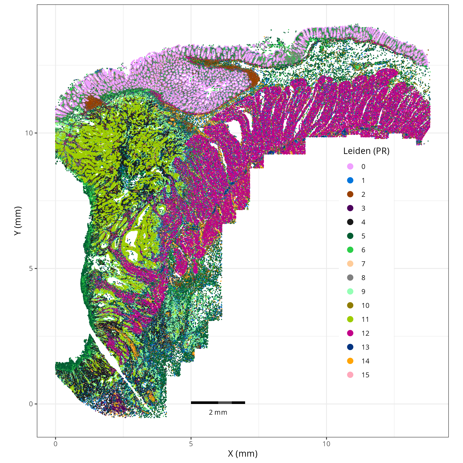
Here are the overall (global) plots.
::: {.panel-tabset}
#### Leiden - UMAP
```{r}
#| label: fig-umap-leiden
#| message: false
#| warning: false
#| echo: false
#| fig.width: 6
#| fig.height: 5
#| fig-cap: "UMAP with Leiden (PR-based) cells."
#| eval: true
knitr::include_graphics(file.path(analysis_asset_dir, "preprocessing", "leiden__umap_pr__S0__plot.png"))
```
#### Leiden - XY
```{r}
#| label: fig-xy-celltype-broad
#| message: false
#| warning: false
#| echo: false
#| fig.width: 6
#| fig.height: 5
#| fig-cap: "XY with Leiden (PR-based) cells."
#| eval: true
knitr::include_graphics(file.path(analysis_asset_dir, "preprocessing", "leiden__spatial__S0__plot.png"))
```
:::
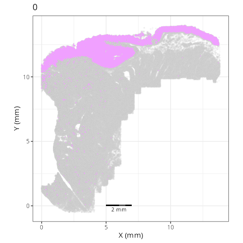
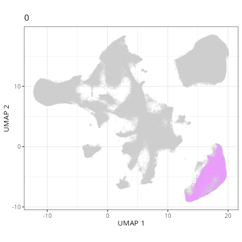
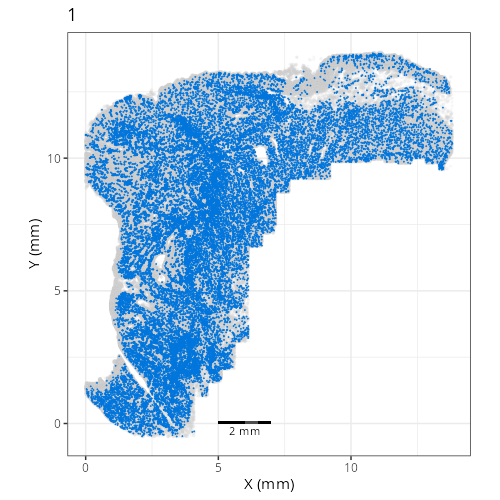
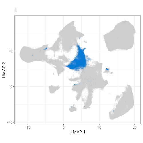
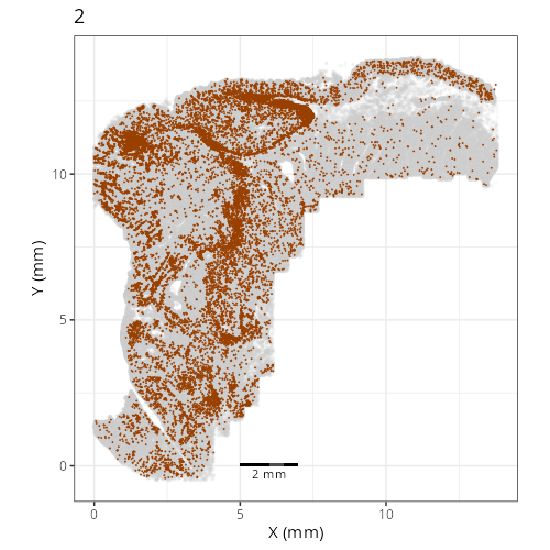
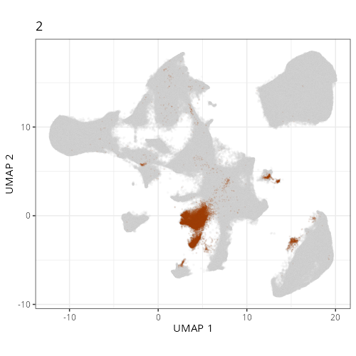
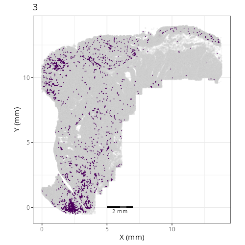
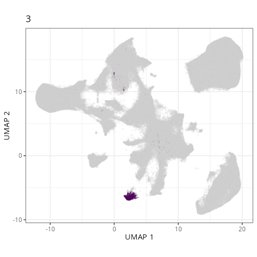
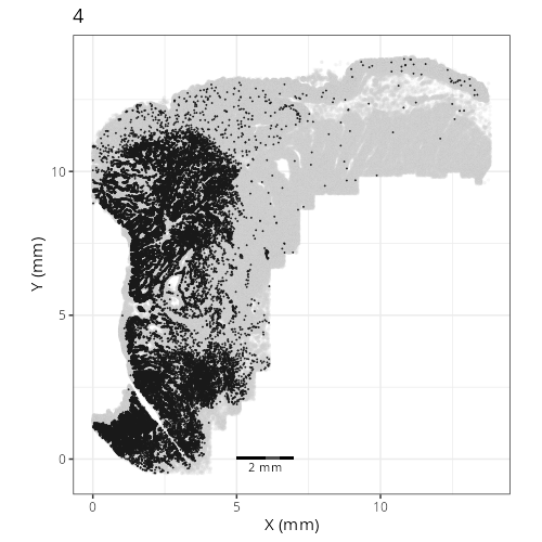
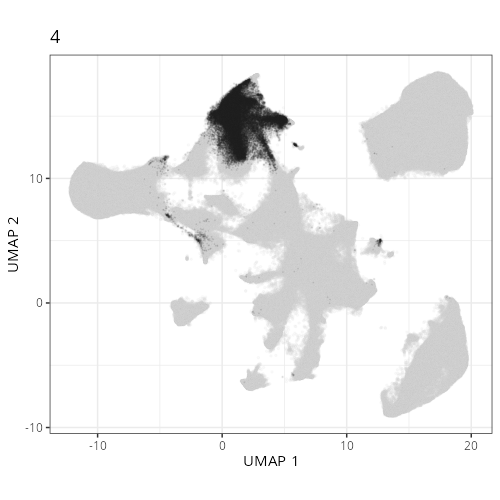
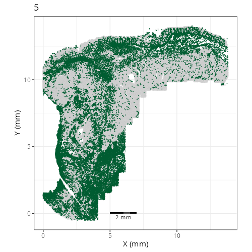
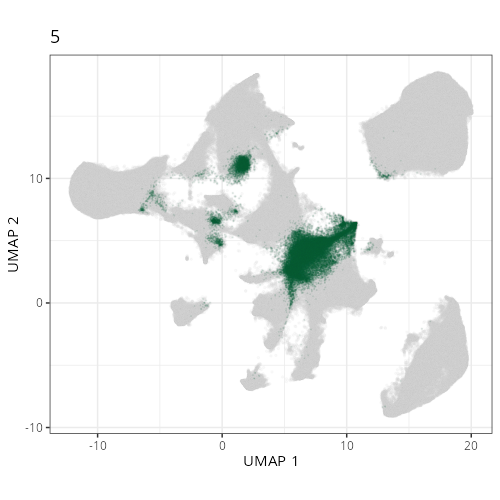
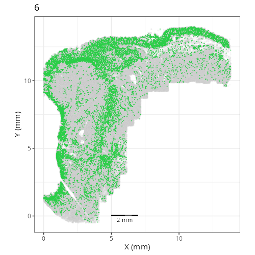
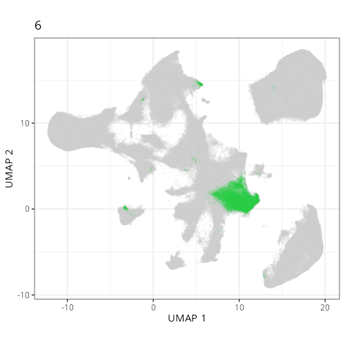
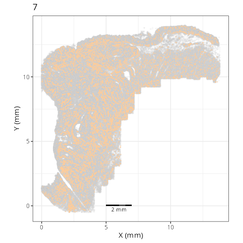
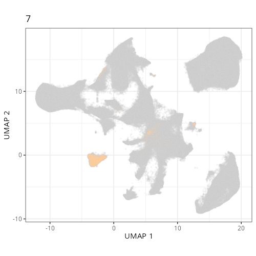
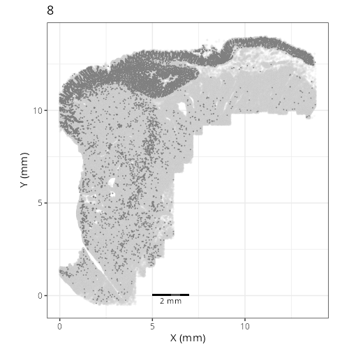
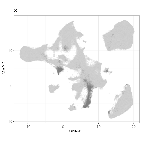
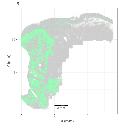
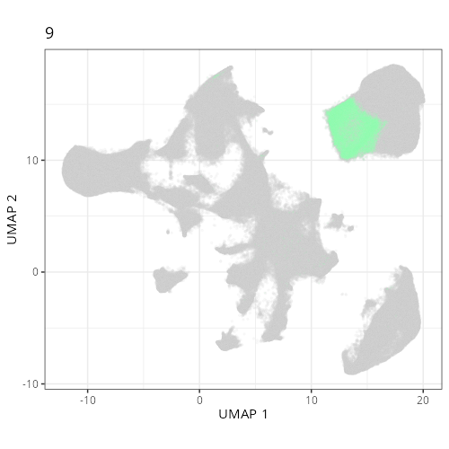
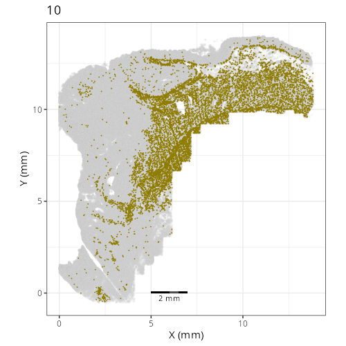
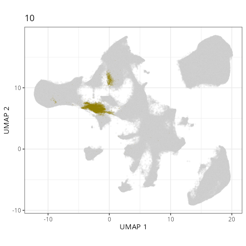
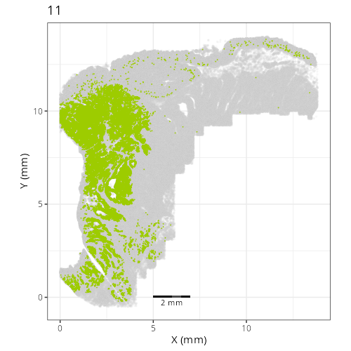
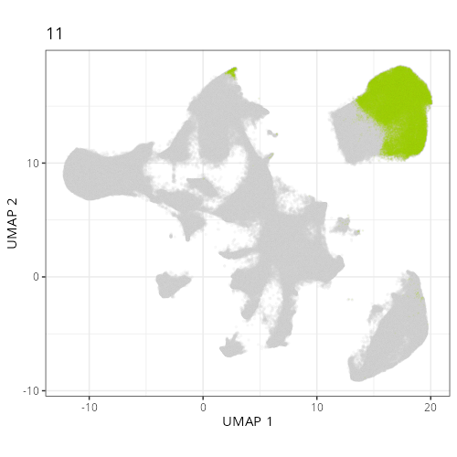
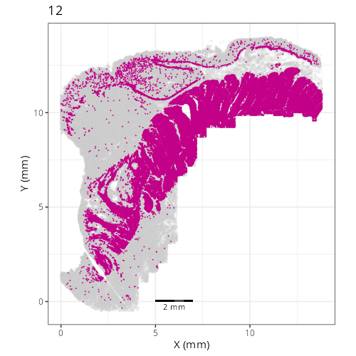
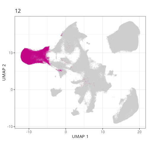
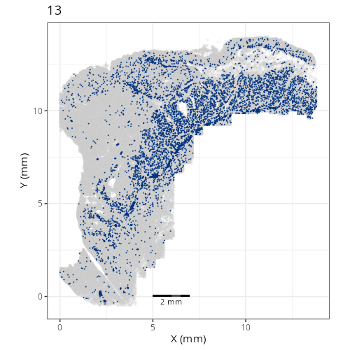
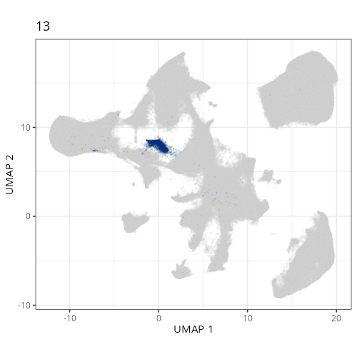
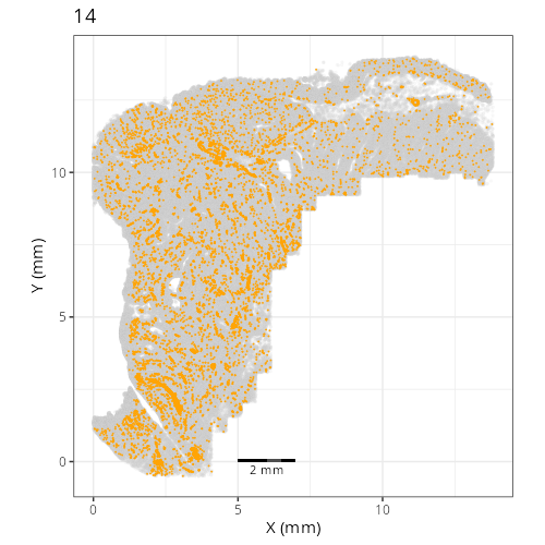
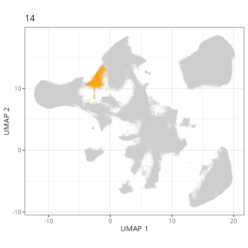
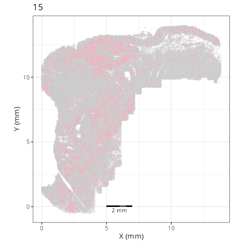
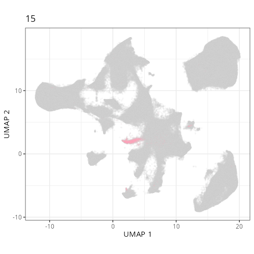
Here are the individual plots[^2] we created organized by Leiden cluster. From these
pairs of plots one can quickly see how some Leiden clusters are spatially restricted.
For example, Leiden 0 consists of cells in the top part of the tissue (_i.e._,
the non-tumoral epithelium). Similarly, cluster 12 occupies the left-most region
of the tissue.
::: {.panel-tabset}
```{r}
#| output: asis
#| eval: true
#| code-fold: true
#| echo: false
fig_dir <- file.path(analysis_asset_dir, "preprocessing")
group_prefix <- "leiden"
slide_id <- "S0"
xy_files <- Sys.glob(file.path(fig_dir,
paste0(group_prefix,
"__spatial__", slide_id, "__facet_*png")))
org_order <- as.numeric(gsub(".png", "", unlist(lapply(strsplit(xy_files, split="_facet_"), "[[", 2L))))
xy_files <- xy_files[match(sort(org_order), org_order)]
umap_files <- Sys.glob(file.path(fig_dir,
paste0(group_prefix,
"__umap_pr__", slide_id, "__facet_*png")))
org_order <- as.numeric(gsub(".png", "", unlist(lapply(strsplit(umap_files, split="_facet_"), "[[", 2L))))
umap_files <- umap_files[match(sort(org_order), org_order)]
res <- purrr::map2_chr(xy_files, umap_files, \(current_xy_file, current_umap_file){
knitr::knit_child(text = c(
"### `r gsub('.png', '', strsplit(current_umap_file, split='__facet_')[[1]][2])`",
"",
":::{columns}",
"",
"::: {.column width='40%'}",
"",
"```{r eval=TRUE}",
"#| echo: false",
"knitr::include_graphics(current_xy_file)",
"```",
"",
":::",
"",
"::: {.column width='10%'}",
"",
":::",
"",
"::: {.column width='40%'}",
"",
"```{r eval=TRUE}",
"#| echo: false",
"knitr::include_graphics(current_umap_file)",
"```",
":::",
"",
":::",
"",
"",
""
), envir = environment(), quiet = TRUE)
})
cat(res, sep = '\n')
```
:::
## Conclusion
And with that, we've navigated the essential pre-processing steps. Starting with
our quality-controlled cell data, we applied normalization to account for
technical variations, identified the most informative genes, and used PCA to
reduce the data's dimensionality. Building upon this foundation, we generated
UMAP embeddings for visualization and performed Leiden clustering to partition
the cells into distinct groups based on their expression profiles.
The interactive exploration highlighted a critical point: parameters matter.
Choices made during normalization, dimensionality reduction, and clustering
significantly influence the final UMAP layout and cluster assignments. There
isn't a single "correct" set of parameters, but understanding their effects
allows you to tailor the analysis to best reveal the biological structures
relevant to your specific questions.
The resulting AnnData object, now enriched with normalized data layers, PCA
coordinates, UMAP embeddings, and Leiden cluster labels, is primed for the next
crucial phase: assigning biological meaning to these patterns. In the following
chapters we will delve into grouping cells based on their spatial domain and their
cell types.
[^1]: when I tried using the `sc.experimental.pp.normalize_pearson_residuals` method
on this dataset, the OS crashed (>200 GBs of RAM).
[^2]: To see how to generate this type of output,
click the `</>` icon on the top right of this chapter and then click `view source`.