Spatial transcriptomics data provide rich opportunities for visual exploration. In this post, we demonstrate several useful visualizations for CosMx® data, particularly when working from flat files, and showcase a range of visualizations to highlight different aspects of CosMx data. Similar plots could be generated when working with common packages such as Seurat (Hao et al. 2024) or Squidpy (Palla et al. 2022). For more plotting ideas with these tools, see the following posts:
These plots serve as a foundation for both quality control and exploratory analysis and are meant to serve as inspiration for additional plots you could make. For every plot, we show one version made in R and another made in Python; you can view the corresponding R or Python code by expanding the dropdown tab above the figure.
2 Data set up
For demonstration in this post, we use data from a breast cancer sample that has been analyzed in AtoMx® SIP through unsupervised cell typing. Many of the below plots rely on the same data objects. For convenience, we show how each of these objects are read in here and will use them in later code blocks. We also load in libraries that will be used in later sections.
library(ggplot2)library(grid)library(data.table)library(R.utils)library(dplyr)library(ggsci)library(pals)library(FNN)library(viridis)library(scales)# Define pathsraw_data_dir <-"/path/to/raw/data"out_dir <-"/path/to/out/dir"slide_name <-"slideName"# Set this to your slide name, i.e. the identifier at the front of each flat file# Read datacell_meta <-read.csv(paste0(raw_data_dir, "/", slide_name, "_metadata_file.csv.gz")) #Note this is a small file and we read it into a data frame for conveniencecell_polygons <-fread(paste0(raw_data_dir, "/", slide_name, "-polygons.csv.gz"))fov_positions <-fread(paste0(raw_data_dir, "/", slide_name, "_fov_positions_file.csv.gz"))
Code
from pathlib import Pathimport osimport gzipimport subprocessimport ioimport pandas as pdimport numpy as npimport matplotlib.pyplot as pltimport matplotlib.cm as cmimport matplotlib.patches as mpatchesimport matplotlib.colors as mcolorsfrom mpl_toolkits.axes_grid1.inset_locator import inset_axesfrom sklearn.neighbors import NearestNeighborsimport stringimport math# Define pathsraw_data_dir = Path("/path/to/raw/data")out_dir = Path("/path/to/out/dir")slide_name ="slideName"# Read datacell_meta = pd.read_csv(raw_data_dir /f"{slide_name}_metadata_file.csv.gz")cell_polygons = pd.read_csv(raw_data_dir /f"{slide_name}-polygons.csv.gz")fov_positions = pd.read_csv(raw_data_dir /f"{slide_name}_fov_positions_file.csv.gz")
2.1 Scale Bar Function
Because the majority of these plots are spatial plots, we’ll often want to include a scale bar. Rather than showing how to make that scale bar for every plot, we write two quick general functions (R and python versions) here at the beginning to make a nice scale bar and reuse these functions throughout this post.
Additionally, all the code here is designed to work from positions given in pixels, as they are in default flat files. If you have positions in mm you’ll want to adjust accordingly, primarily in the scale bar function.
## Set up scale bar functionmake_scale_bar_r <-function(x_vals, y_vals, microns_per_pixel =0.12028) {# Adds a scale bar to a ggplot.#Parameters:#x_vals: vector of x coordinates in pixels#y_vals: vector of y coordinates in pixels#microns_per_pixel: conversion factor from pixels to microns. Default is conversion factor for commercial CosMx instrument# Example usage:# scale_bar = make_scale-bar_r(x_vals = cell_meta$CenterX_global_px, y_vals = cell_meta$CenterY_global_px)# ggplot() + scale_bar$bg + scale_bar$rect + scale_bar$label# Calculate x-axis range x_range <-range(x_vals, na.rm =TRUE) x_length <-diff(x_range) x_length_um <- x_length * microns_per_pixel# Target scale length ~1/4 of the x-axis target <- x_length_um /4# Compute order of magnitude order <-10^floor(log10(target)) mantissa <- target / order# Round mantissa to nearest 1, 2, or 5 nice_mantissa <-if (mantissa <1.5) {1 } elseif (mantissa <3.5) {2 } elseif (mantissa <7.5) {5 } else {10 }# Final scale length in pixels scale_length_um <- nice_mantissa * order scale_length_px <- scale_length_um / microns_per_pixel# Format label scale_label <-if (scale_length_um >=1000) {paste0(scale_length_um /1000, " mm") } else {paste0(scale_length_um, " µm") }# Set coordinates for the scale bar x_start <- x_range[2] - scale_length_px *1.1 x_end <- x_range[2] - scale_length_px *0.1 y_pos <-min(y_vals, na.rm =TRUE) + scale_length_px *0.1# Generate scale bar background, scale bar and annotation to returnlist(bg =annotation_custom(grob =rectGrob(gp =gpar(fill ="white", alpha =0.8, col =NA)),xmin = x_start- scale_length_px*0.05, xmax = x_end+ scale_length_px*0.05,ymin = y_pos- scale_length_px*0.05, ymax = y_pos + scale_length_px*0.3 ),rect =annotation_custom(grob =rectGrob(gp =gpar(fill ="black")),xmin = x_start, xmax = x_end,ymin = y_pos, ymax = y_pos + scale_length_px *0.05 ),label =annotation_custom(grob =textGrob(scale_label, gp =gpar(col ="black"), just ="center", vjust =0),xmin = (x_start + x_end)/2, xmax = (x_start + x_end)/2,ymin = y_pos + scale_length_px *0.1, ymax = y_pos + scale_length_px *0.1 ) )}
Code
## Set up scale bar functiondef make_scale_bar_py(ax, x_coords, y_coords, microns_per_pixel=0.12028):""" Adds a scale bar to a matplotlib plot. Parameters: - ax: matplotlib Axes object - x_coords: list or array of x coordinates - y_coords: list or array of y coordinates - microns_per_pixel: conversion factor from pixels to microns. Default is conversion factor for commercial CosMx instrument Example usage: - fig, ax = plt.subplots() - ax.scatter(x, y) - make_scale_bar_py(ax, microns_per_pixel, x, y) """# Calculate x-axis range x_range = [min(x_coords), max(x_coords)] x_length = x_range[1] - x_range[0] x_length_um = x_length * microns_per_pixel# Target scale length ~1/4 of the x-axis target = x_length_um /4# Compute order of magnitude order =10** np.floor(np.log10(target)) mantissa = target / order# Round mantissa to nearest 1, 2, or 5if mantissa <1.5: nice_mantissa =1elif mantissa <3.5: nice_mantissa =2elif mantissa <7.5: nice_mantissa =5else: nice_mantissa =10# Final scale length in pixels scale_length_um = nice_mantissa * order scale_length_px = scale_length_um / microns_per_pixel# Format labelif scale_length_um >=1000: scale_label =f"{scale_length_um /1000:.1f} mm"else: scale_label =f"{scale_length_um:.0f} µm"# Set coordinates for the scale bar x_start = x_range[1] - scale_length_px *1.1 x_end = x_range[1] - scale_length_px *0.1 y_pos =min(y_coords) + scale_length_px *0.1# Set up background for scale bar scale_bg = mpatches.Rectangle( (x_start - scale_length_px *0.05, y_pos - scale_length_px *0.05), width=(x_end - x_start) + scale_length_px *0.1, height=scale_length_px *0.4, color='white', alpha=0.8, zorder =10 )# Add background ax.add_patch(scale_bg)# Draw scale bar ax.plot([x_start, x_end], [y_pos, y_pos], color='black', linewidth=2, zorder=11) ax.text((x_start + x_end) /2, y_pos + scale_length_px *0.1, scale_label, color='black', ha='center', va='bottom', zorder=12)
3 Plotting Data in Space
Spatial transcriptomics unlocks the ability to visualize gene expression in its native tissue context. In this section, we explore a variety of spatial plots, from full tissue views to single FOVs or smaller, and from cell outlines to transcript overlays, highlighting different ways to represent spatial data.
3.1 Cell Positions
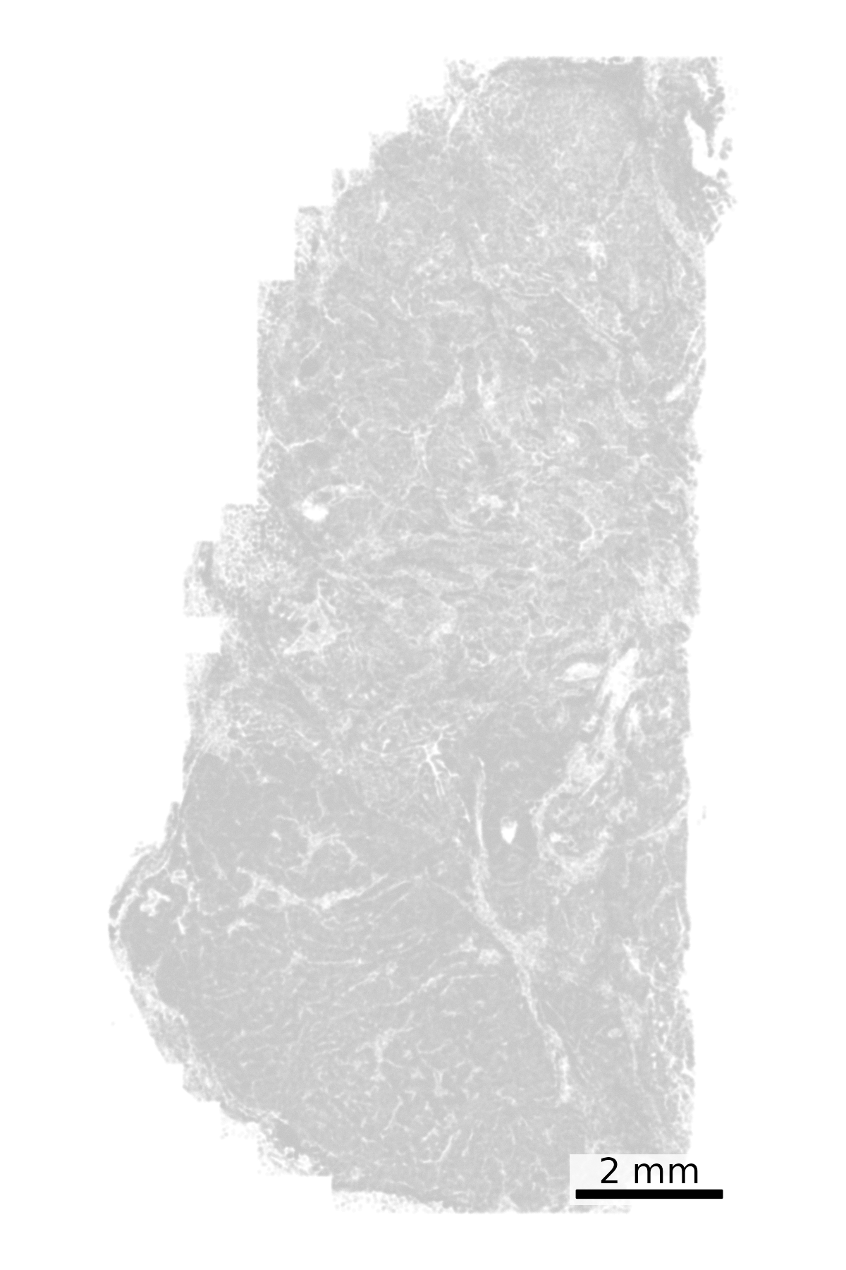
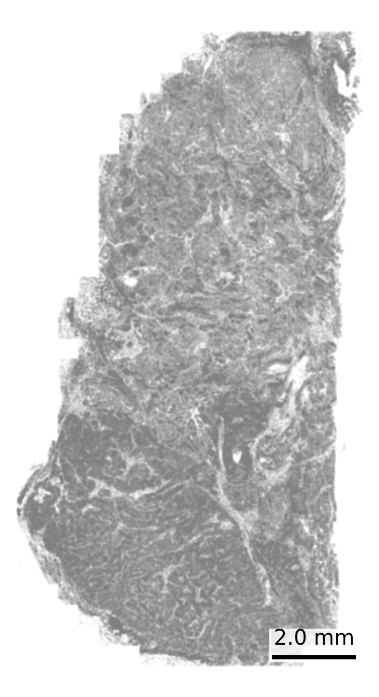
Visualize cell centroids from the cell metadata file. This shows a broad overview of the tissue structure. We start with all cells colored grey.
## Set up scale barscale_bar <-make_scale_bar_r(x_vals = cell_meta$CenterX_global_px,y_vals = cell_meta$CenterY_global_px)## Plot itggplot(cell_meta,aes(x = CenterX_global_px, y = CenterY_global_px)) +geom_point(color ="grey", size =0.1, alpha =0.05) +coord_fixed() +# Fix aspect ratiotheme_void() + scale_bar$bg + scale_bar$rect + scale_bar$labelggsave(paste0(out_dir, "cell_positions.png"),width =4, height =6, units ="in")
Code
## Create the scatter plotfig, ax = plt.subplots(figsize=(4, 6))ax.scatter( cell_meta["CenterX_global_px"], cell_meta["CenterY_global_px"], color="grey", s=0.1, alpha=0.05)ax.set_aspect('equal', adjustable='box') # Fix aspect ratioax.axis('off') # Removes axes and grid# Add scale barmake_scale_bar_py(ax, cell_meta["CenterX_global_px"], cell_meta["CenterY_global_px"])# Save the figureplt.savefig(os.path.join(out_dir, "python_cell_positions.png"), bbox_inches='tight', pad_inches=0, dpi=300)plt.close()
3.2 Cell Polygons
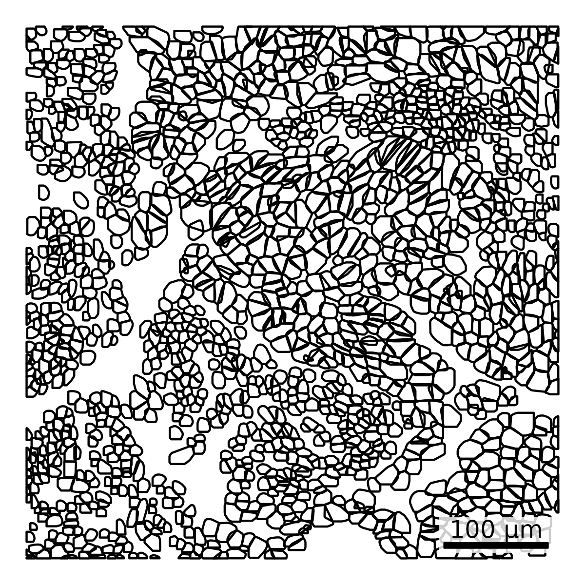
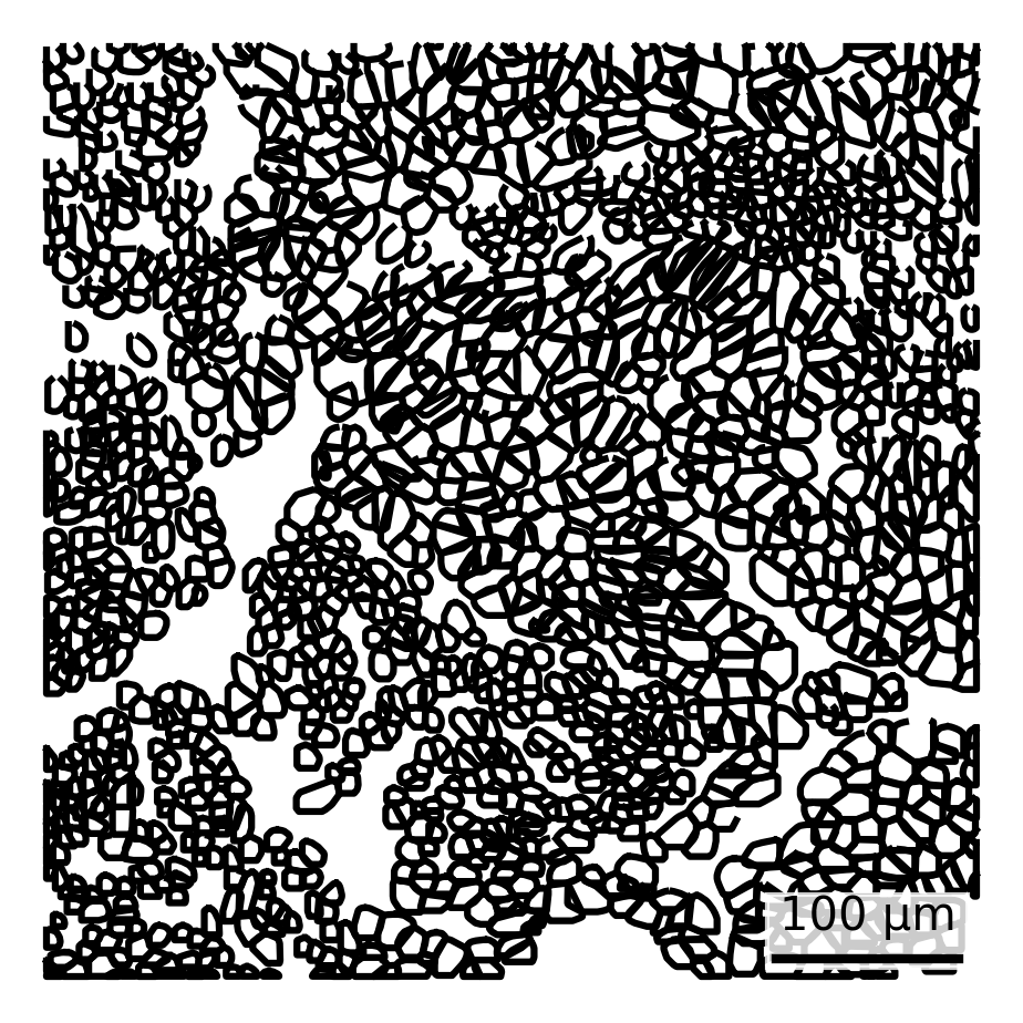
To illustrate cell boundaries, we plot polygon outlines derived from the polygon flat files. These visualizations are most informative when zoomed in, so we focus on a single FOV where individual cell shapes are more discernible.
Note on Polygon Flat Files
The polygon flat file encodes each cell’s shape using a simplified set of vertices. As a result, some cells may appear to overlap when plotted—this is a visual artifact caused by rounding during polygon generation.
Importantly, the actual segmentation used for transcript assignment does not contain overlapping cell borders. The cell boundaries are sampled using a convex hull to minimize the number of points in the polygons flat file. This file is intended to provide a rough approximation of cell shapes, which is why convex hull simplification may introduce overlaps.
For precise cell boundaries, refer to the CellLabels_F#####.TIF file, which defines borders at the per-pixel level.
## Set up scale barscale_bar <-make_scale_bar_r(x_vals = cell_polygons %>%filter(fov ==100) %>%pull(x_global_px),y_vals = cell_polygons %>%filter(fov ==100) %>%pull(y_global_px))## Plot itggplot(cell_polygons %>%filter(fov ==100), # Select cells in FOV 100aes(x = x_global_px, y = y_global_px, group = cell)) +geom_polygon(fill =NA, color ="black") +coord_fixed() +theme_void() + scale_bar$bg + scale_bar$rect + scale_bar$labelggsave(paste0(out_dir, "cell_outlines_singleFOV.png"),width =4, height =4, units ="in")
Code
# Filter data for FOV 100filtered_data = cell_polygons[cell_polygons["fov"] ==100]## Create the polygon plotfig, ax = plt.subplots(figsize=(4, 4))for key, group in filtered_data.groupby("cell"): ax.plot(group["x_global_px"], group["y_global_px"], color="black", zorder=1)ax.set_aspect('equal', adjustable='box')ax.axis('off') # Removes axes and grid# Add scale barmake_scale_bar_py(ax, filtered_data["x_global_px"], filtered_data["y_global_px"])# Save the figureplt.savefig(os.path.join(out_dir, "python_cell_outlines_singleFOV.png"), bbox_inches='tight', pad_inches=0, dpi=300)plt.close()
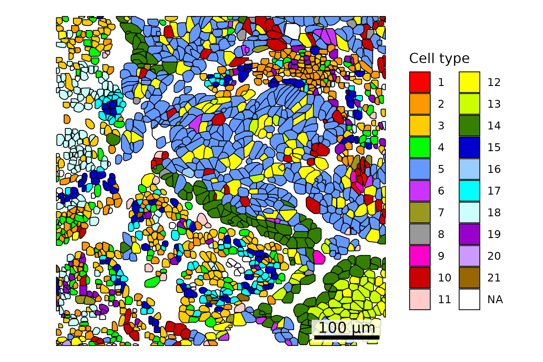
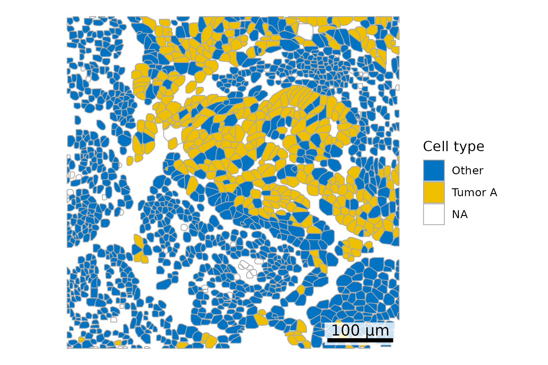
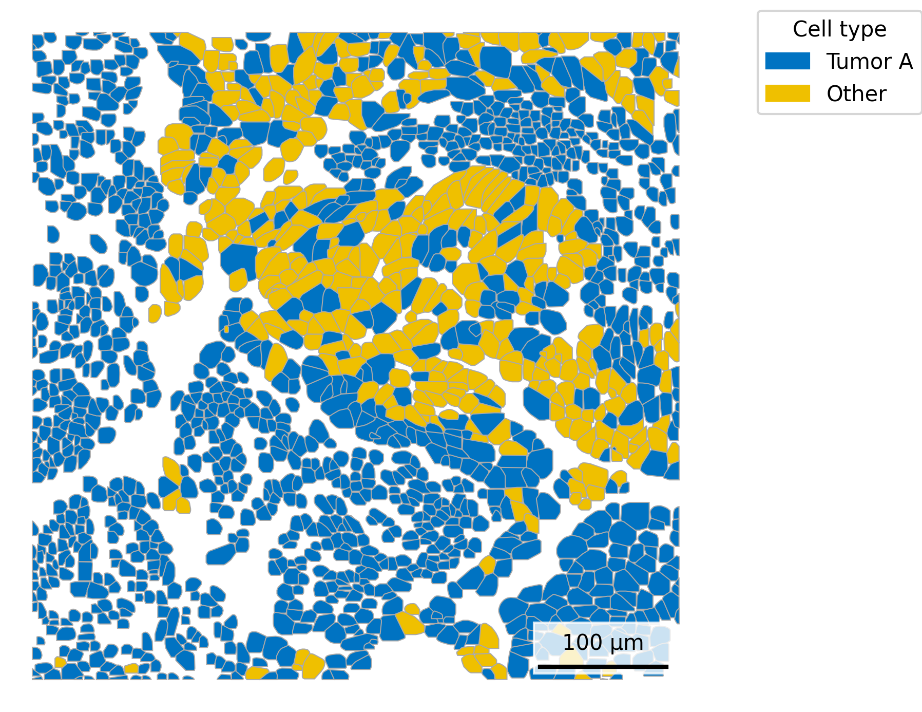
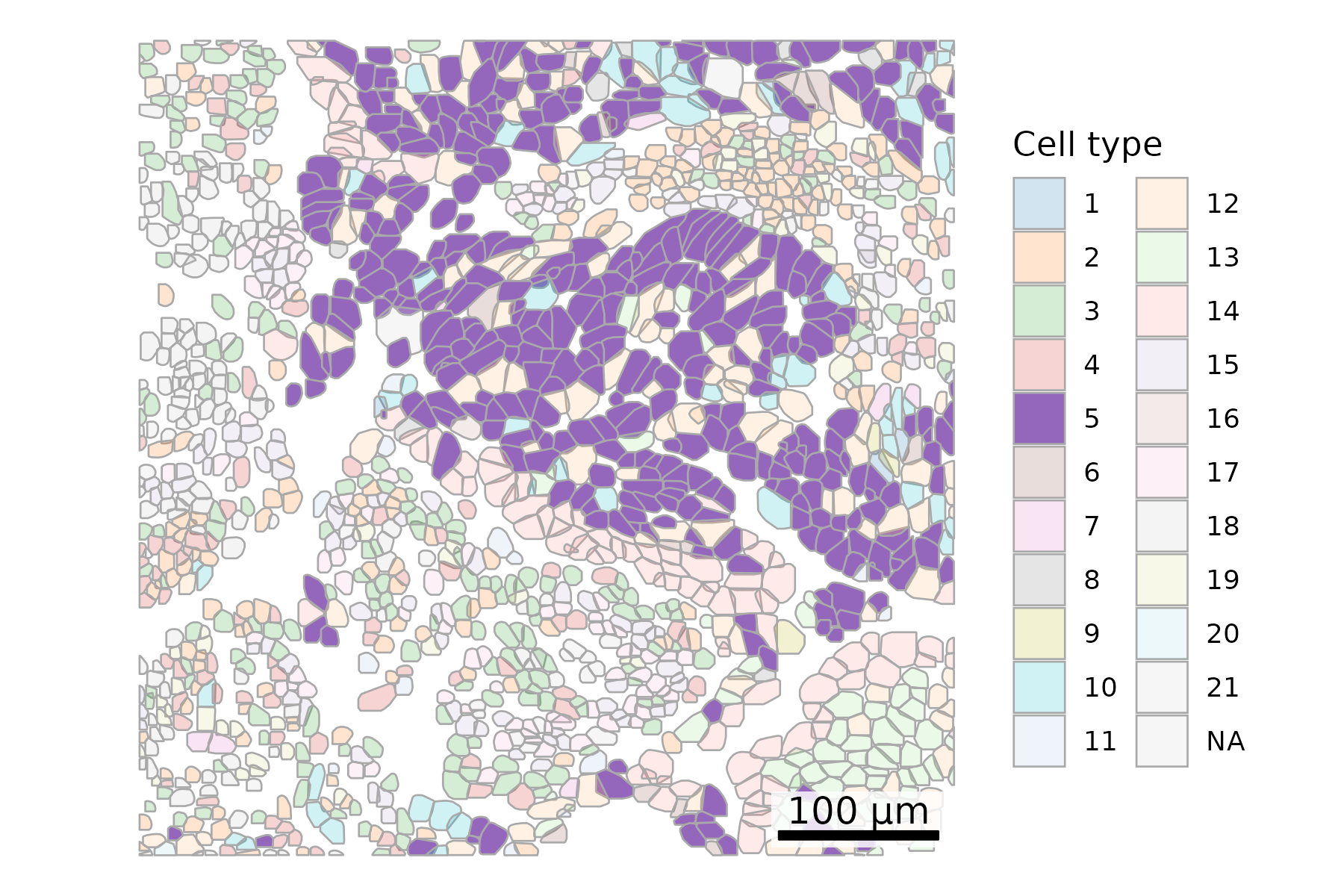
3.3 Color Cells by Metadata
Overlay polygons with metadata such as cell type. Here, we use results from Leiden clustering. Throughout the post, we showcase a variety of color palettes. When only a few colors are needed, we aim for consistency between R and Python plots. In cases requiring many colors, we highlight diverse palette options, which may differ across the two languages.
Note
There are a small number of cells with no associated cell type as they got flagged in QC. These show up as NA in the plots.
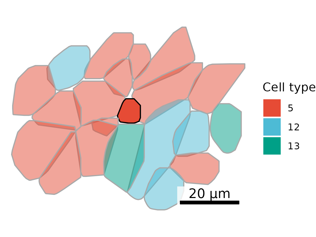
## Add cell type to polygonsplot.df <- cell_polygons %>%filter(fov ==100) %>%as.data.frame()meta <-as.data.frame(cell_meta)row.names(meta) <- meta$cellplot.df$cell_type <-as.data.frame(meta)[plot.df$cell, "leiden_cluster"] ## Select cells to highlightplot.df$highlight <-ifelse(plot.df$cell_type =="5", "Tumor A", "Other")## Set up scale barscale_bar <-make_scale_bar_r(x_vals = plot.df %>%pull(x_global_px),y_vals = plot.df %>%pull(y_global_px))## Plot itggplot(plot.df,aes(x = x_global_px, y = y_global_px, group = cell,fill = highlight)) +geom_polygon(color ="darkgrey", linewidth =0.3) +scale_fill_jco() +# Use a color palette from JCO (Journal of Clinical Oncology)coord_fixed() +theme_void() +labs(fill ="Cell type") + scale_bar$bg + scale_bar$rect + scale_bar$labelggsave(paste0(out_dir, "celltypeHighlight_polygons_singleFOV.png"),width =6, height =4, units ="in")
Code
# Filter for FOV 100plot_df = cell_polygons[cell_polygons["fov"] ==100]# Merge only the 'leiden_cluster' and 'nCount_RNA' columnsmeta_subset = cell_meta[['cell', 'leiden_cluster', 'nCount_RNA']]plot_df = plot_df.merge(meta_subset, on='cell', how='left')# Add highlight columnplot_df['highlight'] = np.where(plot_df['leiden_cluster'] ==5, 'Tumor A', 'Other')## Plotfig, ax = plt.subplots(figsize=(6, 6))for key, group in plot_df.groupby("cell"): highlight = group["highlight"].iloc[0] fill_color ='#EFC000'if highlight =='Tumor A'else'#0073C2'# Fill color logic, matching blue / yellow shown in R plot coords = group[["x_global_px", "y_global_px"]].values coords = np.vstack([coords, coords[0]]) # close the polygon ax.fill(coords[:, 0], coords[:, 1], facecolor=fill_color, edgecolor='darkgrey', linewidth=0.5, zorder =1)ax.set_aspect('equal')ax.axis('off')# Add scale barmake_scale_bar_py(ax, plot_df["x_global_px"], plot_df["y_global_px"])# Legendlegend_handles = [ mpatches.Patch(color='#0073C2', label='Tumor A'), mpatches.Patch(color='#EFC000', label='Other')]ax.legend(handles=legend_handles, title="Cell type", bbox_to_anchor=(1.05, 1), loc='upper left')plt.savefig(os.path.join(out_dir, "python_celltypeHighlight_polygons_singleFOV.png"), bbox_inches='tight', pad_inches=0, dpi=300)plt.close()
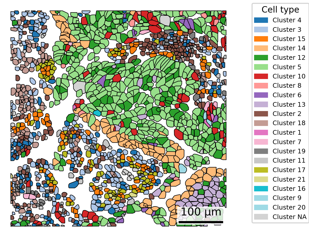
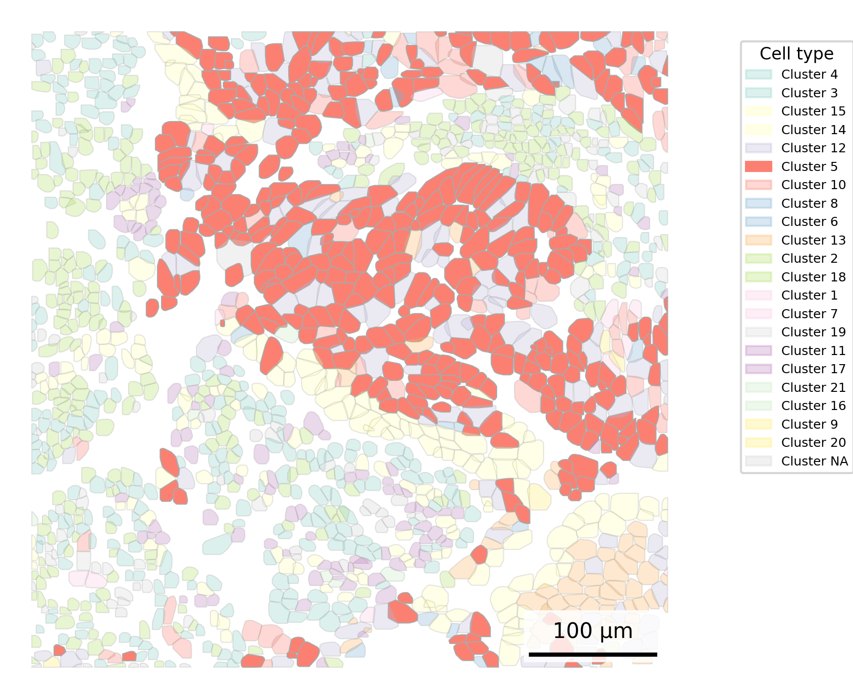
3.5 Mute Background Cells
As an alternative, we can highlight one cell type by muting the color for all others. However, keep in mind that when many colors are present, muting can reduce contrast and make distinctions harder to perceive. To improve interpretability, consider grouping cells into 5–10 major types or manually assigning similar hues to related cell types. As another option, color the cells of interest black, which may allow you to mute other colors less.
## Add cell type to polygonsplot.df <- cell_polygons %>%filter(fov ==100) %>%as.data.frame()meta <-as.data.frame(cell_meta)row.names(meta) <- meta$cellplot.df$cell_type <-as.data.frame(meta)[plot.df$cell, "leiden_cluster"] ## Set alpha by cell typealpha_vals <-rep(0.2, length(unique(plot.df$cell_type)))names(alpha_vals) <-c(unique(plot.df$cell_type))alpha_vals["5"] <-1## Set up scale barscale_bar <-make_scale_bar_r(x_vals = plot.df %>%pull(x_global_px),y_vals = plot.df %>%pull(y_global_px))## Plot itggplot(plot.df,aes(x = x_global_px, y = y_global_px, group = cell,fill =as.factor(cell_type), alpha =as.factor(cell_type))) +geom_polygon(color ="darkgrey", linewidth =0.3) +scale_fill_d3(palette ="category20", na.value ="lightgrey") +# Inspired by colors in the D3 visualization librarycoord_fixed() +theme_void() +labs(fill ="Cell type", alpha ="Cell type") +scale_alpha_manual(values = alpha_vals, na.value =0.2) +# Adjust opacity by cell type scale_bar$bg + scale_bar$rect + scale_bar$labelggsave(paste0(out_dir, "celltypeAlphaHighlight_polygons_singleFOV.png"),width =6, height =4, units ="in")
Code
# Filter for FOV 100plot_df = cell_polygons[cell_polygons["fov"] ==100]# Merge only the 'leiden_cluster' columnmeta_subset = cell_meta[['cell', 'leiden_cluster']]plot_df = plot_df.merge(meta_subset, on='cell', how='left')# Create a colormapclusters = plot_df["leiden_cluster"].unique()# Filter out NA values firstvalid_clusters = [c for c in clusters if pd.notna(c)]cmap = cm.get_cmap("Set3", len(valid_clusters)) #Use matplotlib's Set3 palettecluster_to_color = {cluster: cmap(i) for i, cluster inenumerate(valid_clusters)}#Add color for NA valuescluster_to_color[np.nan] ="lightgrey"# Add alpha columnplot_df['alpha'] = np.where(plot_df['leiden_cluster'] ==5, 1, 0.3)## Plotfig, ax = plt.subplots(figsize=(6, 6))for key, group in plot_df.groupby("cell"): cell_type = group["leiden_cluster"].iloc[0] alpha = group["alpha"].iloc[0] fill_color = cluster_to_color[np.nan] if pd.isna(cell_type) else cluster_to_color[cell_type] coords = group[["x_global_px", "y_global_px"]].values coords = np.vstack([coords, coords[0]]) # close the polygon ax.fill(coords[:, 0], coords[:, 1], facecolor=fill_color, edgecolor='darkgrey', linewidth=0.5, alpha=alpha, zorder=1)ax.set_aspect('equal')ax.axis('off')# Add scale barmake_scale_bar_py(ax, plot_df["x_global_px"], plot_df["y_global_px"])# Legend for fill colorsunique_clusters = plot_df["leiden_cluster"].unique()legend_handles = [ mpatches.Patch( color=color, label=f"Cluster {int(cluster)}"if pd.notna(cluster) else"Cluster NA", alpha =1if cluster ==5else0.3)for cluster, color in cluster_to_color.items()]ax.legend( handles=legend_handles, title="Cell type", bbox_to_anchor=(1.05, 0.95), loc='upper left', fontsize =6, title_fontsize=8)plt.savefig(os.path.join(out_dir, "python_celltypeAlphaHighlight_polygons_singleFOV.png"), bbox_inches='tight', pad_inches=0, dpi=300)plt.close()
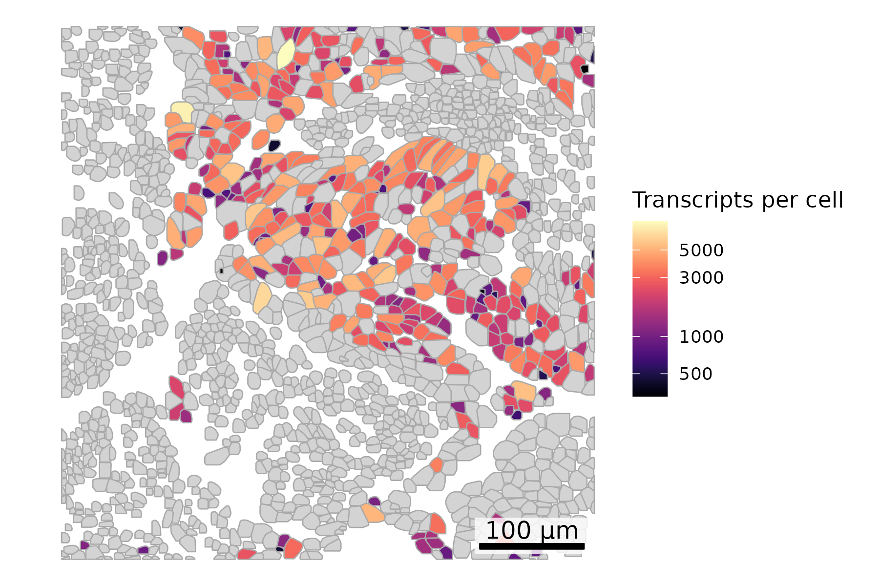
3.6 Dynamically Color One Cell Type
Sometimes we want to highlight metadata about a single cell type, such as counts per cell specifically for tumor cells. To do this, we can set all other cells to a background color such as light grey and then dynamically color the cells of interest.
## Add cell type and counts to polygonsplot.df <- cell_polygons %>%filter(fov ==100) %>%as.data.frame()meta <-as.data.frame(cell_meta)row.names(meta) <- meta$cellplot.df$cell_type <-as.data.frame(meta)[plot.df$cell, "leiden_cluster"]plot.df$nCount_RNA <-as.data.frame(meta)[plot.df$cell, "nCount_RNA"]## Set up scale barscale_bar <-make_scale_bar_r(x_vals = plot.df %>%pull(x_global_px),y_vals = plot.df %>%pull(y_global_px))## Plot itggplot(plot.df,aes(x = x_global_px, y = y_global_px, group = cell,fill =ifelse(cell_type =="5", nCount_RNA, NA))) +#Logic to color only cells of one type by total countsgeom_polygon(color ="darkgrey", linewidth =0.3) +scale_fill_viridis(option ="magma", trans ="log10", na.value ="lightgrey") +# Use viridis color palettecoord_fixed() +theme_void() +labs(fill ="Transcripts per cell") + scale_bar$bg + scale_bar$rect + scale_bar$labelggsave(paste0(out_dir, "celltypeHighlightTxperCell_polygons_singleFOV.png"),width =6, height =4, units ="in")
Code
# Filter for FOV 100plot_df = cell_polygons[cell_polygons["fov"] ==100]# Merge only the 'leiden_cluster' and 'nCount_RNA' columnsmeta_subset = cell_meta[['cell', 'leiden_cluster', 'nCount_RNA']]plot_df = plot_df.merge(meta_subset, on='cell', how='left')# Prepare log10-transformed values for cluster 5highlight_df = plot_df[plot_df['leiden_cluster'] ==5].copy()highlight_df['log_nCount_RNA'] = np.log10(highlight_df['nCount_RNA'].replace(0, np.nan)) # Log10 transformvmin, vmax = highlight_df['log_nCount_RNA'].min(), highlight_df['log_nCount_RNA'].max()norm = mcolors.Normalize(vmin=vmin, vmax=vmax) # Normalize to 0 - 1 range as expected by matplotlib colormapcmap = cm.get_cmap("magma") # Use the magma palette# Assign colors dynamicallycell_to_color = {}for _, row in plot_df.iterrows():if row['leiden_cluster'] ==5and pd.notna(row['nCount_RNA']) and row['nCount_RNA'] >0: log_val = np.log10(row['nCount_RNA']) scaled_val = norm(log_val) cell_to_color[row['cell']] = cmap(scaled_val)else: cell_to_color[row['cell']] ="lightgrey"## Plotfig, ax = plt.subplots(figsize=(6, 6))for key, group in plot_df.groupby("cell"): fill_color = cell_to_color[key] coords = group[["x_global_px", "y_global_px"]].values coords = np.vstack([coords, coords[0]]) # close the polygon ax.fill(coords[:, 0], coords[:, 1], facecolor=fill_color, edgecolor='darkgrey', linewidth=0.5, zorder=1)ax.set_aspect('equal')ax.axis('off')# Add scale barmake_scale_bar_py(ax, plot_df["x_global_px"], plot_df["y_global_px"])# Add colorbar with original transcript countssm = cm.ScalarMappable(cmap=cmap, norm=norm)sm.set_array([])cbar = fig.colorbar(sm, ax=ax)tick_vals = np.linspace(vmin, vmax, num=5)cbar.set_ticks(tick_vals)cbar.set_ticklabels([f"{int(10**val):,}"for val in tick_vals])cbar.set_label("Transcripts per cell", fontsize=8)plt.savefig(os.path.join(out_dir, "python_celltypeHighlightTxperCell_polygons_singleFOV.png"), bbox_inches='tight', pad_inches=0, dpi=300)plt.close()
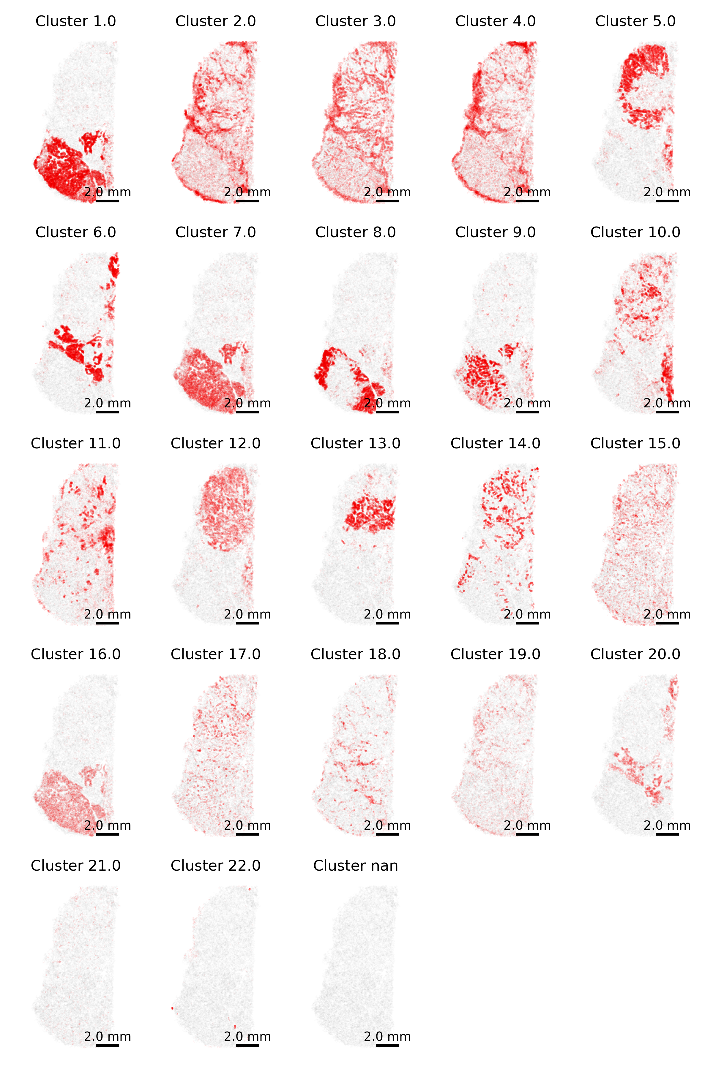
3.7 Gallery of single cell type highlighting
Similar to above, here we highlight one cell type at a time. However, we now do this for each cell type separately and show a tiled gallery of all cell types. For this example, we show the whole tissue to give the broader context of where each cell type appears.
Note
In making this gallery, plotting all cells in every facet causes many cells to be plotted if you’re looking at a large slide. Here, we instead show 5% of cells in our background to give a tissue overview and all 100% of cells of the type of interest in the foreground.
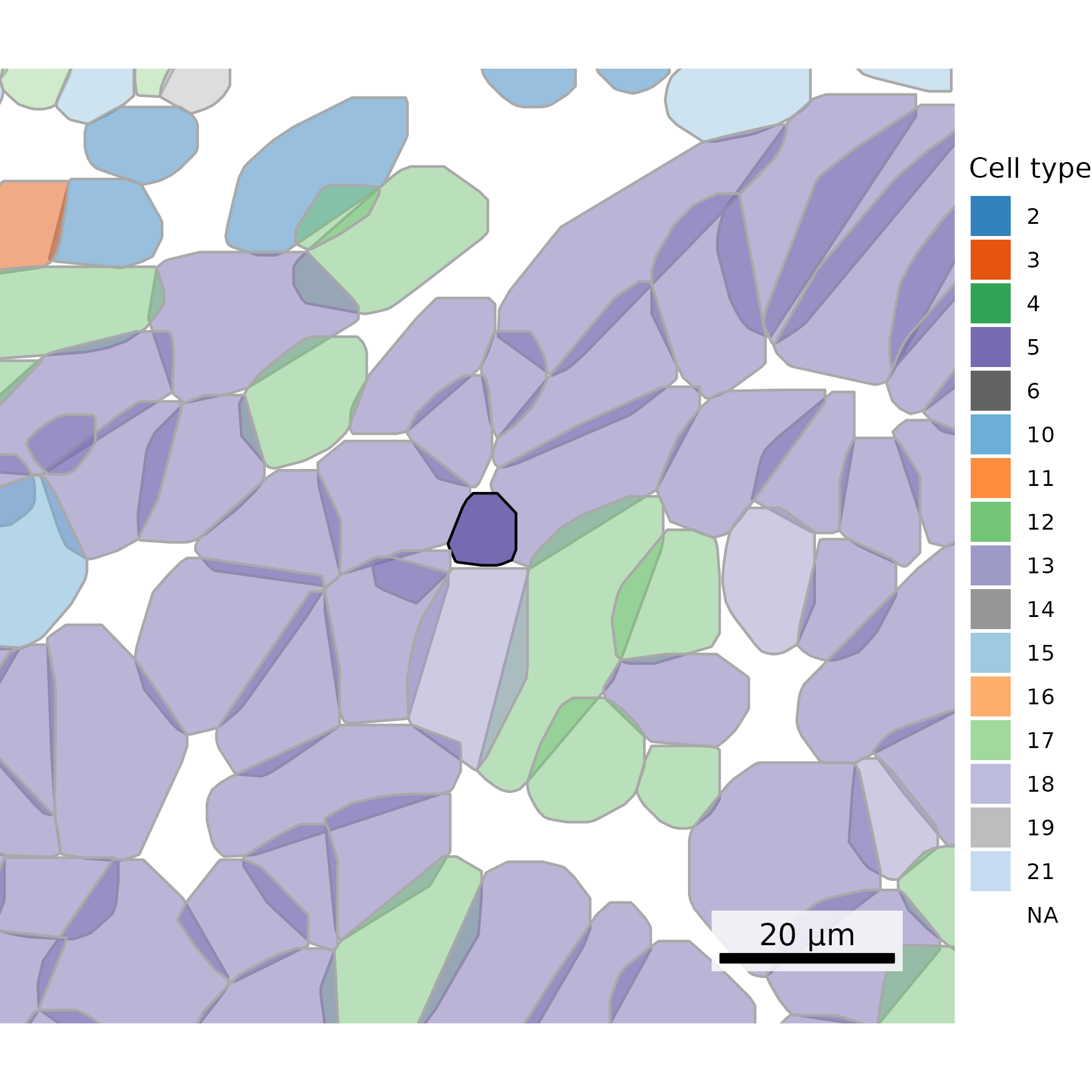
## Get cells to plot# Extract cell centroidsxy <- cell_meta[,c("CenterX_global_px", "CenterY_global_px")]row.names(xy) <- cell_meta$cell_idneighbors <- FNN::get.knnx(data = xy, # 2-column matrix of xy locationsquery = xy, k =21) # Set to one more than target. Value chosen includes the cell itself.row.names(neighbors$nn.index) <-row.names(xy)# Select cell of interestcoi <-"c_1_100_555"# Extract neighboring cellsneighboring_cells <-row.names(neighbors$nn.index)[neighbors$nn.index[coi,]]# Add cell type to polygonsplot.df <- cell_polygons %>%filter(cell %in%c(neighboring_cells, coi)) %>%as.data.frame()meta <-as.data.frame(cell_meta)row.names(meta) <- meta$cellplot.df$cell_type <-as.data.frame(meta)[plot.df$cell, "leiden_cluster"] ## Set up scale barscale_bar <-make_scale_bar_r(x_vals = plot.df %>%pull(x_global_px),y_vals = plot.df %>%pull(y_global_px))## Plot itggplot(plot.df,aes(x = x_global_px, y = y_global_px, group = cell,fill =as.factor(cell_type), alpha = (cell == coi), # Emphasize cell of interestcolor = (cell == coi))) +# Emphasize cell of interestgeom_polygon() +scale_alpha_manual(values =c("TRUE"=1, "FALSE"=0.5)) +scale_color_manual(values =c("TRUE"="black", "FALSE"="darkgrey")) +scale_fill_npg() +# Use palette inspired by nature publishing groupcoord_fixed() +theme_void() +labs(fill ="Cell type") +guides(alpha ="none") +guides(color ="none") + scale_bar$bg + scale_bar$rect + scale_bar$labelggsave(paste0(out_dir, "celltype_polygons_cell20neighbors.png"),width =4, height =3, units ="in")
Code
# Extract cell centroidsxy = cell_meta[['CenterX_global_px', 'CenterY_global_px']].values# Find nearest neighbors#nbrs = sklearn.neighbors.NearestNeighbors(n_neighbors=21).fit(xy)nbrs = NearestNeighbors(n_neighbors=21).fit(xy)distances, indices = nbrs.kneighbors(xy)# Select cell of interestcoi ='c_1_100_555'coi_index = cell_meta[cell_meta['cell_id'] == coi].index[0]# Extract neighboring cellsneighboring_cells = cell_meta.iloc[indices[coi_index]].cell_id.values# Add cell type to polygonsplot_df = cell_polygons[cell_polygons['cell'].isin(neighboring_cells)]plot_df = plot_df.merge(cell_meta[['cell_id', 'leiden_cluster']], left_on='cell', right_on='cell_id')plot_df['alpha'] = np.where(plot_df['cell'] == coi, 1, 0.3)# Set up color mappingunique_clusters =sorted(plot_df["leiden_cluster"].dropna().unique())cmap = plt.cm.get_cmap("Accent", len(unique_clusters)) # Matplotlib's accent color palettecluster_to_color = {cluster: cmap(i) for i, cluster inenumerate(unique_clusters)}if plot_df["leiden_cluster"].isna().any(): cluster_to_color[np.nan] ="lightgrey"## Plotfig, ax = plt.subplots(figsize=(6, 6))for key, group in plot_df.groupby("cell"): cell_type = group["leiden_cluster"].iloc[0] alpha = group["alpha"].iloc[0] edge_color ='black'if group["cell"].iloc[0] == coi else'darkgrey' fill_color = cluster_to_color[np.nan] if pd.isna(cell_type) else cluster_to_color[cell_type] coords = group[["x_global_px", "y_global_px"]].values coords = np.vstack([coords, coords[0]]) # close the polygon ax.fill(coords[:, 0], coords[:, 1], facecolor=fill_color, edgecolor=edge_color, alpha=alpha, zorder =1)ax.set_aspect('equal')ax.axis('off')# Add scale barmake_scale_bar_py(ax, plot_df["x_global_px"], plot_df["y_global_px"])# Legend for fill colorslegend_handles = [ mpatches.Patch( color=color, label=f"Cluster {int(cluster)}"if pd.notna(cluster) else"Cluster NA")for cluster, color in cluster_to_color.items()]ax.legend(handles=legend_handles, title="Cell type", bbox_to_anchor=(1.05, 1), loc='upper left')plt.tight_layout()plt.savefig(os.path.join(out_dir, "python_celltype_polygons_cell20neighbors.png"), bbox_inches='tight', pad_inches=0, dpi=300)plt.close()
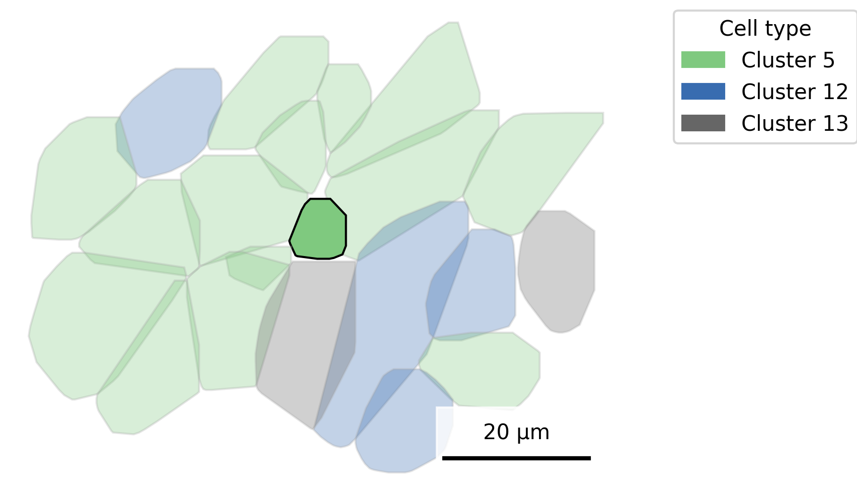
3.9 Plot one cell in its neighborhood
Sometimes, plotting a single cell alongside its x nearest neighbors can give a misleading impression, making it seem like the cells are isolated, even when they’re actually part of a densely packed region. A more spatially accurate alternative is to visualize a square section of tissue centered on a cell of interest.
To do this, we first select all cells within a broader radius to ensure complete polygon shapes are captured. Then, we trim the plot to display only a smaller, focused square around the target cell. This approach preserves spatial context while highlighting the local environment.
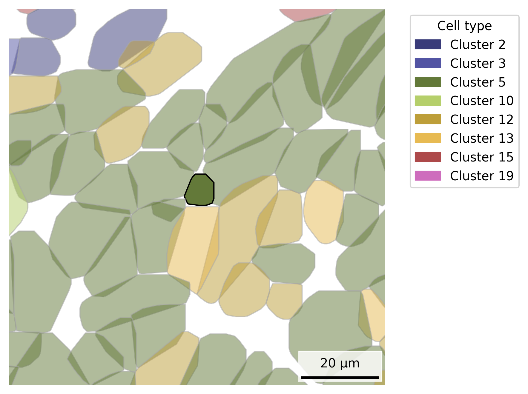
## Get cells to plot# Conversion factor for commercial CosMx instrument.microns_per_pixel <-0.12028# Select cell of interestcoi <-"c_1_100_555"# Set square edge size in microns and pixelssquare_edge_um <-100square_edge_px <- square_edge_um / microns_per_pixel# Extract large square boundaries, double the width and height of target, centered on coi# Ensures that we're not cutting through a cellcoi_x <- cell_polygons %>%filter(cell == coi) %>%pull(x_global_px) %>%median()coi_y <- cell_polygons %>%filter(cell == coi) %>%pull(y_global_px) %>%median()plot.df <- cell_polygons %>%filter( x_global_px > (coi_x - square_edge_px), x_global_px < (coi_x + square_edge_px), y_global_px > (coi_y - square_edge_px), y_global_px < (coi_y + square_edge_px))# Add cell type to polygonsmeta <-as.data.frame(cell_meta)row.names(meta) <- meta$cellplot.df$cell_type <-as.data.frame(meta)[plot.df$cell, "leiden_cluster"] ## Set up scale bar, adding min / max values directly because we'll be showing a subset of the datascale_bar <-make_scale_bar_r(x_vals =c(coi_x - square_edge_px/2, coi_x + square_edge_px/2),y_vals =c(coi_y - square_edge_px/2, coi_y + square_edge_px/2))## Plot itggplot(plot.df,aes(x = x_global_px, y = y_global_px, group = cell,fill =as.factor(cell_type), alpha = (cell == coi), # Emphasize cell of interestcolor = (cell == coi))) +# Emphasize cell of interestgeom_polygon() +scale_alpha_manual(values =c("TRUE"=1, "FALSE"=0.5)) +scale_color_manual(values =c("TRUE"="black", "FALSE"="darkgrey")) +scale_fill_d3(palette ="category20c") +# Inspired by colors in the D3 visualization librarytheme_void() +labs(fill ="Cell type") +guides(alpha ="none") +guides(color ="none") +# Set reduced coordinatescoord_fixed(ratio =1,xlim=c(coi_x - square_edge_px/2, coi_x + square_edge_px/2), ylim=c(coi_y - square_edge_px/2, coi_y + square_edge_px/2)) + scale_bar$bg + scale_bar$rect + scale_bar$labelggsave(paste0(out_dir, "celltype_polygons_cell100umsquare.png"),width =6, height =6, units ="in")
Code
# Constantsmicrons_per_pixel =0.12028coi ="c_1_100_555"square_edge_um =100square_edge_px = square_edge_um / microns_per_pixel# Compute centroid of cell of interestcoi_data = cell_polygons[cell_polygons['cell'] == coi]coi_x = coi_data['x_global_px'].median()coi_y = coi_data['y_global_px'].median()# Filter polygons within square regionplot_df = cell_polygons[ (cell_polygons['x_global_px'] > (coi_x - square_edge_px)) & (cell_polygons['x_global_px'] < (coi_x + square_edge_px)) & (cell_polygons['y_global_px'] > (coi_y - square_edge_px)) & (cell_polygons['y_global_px'] < (coi_y + square_edge_px))].copy()# Add cell typemeta = cell_meta.set_index('cell')plot_df['cell_type'] = plot_df['cell'].map(meta['leiden_cluster'])# Set up color mappingunique_clusters =sorted(plot_df["cell_type"].dropna().unique())cmap = plt.cm.get_cmap("tab20b", len(unique_clusters)) # Matplotlib's tab20b palettecluster_to_color = {cluster: cmap(i) for i, cluster inenumerate(unique_clusters)}if plot_df["cell_type"].isna().any(): cluster_to_color[np.nan] ="lightgrey"# Plottingfig, ax = plt.subplots(figsize=(6,6))# Group by cell to draw polygonsfor cell_id, group in plot_df.groupby('cell'): cell_type = group["cell_type"].iloc[0] coords = group[['x_global_px', 'y_global_px']].values polygon = mpatches.Polygon(coords, closed=True, facecolor=cluster_to_color[np.nan] if pd.isna(cell_type) else cluster_to_color[cell_type], edgecolor='black'if cell_id == coi else'darkgrey', alpha=1.0if cell_id == coi else0.5) ax.add_patch(polygon)# Add scale bar, setting up arrays that are the axis limits since we'll be reducing the plotting windowmake_scale_bar_py(ax, np.array([coi_x - square_edge_px /2, coi_x + square_edge_px /2]), np.array([coi_y - square_edge_px /2, coi_y + square_edge_px /2])) # Set plot limits and aspectax.set_xlim(coi_x - square_edge_px /2, coi_x + square_edge_px /2)ax.set_ylim(coi_y - square_edge_px /2, coi_y + square_edge_px /2)ax.set_aspect('equal')ax.axis('off')# Legend for fill colors with only colors in the visible region# Get current axis limitsxlim = ax.get_xlim()ylim = ax.get_ylim()# Identify cells whose polygons fall within the visible regionvisible_cells = plot_df[ (plot_df['x_global_px'] >= xlim[0]) & (plot_df['x_global_px'] <= xlim[1]) & (plot_df['y_global_px'] >= ylim[0]) & (plot_df['y_global_px'] <= ylim[1])]# Get unique visible cell typesvisible_cell_types = visible_cells['cell_type'].dropna().unique().tolist()if visible_cells['cell_type'].isna().any(): visible_cell_types.append(np.nan)# Filter legend handles to only include visible cell typeslegend_handles = [ mpatches.Patch( color=color, label=f"Cluster {int(cluster)}"if pd.notna(cluster) else"Cluster NA" )for cluster, color in cluster_to_color.items()if cluster in visible_cell_types]# Add the filtered legendax.legend(handles=legend_handles, title="Cell type", bbox_to_anchor=(1.05, 1), loc='upper left')# Save figureplt.tight_layout()plt.savefig(os.path.join(out_dir, "python_celltype_polygons_cell100umsquare.png"), dpi=300, bbox_inches='tight')plt.close()
3.10 Overlay Specific Transcripts
Add transcripts of interest (e.g., KRT8) as points.
Transcript File Performance Tip
Reading the full transcript file into memory can be computationally intensive, especially if you’re only interested in a subset of transcripts for plotting.
Instead of loading the entire file, here we filter the relevant lines using a shell command before importing them into R with fread() or into Python. This can significantly reduce load time although with a large dataset it still may take a few minutes.
For even better performance in future workflows, you might convert the transcript file to a more efficient format like Parquet, which supports faster reads and selective column access.
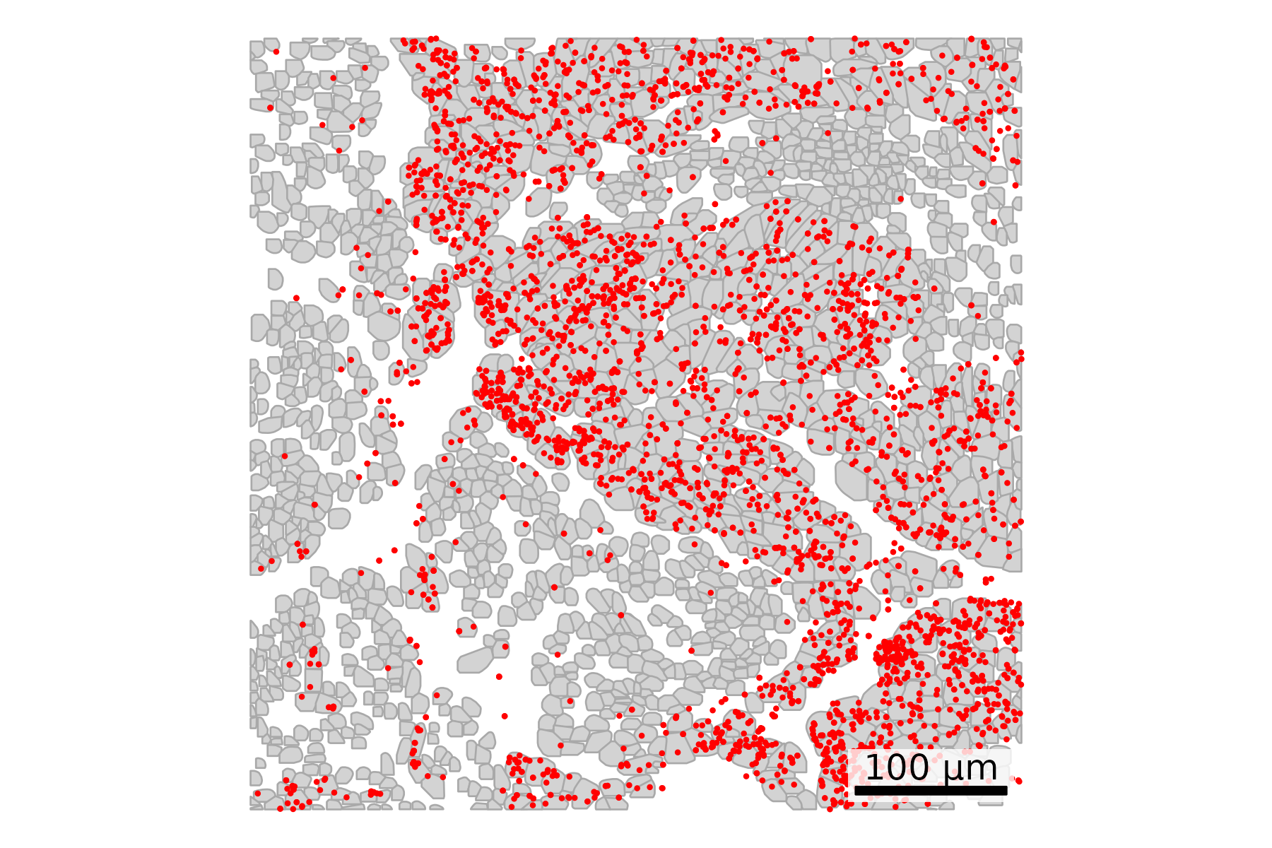
## Read in transcripts# Define your file name as a variablefile_name <-paste0(raw_data_dir, "/", slide_name, "_tx_file.csv.gz")# Construct the shell command using sprintf# fov is in column 1 and target is in column 9cmd <-sprintf("zcat %s | awk -F',' 'NR==1 || ($1==\"100\" && $9==\"KRT8\")'", file_name)# Read the filtered tx datafiltered_tx <-fread(cmd = cmd)## Set up scale barscale_bar <-make_scale_bar_r(x_vals = cell_polygons %>%filter(fov ==100) %>%pull(x_global_px),y_vals = cell_polygons %>%filter(fov ==100) %>%pull(y_global_px))## Plot itggplot(cell_polygons %>%filter(fov ==100),aes(x = x_global_px, y = y_global_px, group = cell)) +geom_polygon(fill ="lightgrey", color ="darkgrey", linewidth =0.3) +geom_point(data = filtered_tx, aes(x = x_global_px, y = y_global_px), #Overlay transcript pointscolor ="red", size =0.3) +coord_fixed() +theme_void() + scale_bar$bg + scale_bar$rect + scale_bar$labelggsave(paste0(out_dir, "polygons_singleFOV_singleTx.png"),width =6, height =4, units ="in")
Code
# Define your file name as a variablefile_name = Path(raw_data_dir /f"{slide_name}_tx_file.csv.gz")# Construct the shell command using sprintf# fov is in column 1 and target is in column 9cmd =f"zcat {file_name} | awk -F',' 'NR==1 || ($1==\"100\" && $9==\"KRT8\")'"# Run the command and capture outputresult = subprocess.run(cmd, shell=True, stdout=subprocess.PIPE, text=True)# Read the filtered result into a DataFramefiltered_tx = pd.read_csv(io.StringIO(result.stdout))# Filter cell polygons to focus on one fovplot_df = cell_polygons[cell_polygons["fov"] ==100]# Plotfig, ax = plt.subplots(figsize=(6, 4))for _, group in plot_df.groupby("cell"): coords = group[["x_global_px", "y_global_px"]].values coords = np.vstack([coords, coords[0]]) # close the polygon ax.fill(coords[:, 0], coords[:, 1], facecolor="lightgrey", edgecolor="darkgrey", linewidth=0.5, zorder=1)# Overlay transcript dotsax.scatter(filtered_tx["x_global_px"], filtered_tx["y_global_px"], color="red", s=0.3, zorder=2)ax.set_aspect('equal', adjustable='box')ax.axis('off')# Add scale barmake_scale_bar_py(ax, plot_df["x_global_px"], plot_df["y_global_px"])# Saveplt.savefig(os.path.join(out_dir, "python_polygons_singleFOV_singleTx.png"), bbox_inches='tight', pad_inches=0, dpi=300)plt.close()
4 QC Module Visualizations
Here we generate plots to visualize many of the metrics output by the RNAQC plots module for AtoMx SIP.
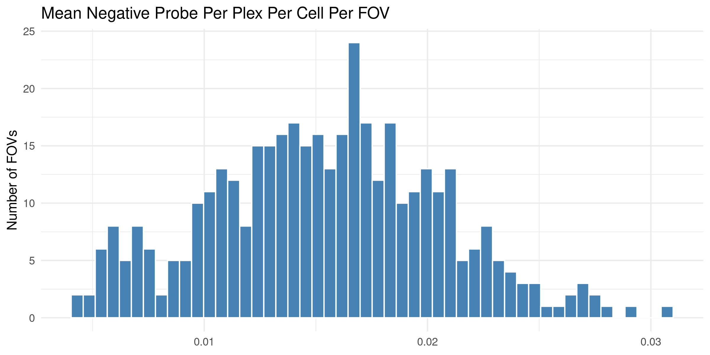
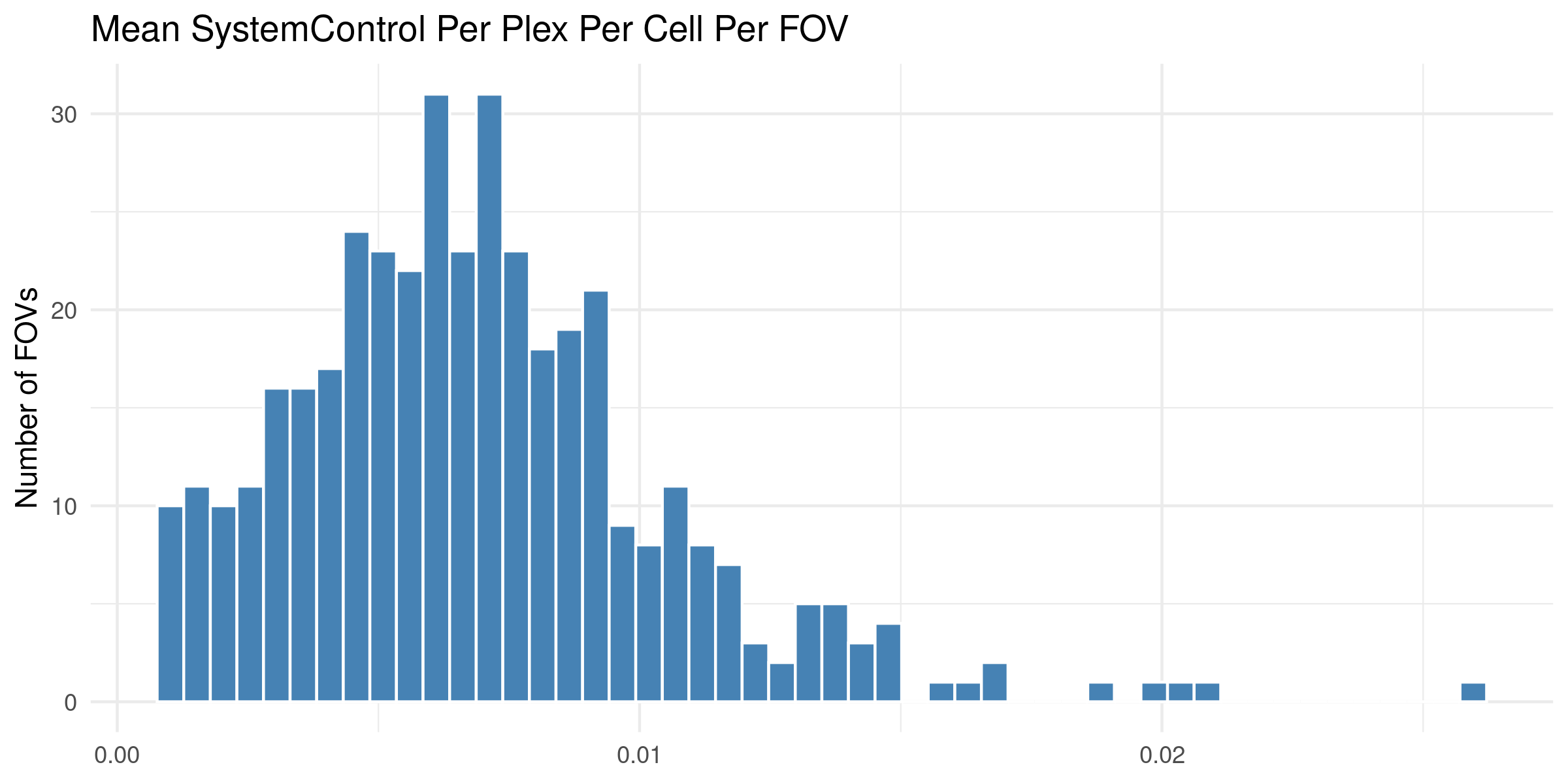
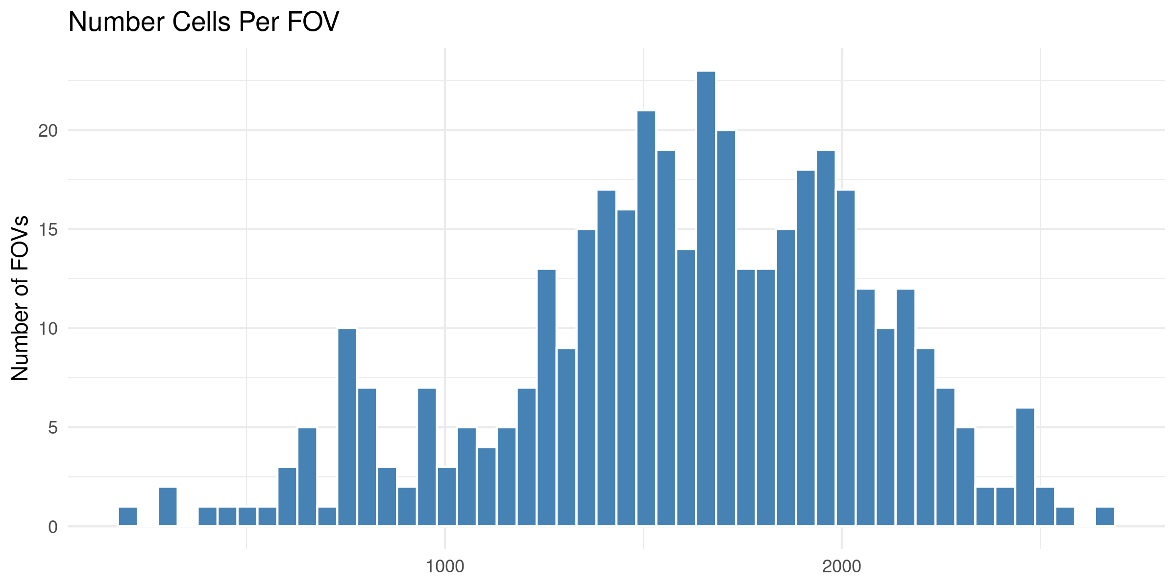
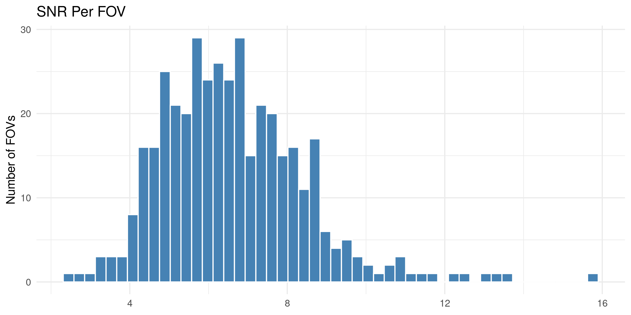
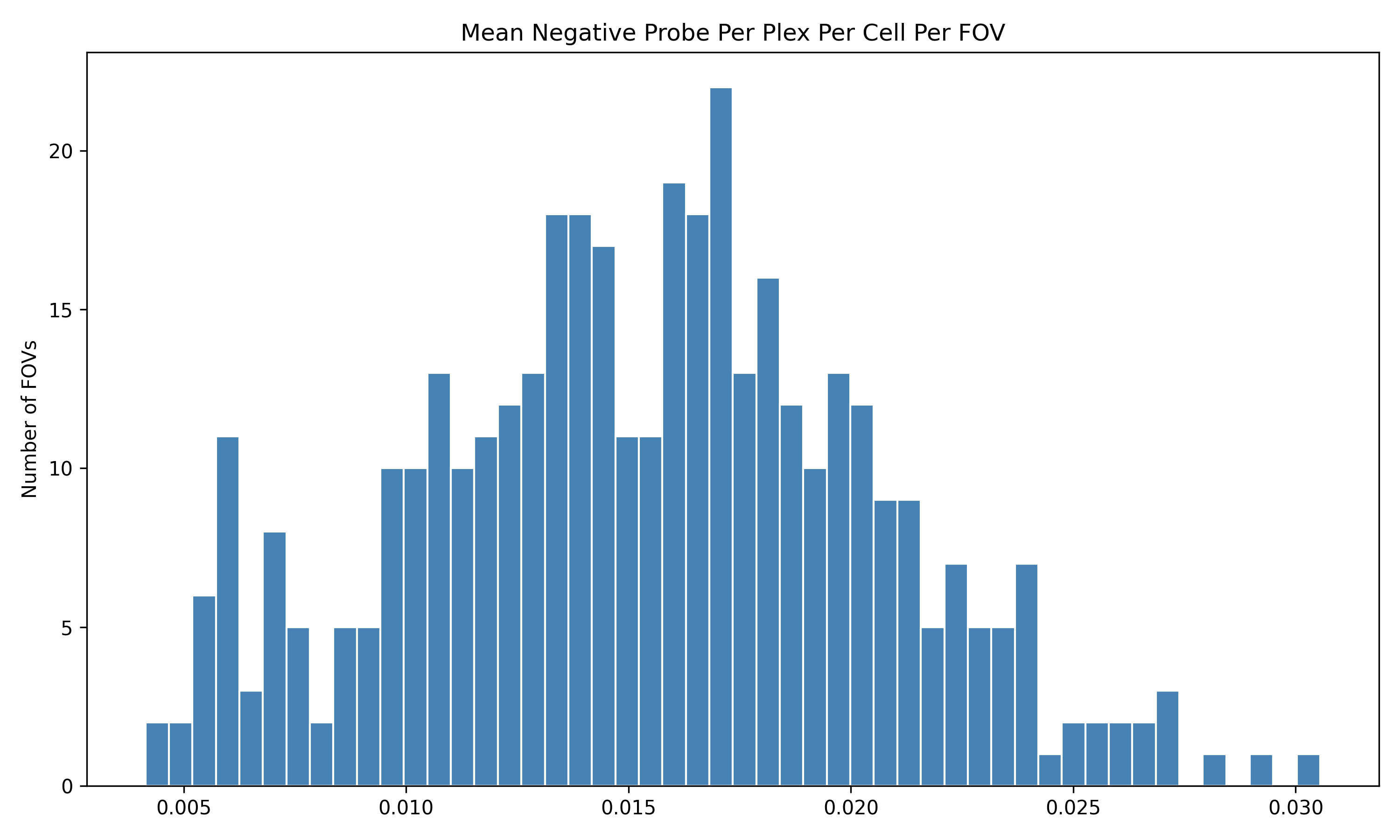
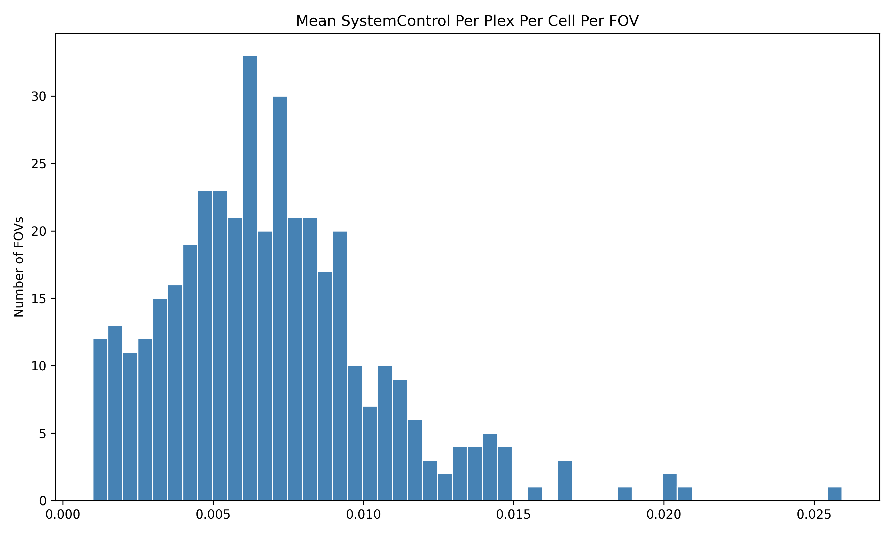
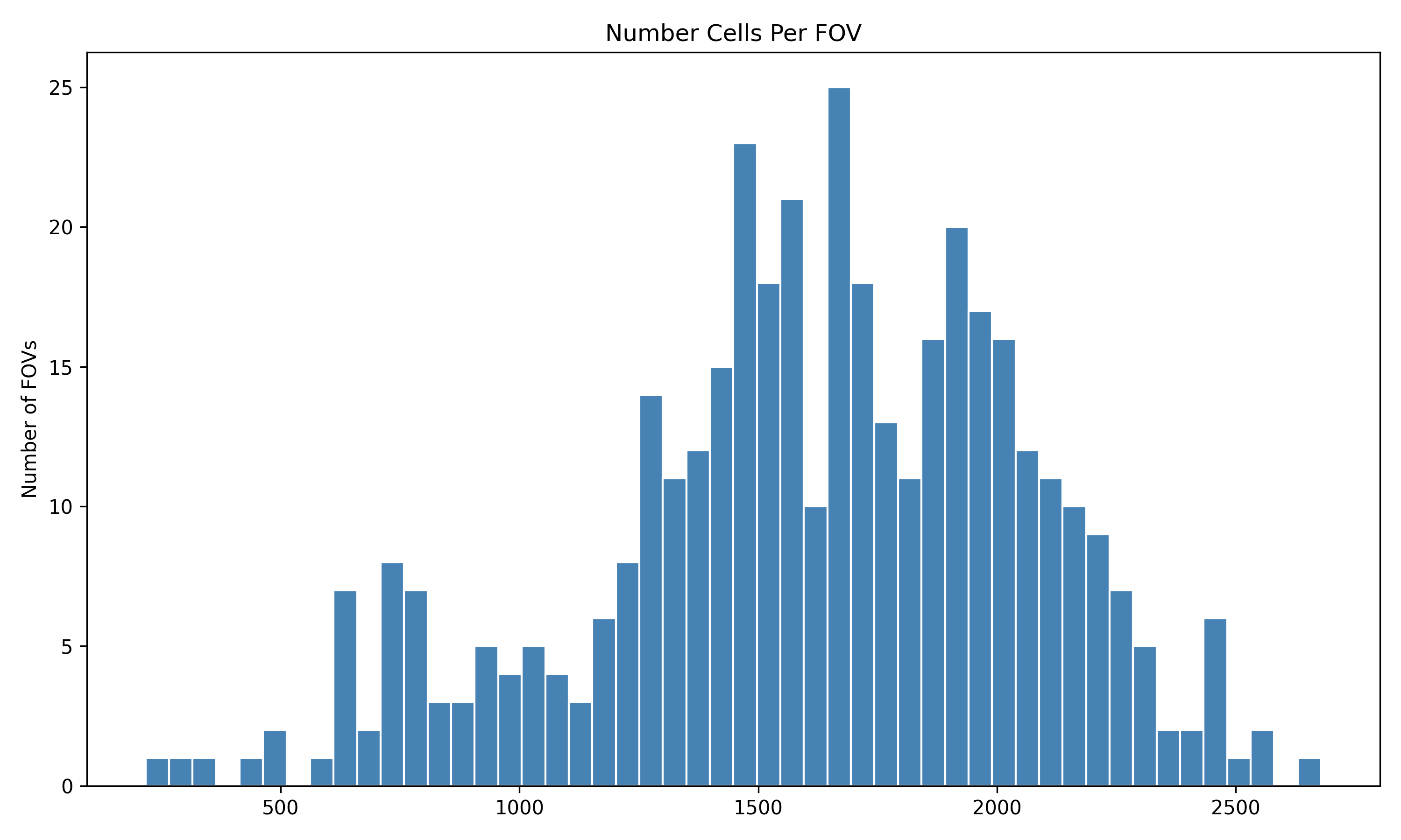
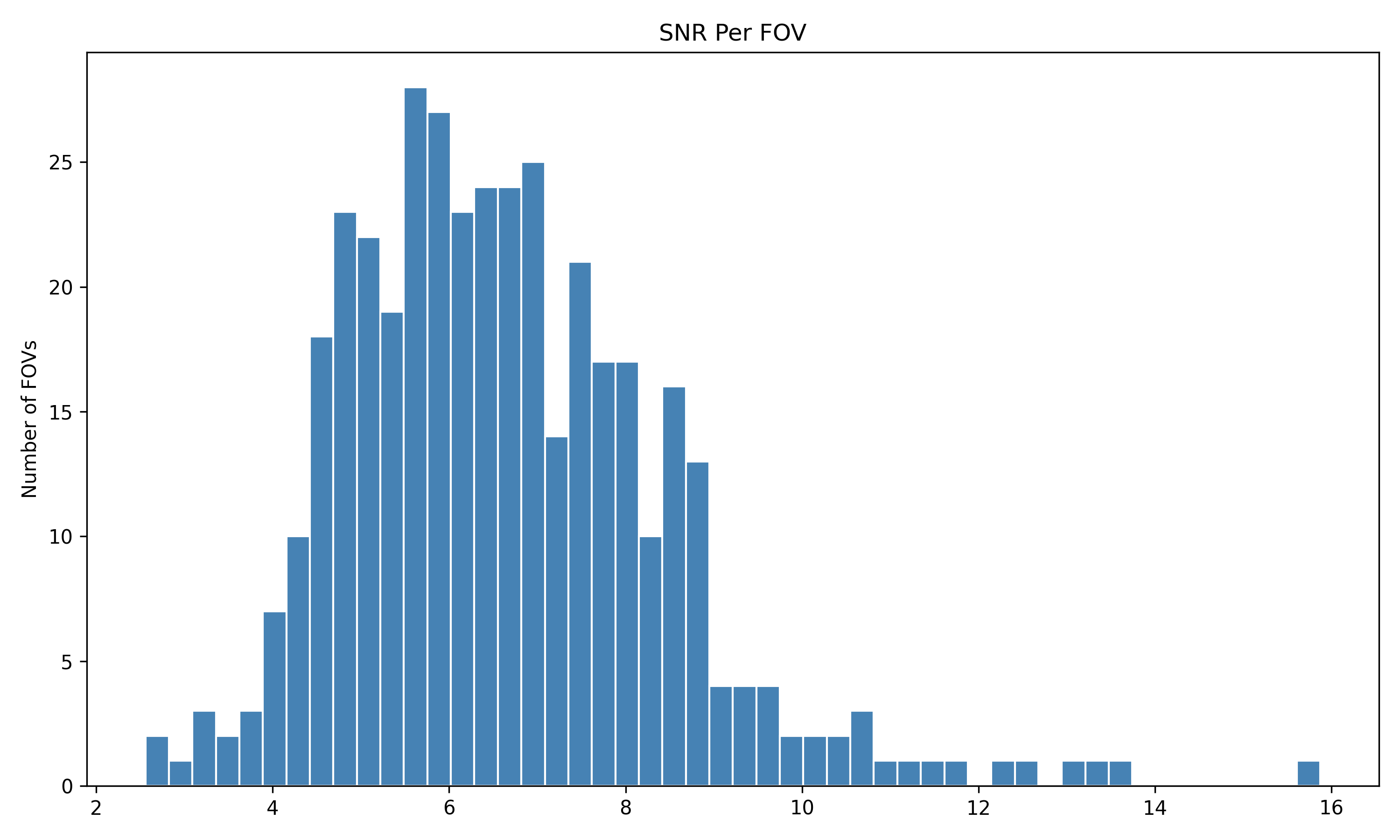
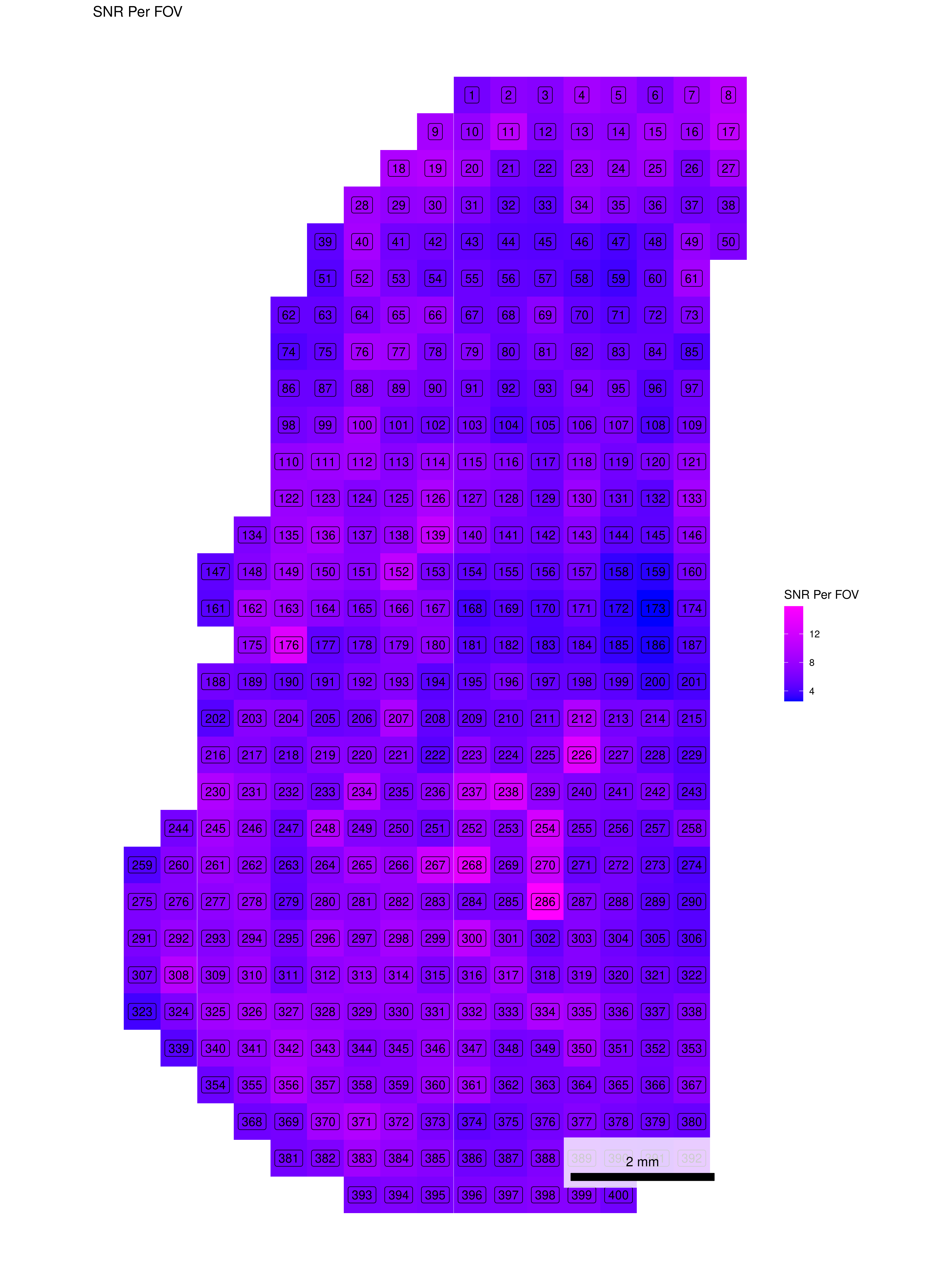
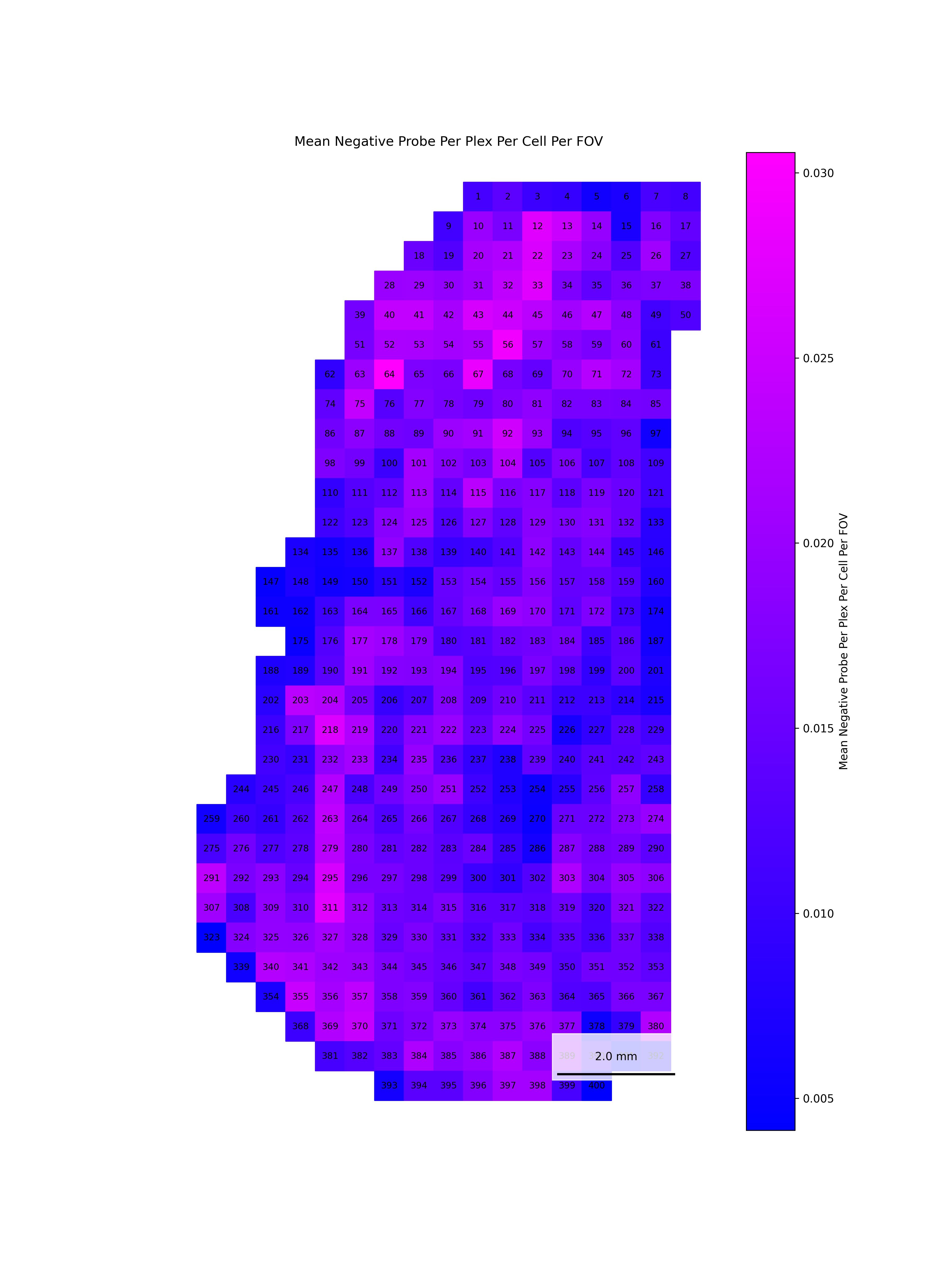
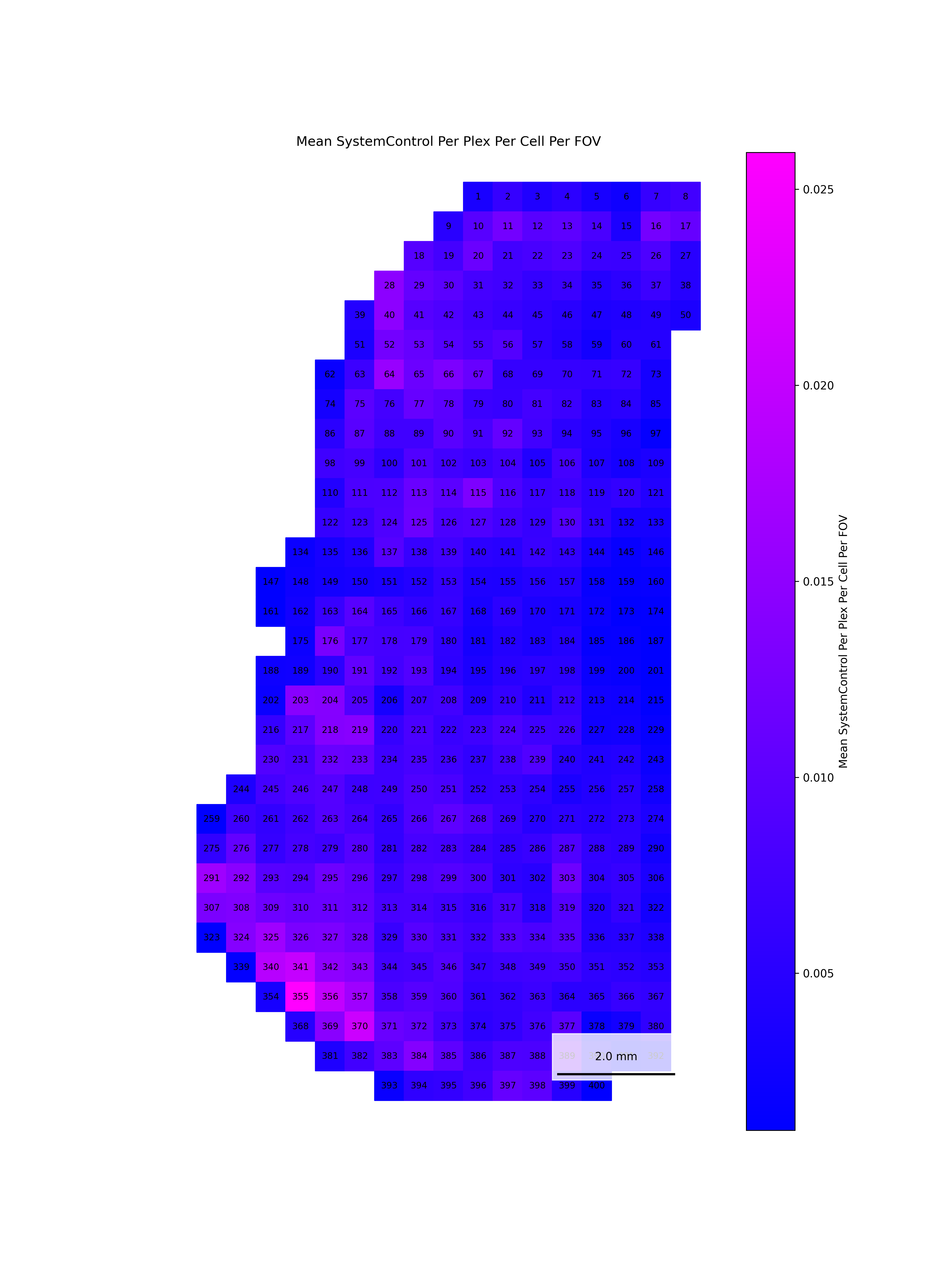
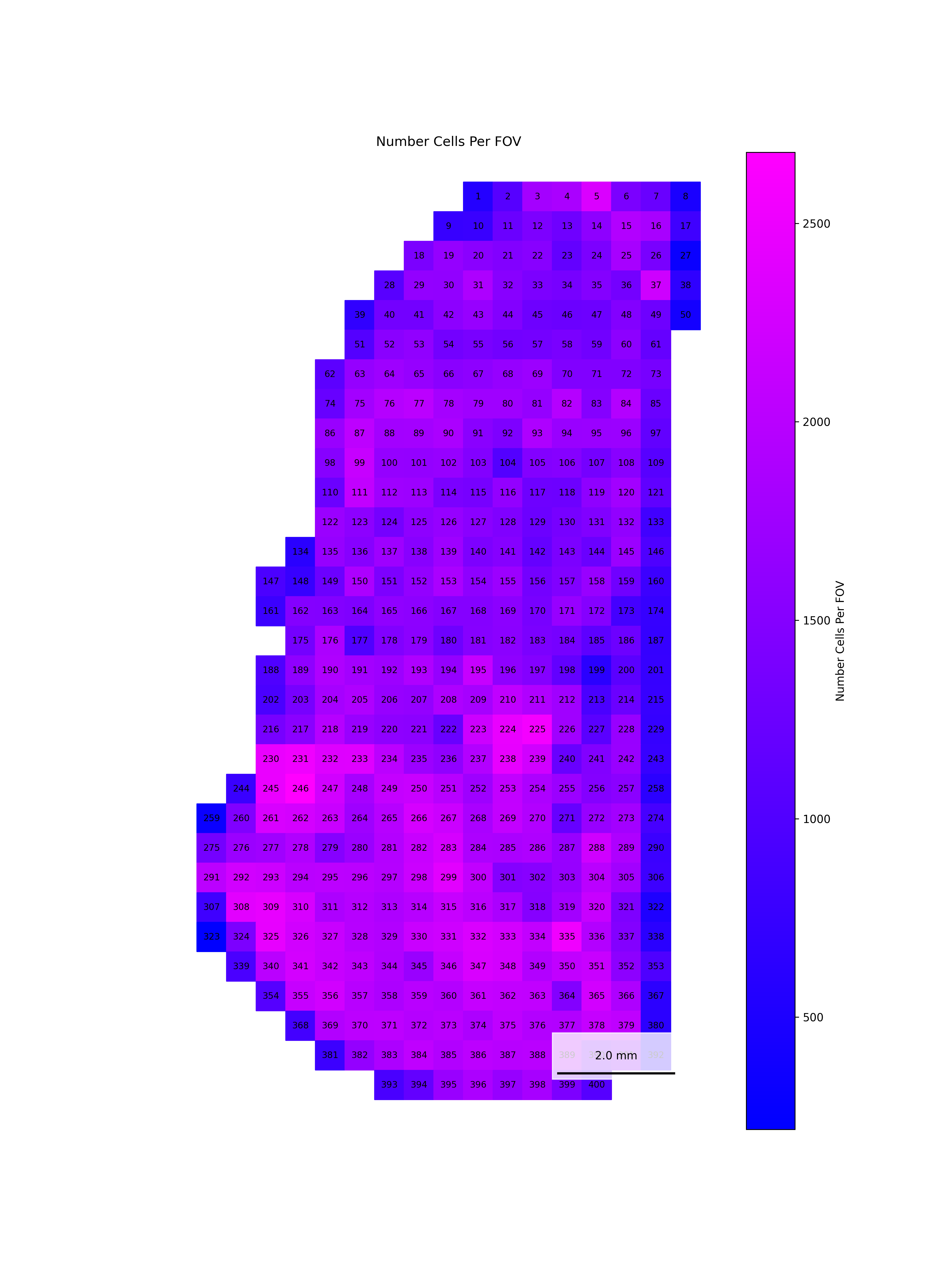
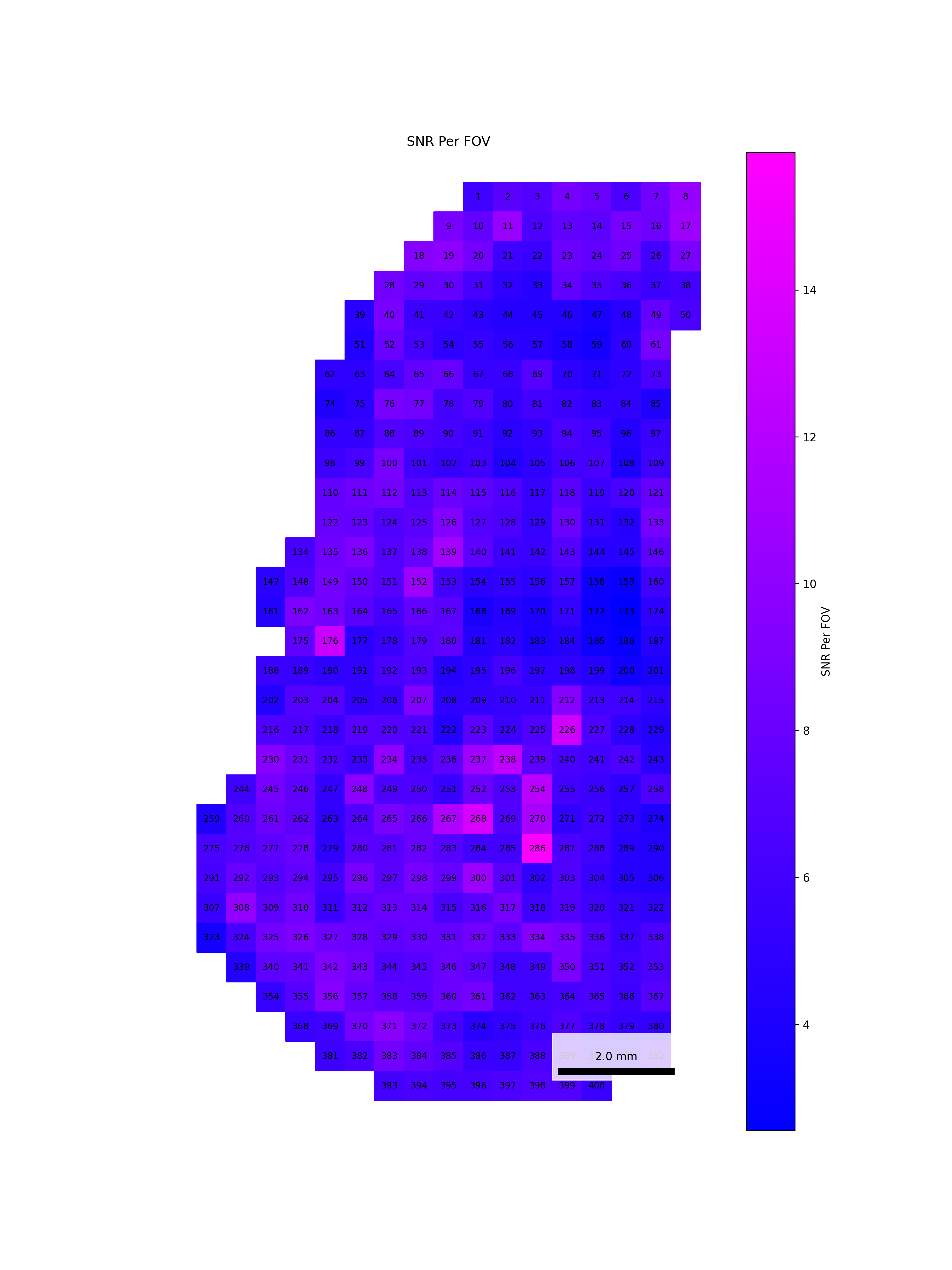
We start by reading in the outputs of this module for use in multiple of the plots in this section. We also add one more column, SNR, which we calculate as mean transcripts per plex / mean negative probes per plex.
qc <-read.csv(paste0(raw_data_dir, "Per_FOV_data_quality_metrics.csv"), # For convenience, we assume this is stored in the same directory as the flat files.row.names =1)# Set up plex for this datasetdataset_plex <-18935# Add per FOV SNRqc$SNR_Per_FOV <- (qc$Mean_Transcripts_Per_Cell_Per_FOV / dataset_plex) / qc$Mean_Negative_Probe_Per_Plex_Per_Cell_Per_FOV
Code
qc = pd.read_csv(Path(raw_data_dir /f"Per_FOV_data_quality_metrics.csv"), index_col=0) # For convenience, we assume this is stored in the same directory as the flat files.# Set up plex for this datasetdataset_plex =18935# Add per FOV SNRqc['SNR_Per_FOV'] = (qc['Mean_Transcripts_Per_Cell_Per_FOV'] / dataset_plex) / qc['Mean_Negative_Probe_Per_Plex_Per_Cell_Per_FOV']
4.1 Distribution of QC Metrics
Histograms showing the distribution for each per FOV metric.
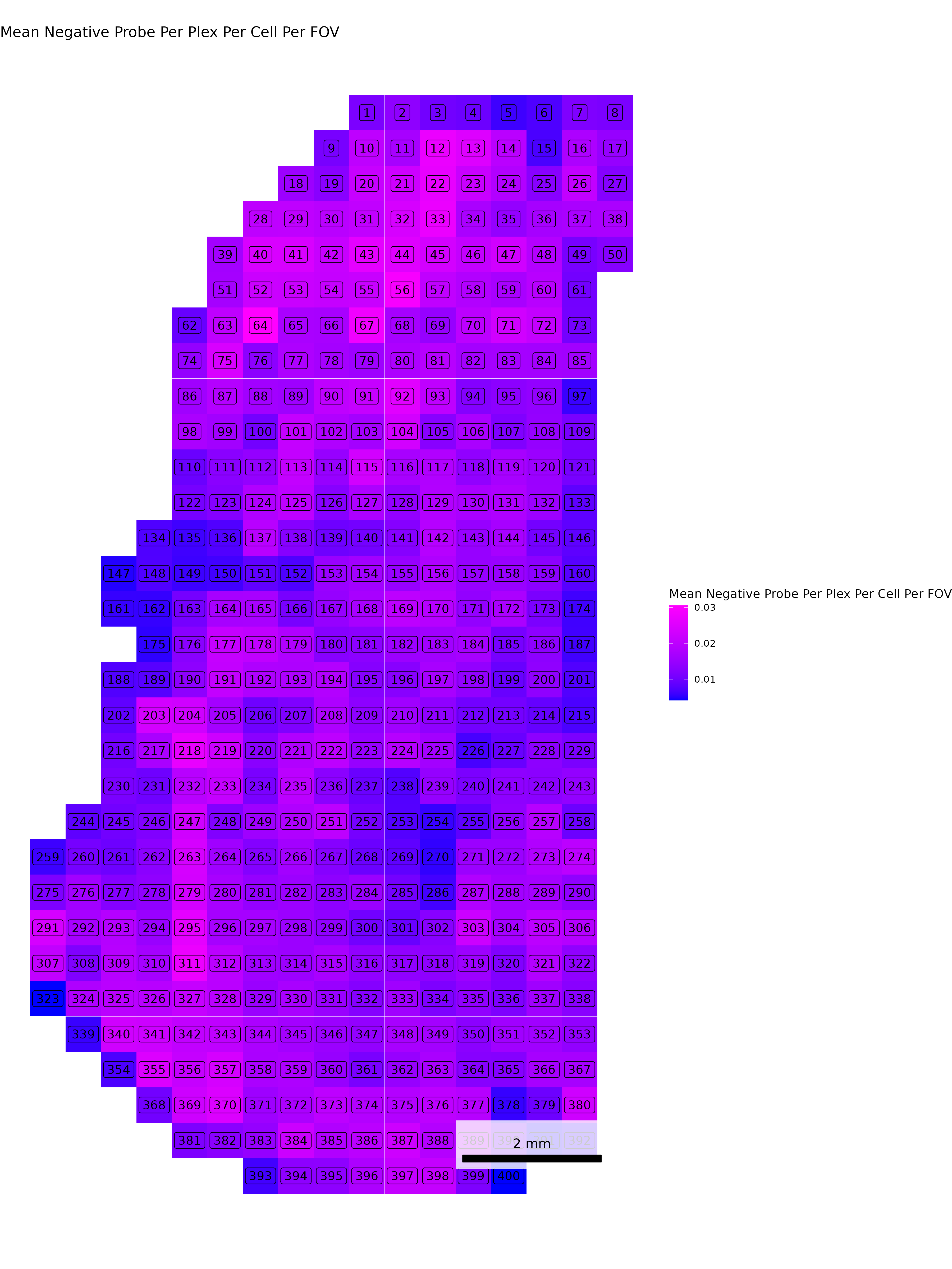
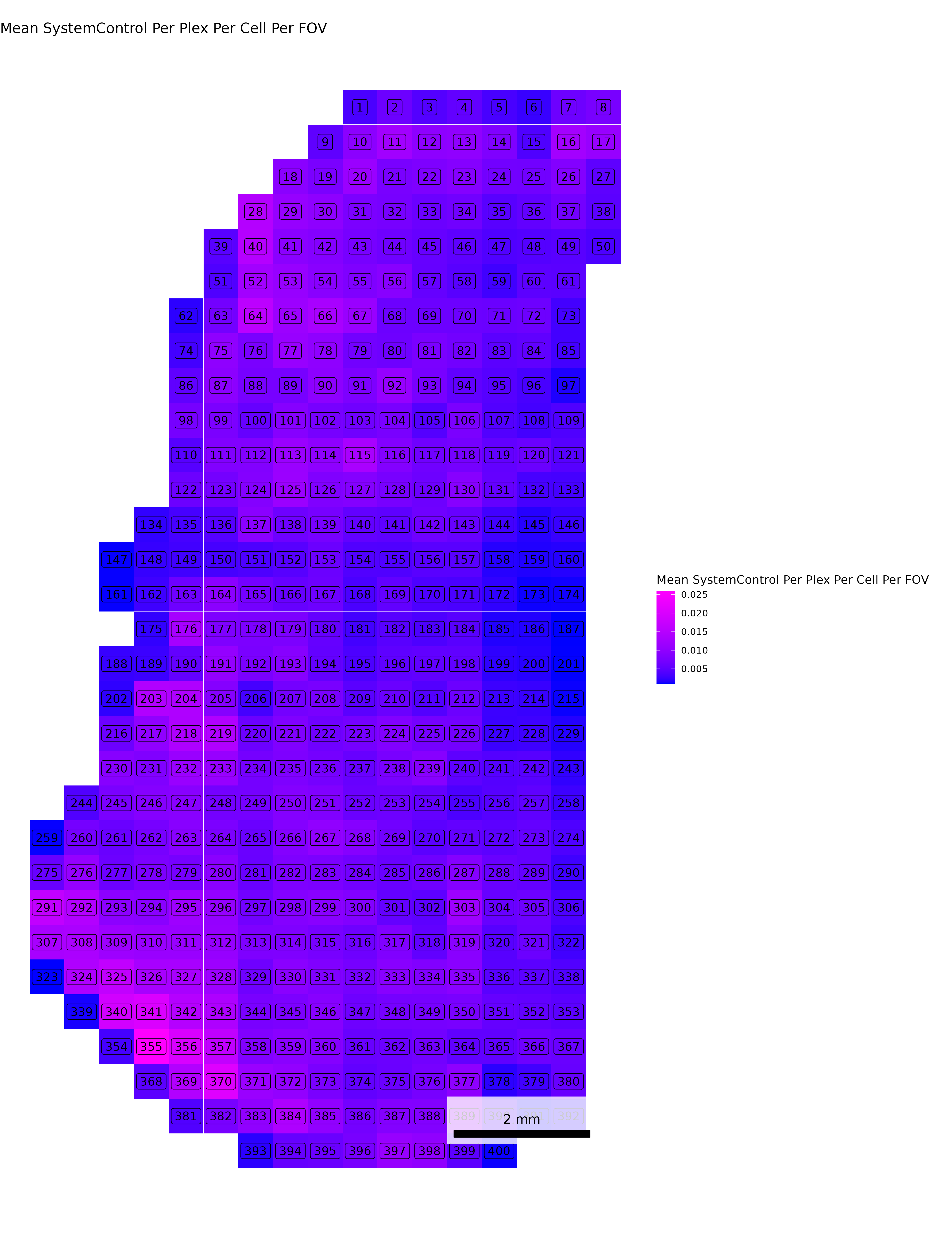
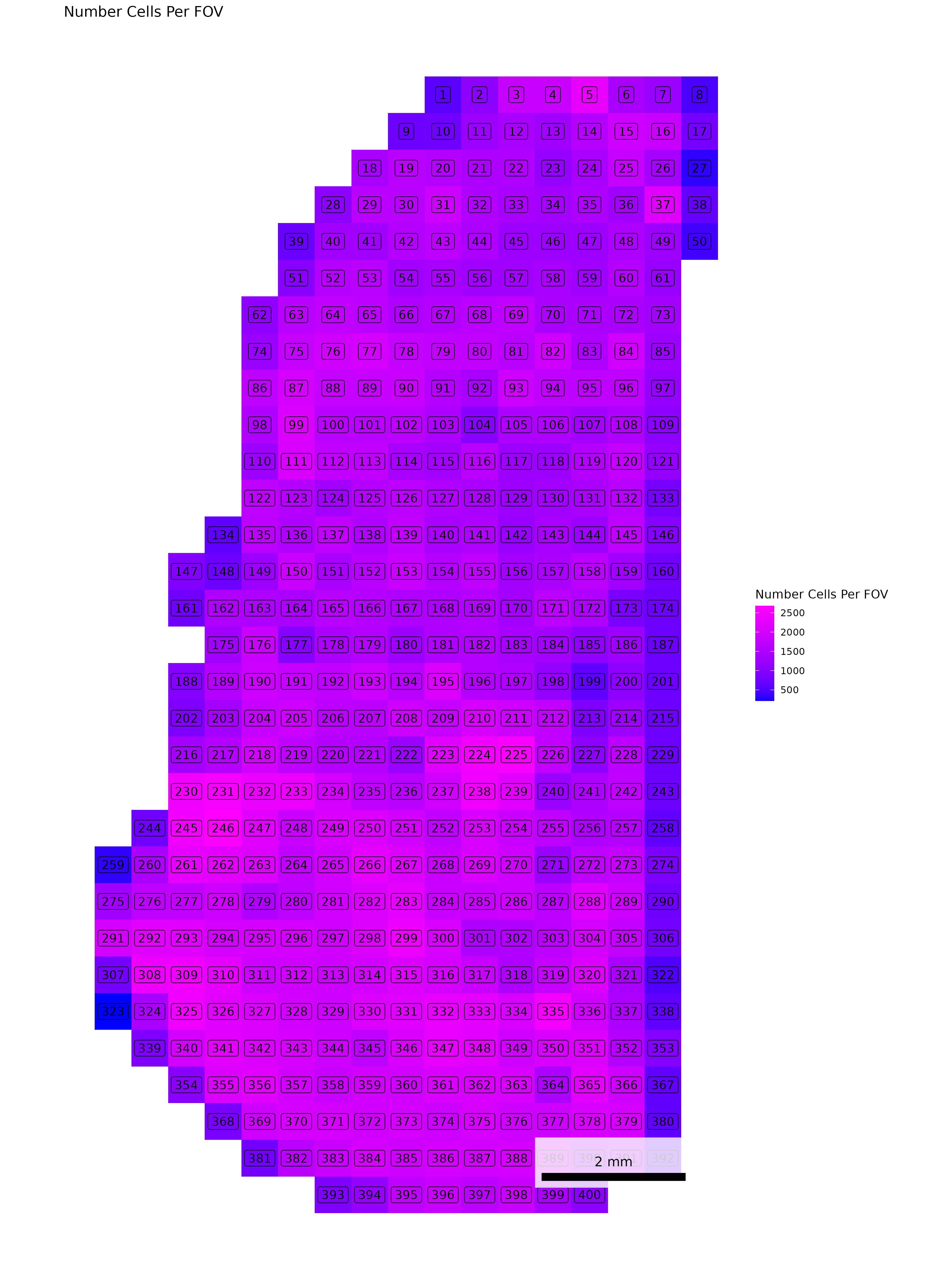
To help identify spatial patterns in quality control metrics, we generate a spatial plot for each FOV. Each plot includes the FOV number overlaid for easy reference and comparison across the tissue.
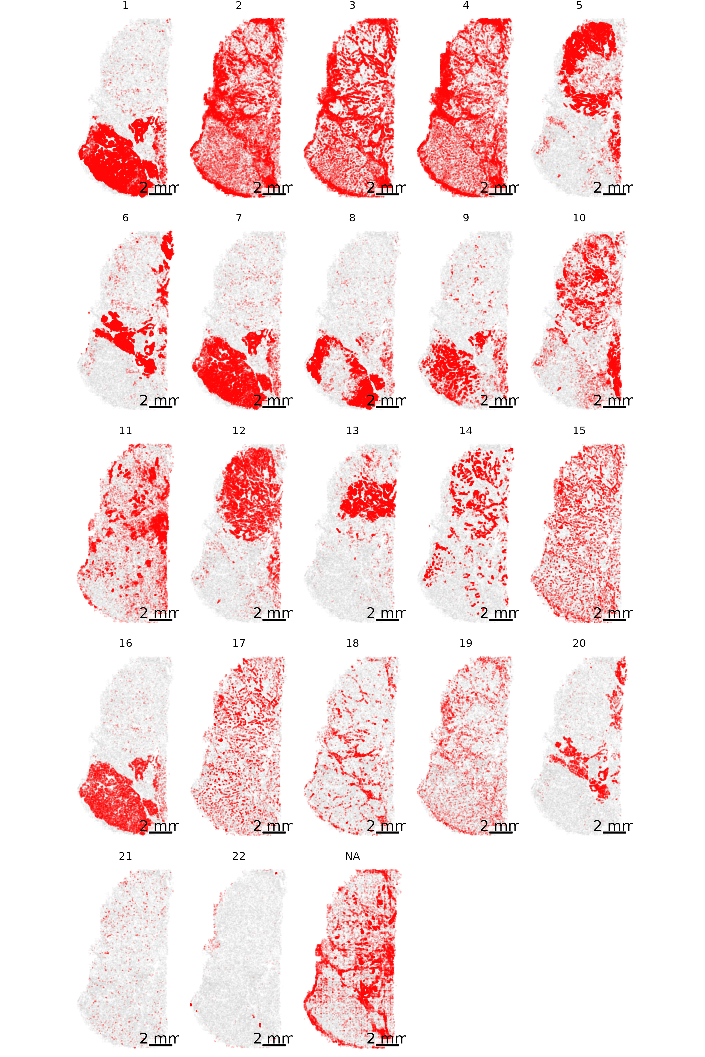
# Extract FOV metric columnsfov_metrics = [col for col in qc.columns if'Per_FOV'in col]# Add xy positions for each FOV to qc dataframefov_positions.set_index('FOV', inplace=True)qc['x_global_px'] = qc['fov'].map(fov_positions['x_global_px'])qc['y_global_px'] = qc['fov'].map(fov_positions['y_global_px'])# Set up a color scale to useblue_magenta = mcolors.LinearSegmentedColormap.from_list("blue_magenta", ["blue", "magenta"])# Plot each per FOV metric in spacefor fov_metric in fov_metrics: fig, ax = plt.subplots(figsize=(12, 16))# The 's' parameter indicates the point size and was empirically determined for this dataset.# You may need to increase or decrease it to get the boxes to fill the space in other datasets. ax.scatter(qc['x_global_px'], qc['y_global_px'], c=qc[fov_metric], cmap='coolwarm', s=700, marker ="s") scatter = ax.scatter(qc['x_global_px'], qc['y_global_px'], c=qc[fov_metric], cmap=blue_magenta, s=700, marker ="s") cbar = fig.colorbar(scatter, ax=ax) cbar.set_label(fov_metric.replace('_', ' '))for i, row in qc.iterrows(): ax.text(row['x_global_px'], row['y_global_px'], str(row['fov']), fontsize=8, ha='center', va='center', color='black') ax.set_title(fov_metric.replace('_', ' ')) ax.set_aspect('equal', adjustable='box') ax.axis('off')# Add scale bar make_scale_bar_py(ax, qc["x_global_px"], qc["y_global_px"]) plt.savefig(f"{out_dir}/python_XY_qc_{fov_metric}.png", dpi=300) plt.close()
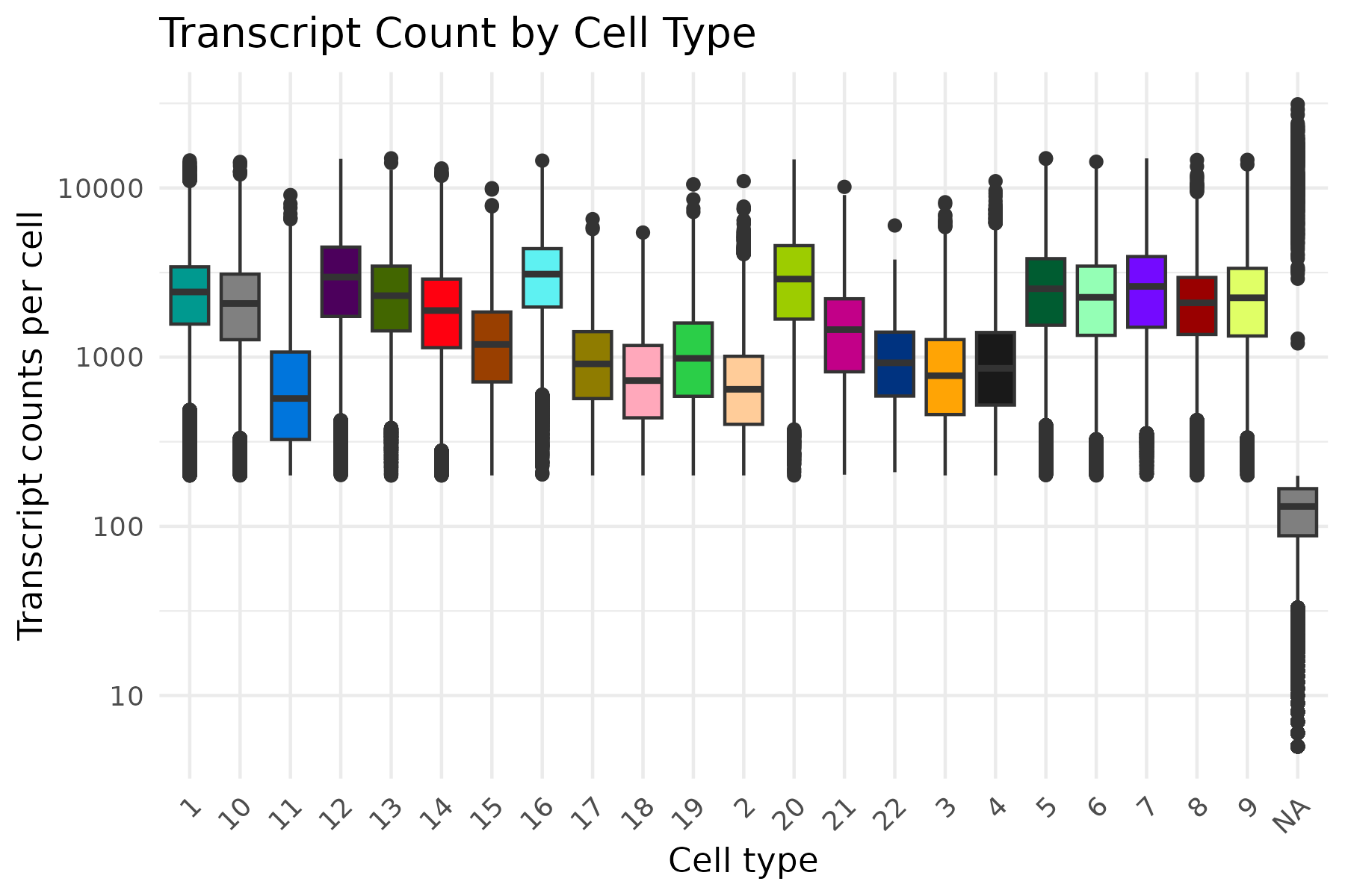
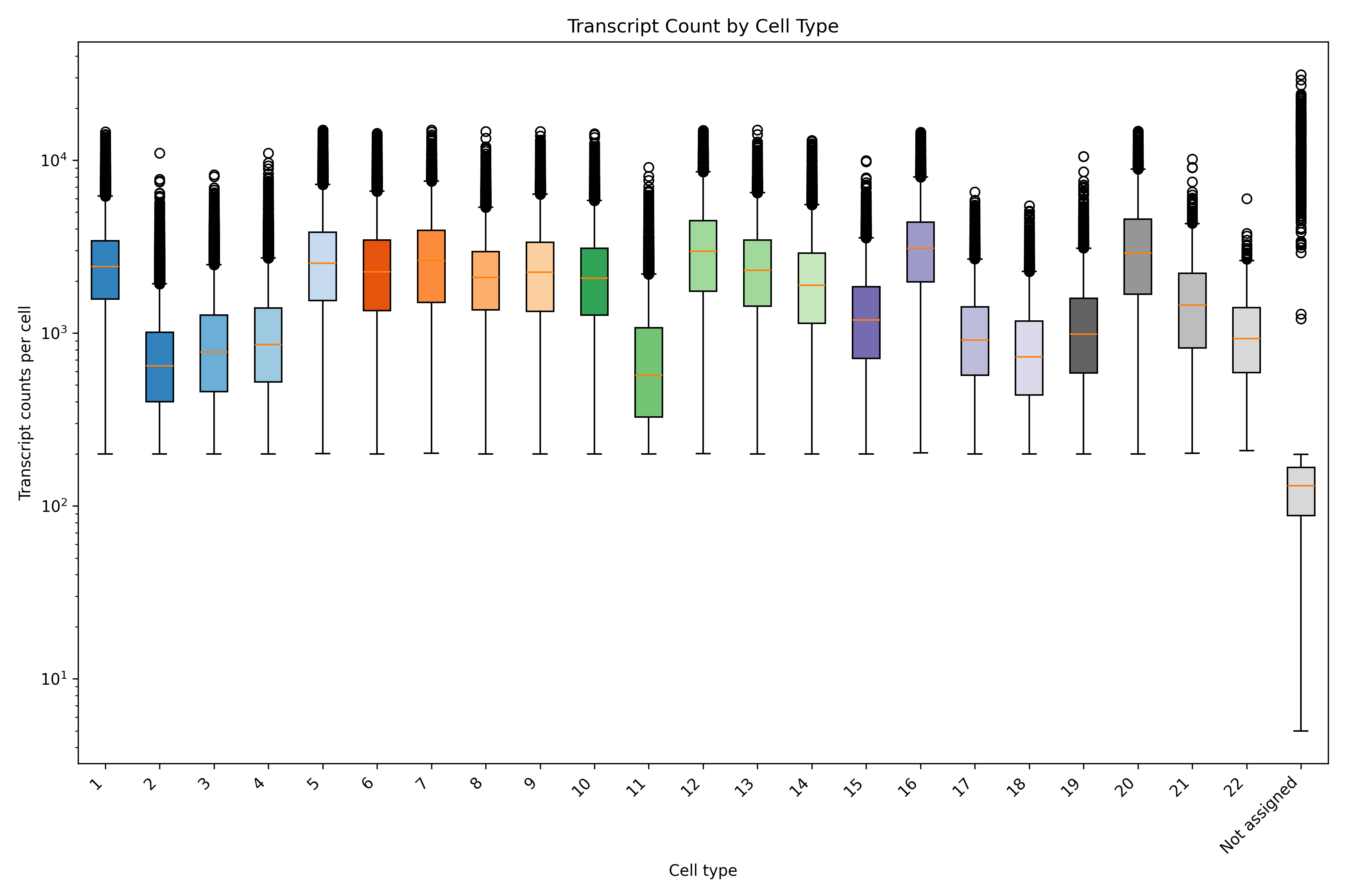
In addition to the outputs of the QC module, there are a number of QC metrics that can be extracted from the meta data and plotted by cell type. As an example here, we show transcripts per cell separated by cell type.
cell_meta$cell_type <-as.character(cell_meta$leiden_cluster)# Use alphabet palettemy_pal <- pals::alphabet(n =length(unique(cell_meta$cell_type)))names(my_pal) <-unique(cell_meta$cell_type)ggplot(cell_meta, aes(x = cell_type, y = nCount_RNA, fill = cell_type)) +geom_boxplot() +scale_fill_manual(values = my_pal) +theme_minimal() +xlab("Cell type") +ylab("Transcript counts per cell") +labs(title ="Transcript Count by Cell Type") +scale_y_log10() +theme(axis.text.x =element_text(angle =45, hjust =1)) +theme(legend.position ="none")ggsave(paste0(out_dir, "/BarPlot_qc_txPerCell_cellType.png"),width =6, height =4, units ="in")
Code
# Convert leiden_cluster to string and assign to cell_type# Fill NaNs with a placeholder (e.g., -1) before convertingcell_meta['leiden_cluster'] = cell_meta['leiden_cluster'].fillna(-1)cell_meta['cell_type'] = cell_meta['leiden_cluster'].astype(int).astype(str)# Convert NA values backcell_meta['leiden_cluster'] = cell_meta['leiden_cluster'].replace(-1, np.nan)cell_meta['cell_type'] = cell_meta['cell_type'].replace({'-1': 'Not assigned'})# Get unique cell types and assign colorsunique_cell_types =sorted(cell_meta['cell_type'].unique(), key=lambda x: float(x) if x.isdigit() elsefloat('inf'))colors = plt.cm.get_cmap('tab20c', len(unique_cell_types)) #Use tab20c palettecolor_dict = {cell_type: colors(i) for i, cell_type inenumerate(unique_cell_types)}# Prepare data for boxplotdata = [cell_meta[cell_meta['cell_type'] == ct]['nCount_RNA'] for ct in unique_cell_types]# Create the boxplotfig, ax = plt.subplots(figsize=(12, 8))box = ax.boxplot(data, patch_artist=True, labels=unique_cell_types)# Apply colors to boxesfor patch, ct inzip(box['boxes'], unique_cell_types): patch.set_facecolor(color_dict[ct])# Customize plotax.set_yscale('log')ax.set_xlabel('Cell type')ax.set_ylabel('Transcript counts per cell')ax.set_title('Transcript Count by Cell Type')plt.xticks(rotation=45, ha='right')plt.legend([], [], frameon=False) # Remove legendplt.tight_layout()# Save the plotplt.savefig(f"{out_dir}/python_BarPlot_qc_txPerCell_cellType.png", dpi=300)plt.close()
4.4 Per cell QC metrics in space
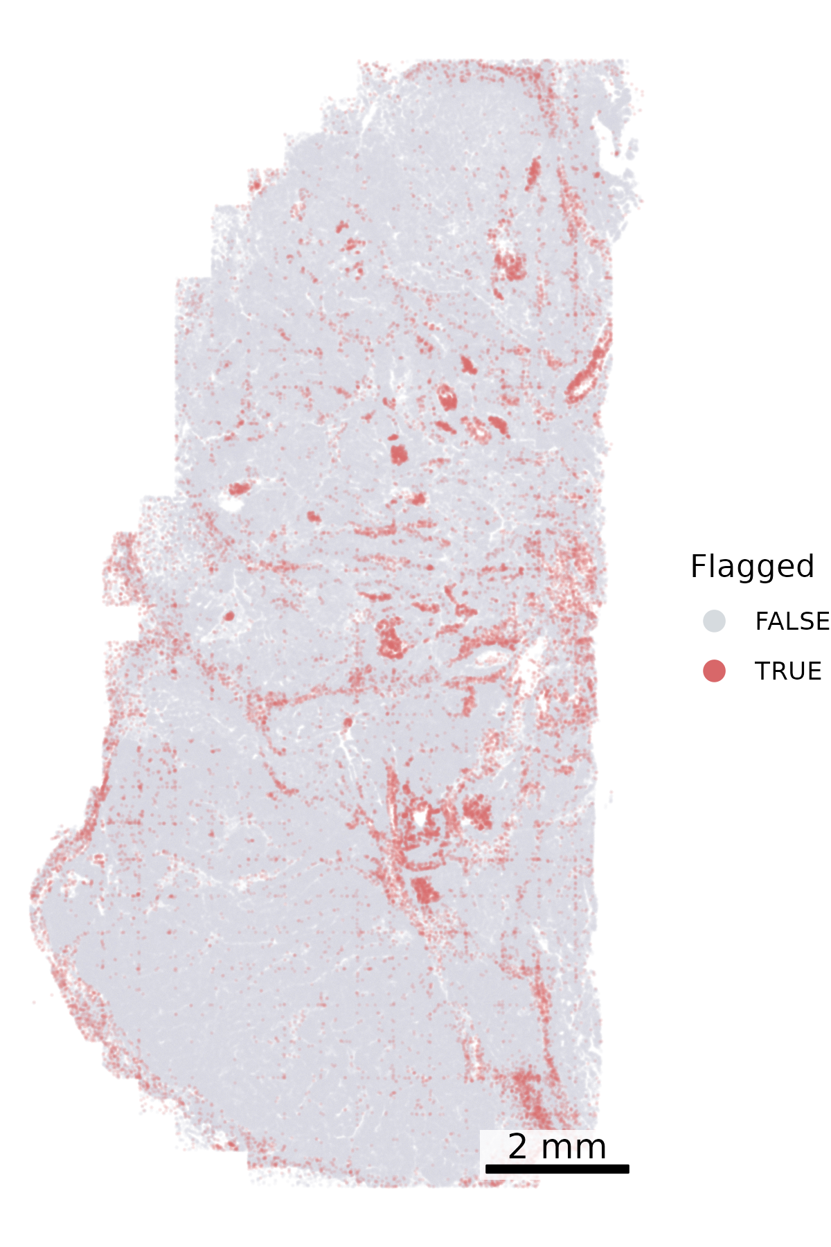
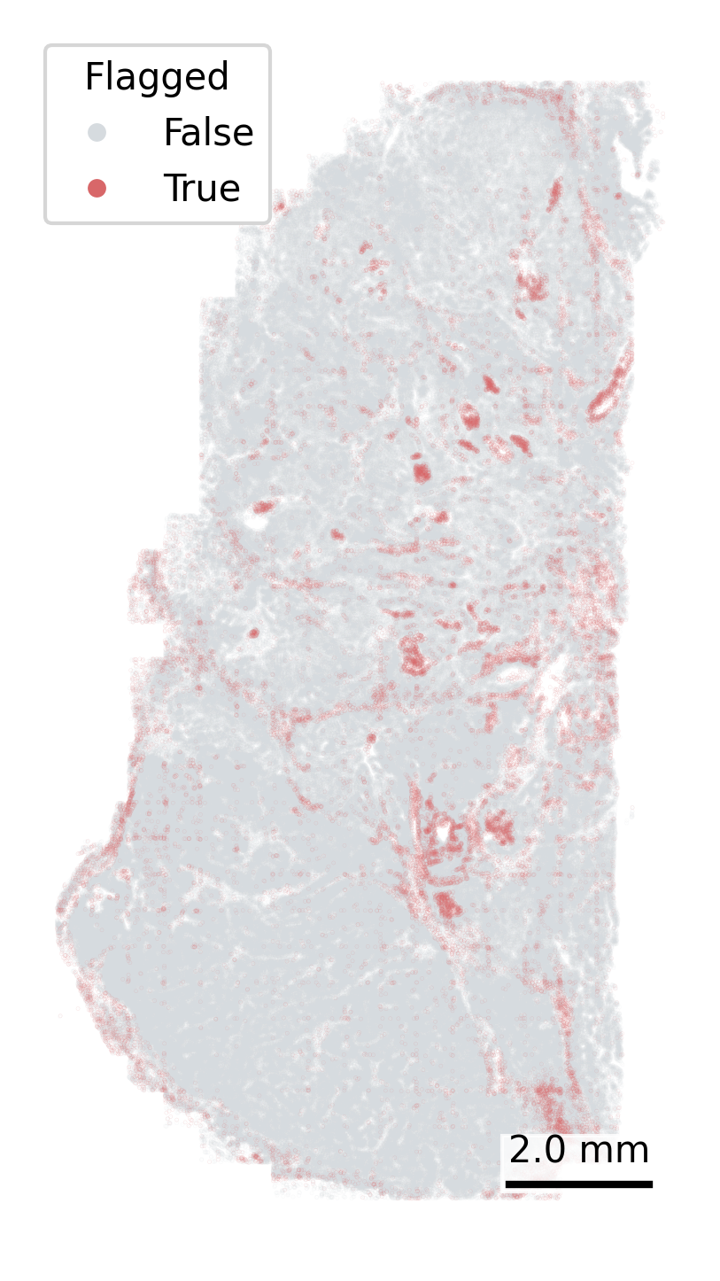
Another QC metric in the meta data is whether a cell has been ‘flagged’ by any of the QC steps in AtoMx. We can plot each cell’s ‘qcCellsFlagged’ status in space to look for spatial patterns in the cells get flagged. Keep an eye out for overplotting here, which can lead to the incorrect conclusion that all cells in a region have been lost. We reduce the opacity to counter this impression.
# Define color mapping for flagged statuscolor_map = {True: "#D86769", False: "#D6DBDF"}# To increase the visibility of the flagged cells, we split the data frame and plot the flagged cells secondfalse_cells = cell_meta[cell_meta['qcCellsFlagged'] ==False]true_cells = cell_meta[cell_meta['qcCellsFlagged'] ==True]# Create the plotfig, ax = plt.subplots(figsize=(4, 6))# Cells not flaggedax.scatter( false_cells['CenterX_global_px'], false_cells['CenterY_global_px'], c=false_cells['qcCellsFlagged'].map(color_map), s=0.01, alpha =0.2, zorder=1)# Cells flaggedax.scatter( true_cells['CenterX_global_px'], true_cells['CenterY_global_px'], c=true_cells['qcCellsFlagged'].map(color_map), s=0.01, alpha =0.2, zorder=2)# Add scale barmake_scale_bar_py(ax, cell_meta["CenterX_global_px"], cell_meta["CenterY_global_px"])# Add a legend with larger marker sizefrom matplotlib.lines import Line2Dlegend_elements = [ Line2D([0], [0], marker='o', color='w', label='False', markerfacecolor=color_map[False], markersize=6), Line2D([0], [0], marker='o', color='w', label='True', markerfacecolor=color_map[True], markersize=6)]ax.legend(handles=legend_elements, title="Flagged")# Fix aspect ratio and remove axesax.set_aspect('equal', adjustable='box')ax.axis('off')# Save the plotplt.savefig(f"{out_dir}/python_qc_flaggedCells.png", dpi=300, bbox_inches='tight')plt.close()
5 Neighborhood Visualizations
We cover more extensive cell neighborhood analysis in a dedicated post, but include some summary visualizations here.
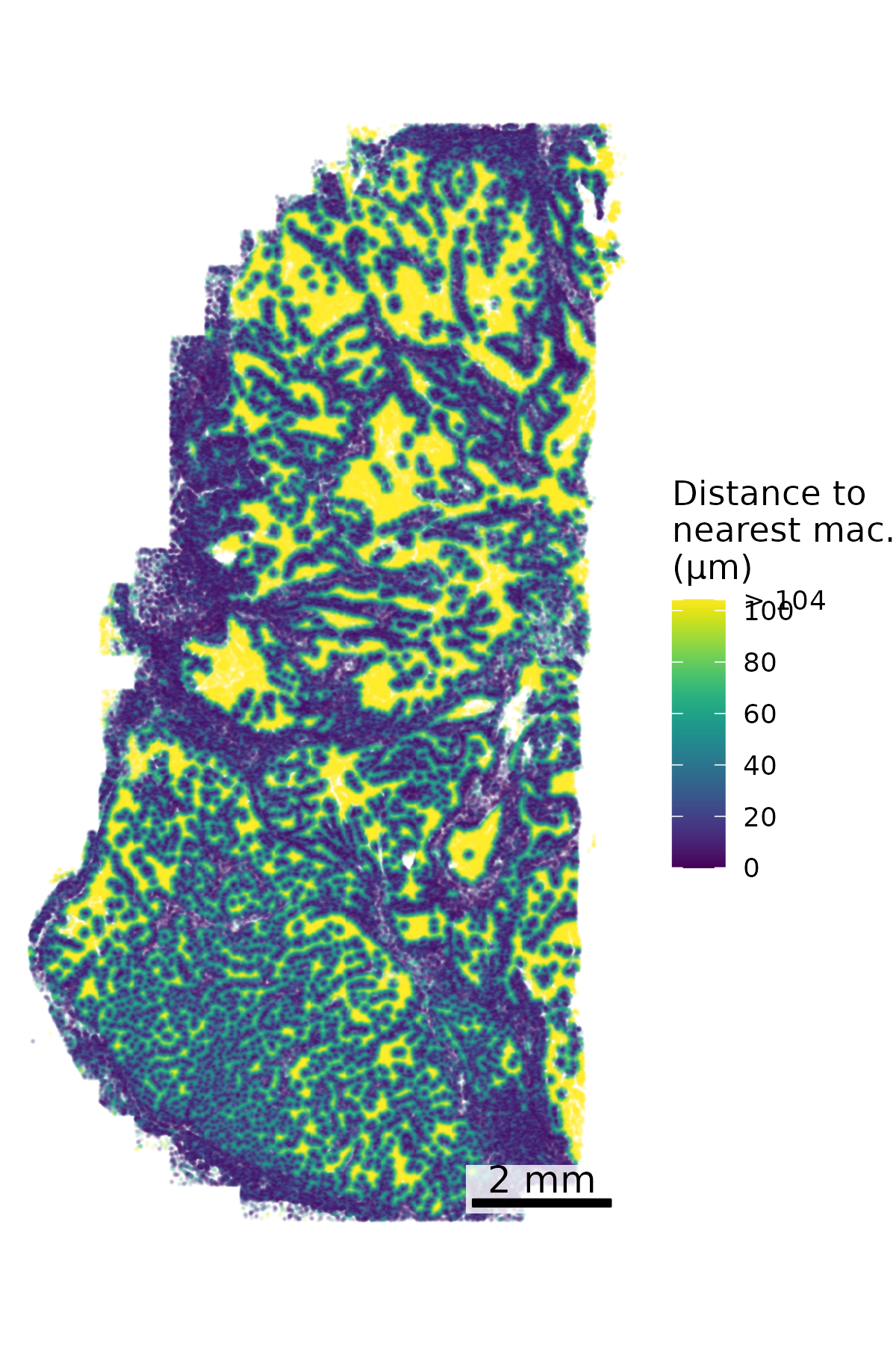
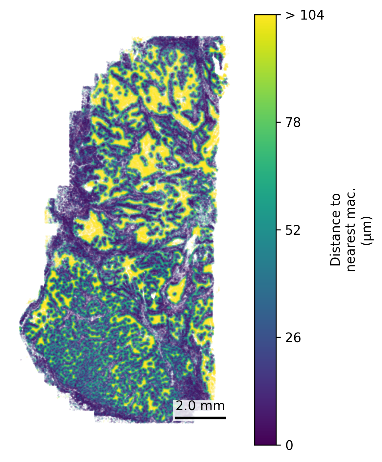
5.1 Distance to Nearest Cell of Type A
We find that often we’re interested in examining how close a given cell is to a cell of a certain type, for example how close every cell is to the nearest macrophage. Here we make a spatial plot to show the distance to the nearest macrophage. Based on the marker genes and spatial distribution here we’ll designate unsupervised cell type 3 as macrophage.
# Separate macrophages and other cellsmacrophages <- cell_meta %>%filter(leiden_cluster ==3) %>%select(CenterX_global_px, CenterY_global_px)all_cells <- cell_meta %>%select(CenterX_global_px, CenterY_global_px)# Find nearest macrophage for each cellnn <- FNN::get.knnx(data = macrophages, query = all_cells, k =1)# Extract distancesdistances <- nn$nn.dist[, 1]# Add to original datacell_meta$nearest_macrophage_distance <- distances# Convert to distance in micronsmicrons_per_pixel =0.12028cell_meta$nearest_macrophage_distance_um <- cell_meta$nearest_macrophage_distance * microns_per_pixel# There are a few outliers in distance, so we cap the distance plotted# Calculate the 90th percentile capcap_value <-quantile(cell_meta$nearest_macrophage_distance_um, 0.9, na.rm =TRUE)# Cap the valuescell_meta$distance_capped <-pmin(cell_meta$nearest_macrophage_distance_um, cap_value)# Define breaks and labelsbreaks <-pretty(c(0, cap_value), n =5)breaks[length(breaks)] <- cap_valuelabels <-as.character(breaks)labels[length(labels)] <-paste0("> ", round(cap_value))## Set up scale barscale_bar <-make_scale_bar_r(x_vals = cell_meta$CenterX_global_px,y_vals = cell_meta$CenterY_global_px)## Plot itggplot(cell_meta,aes(x = CenterX_global_px, y = CenterY_global_px,color = distance_capped)) +geom_point(size =0.1, alpha =0.1) +scale_color_viridis(name ="Distance to\nnearest mac.\n(µm)",breaks = breaks,labels = labels) +coord_fixed() +theme_void() + scale_bar$bg + scale_bar$rect + scale_bar$labelggsave(paste0(out_dir, "nearest_cell.png"),width =4, height =6, units ="in")
Code
# Separate macrophages and all cellsmacrophages = cell_meta[cell_meta['leiden_cluster'] ==3][['CenterX_global_px', 'CenterY_global_px']]all_cells = cell_meta[['CenterX_global_px', 'CenterY_global_px']]# Find nearest macrophage for each cellnn_model = NearestNeighbors(n_neighbors=1)nn_model.fit(macrophages)distances, _ = nn_model.kneighbors(all_cells)# Add distances to the original DataFramecell_meta['nearest_macrophage_distance'] = distances[:, 0]# Convert to micronsmicrons_per_pixel =0.12028cell_meta['nearest_macrophage_distance_um'] = cell_meta['nearest_macrophage_distance'] * microns_per_pixel# Cap the 'nearest_macrophage_distance' at the 90th percentilecap_value = cell_meta['nearest_macrophage_distance_um'].quantile(0.9)cell_meta['distance_capped'] = np.minimum(cell_meta['nearest_macrophage_distance_um'], cap_value)# Define breaks and labels similar to R's pretty functionbreaks = np.linspace(0, cap_value, 5)labels = [f"{int(b)}"for b in breaks]labels[-1] =f"> {int(cap_value)}"## Plotfig, ax = plt.subplots(figsize=(4, 6))scatter = ax.scatter( cell_meta['CenterX_global_px'], cell_meta['CenterY_global_px'], c=cell_meta['distance_capped'], cmap='viridis', s=0.1, alpha=0.1, zorder=1)cbar = fig.colorbar(scatter, ax=ax, label='Distance to\nnearest mac.\n(µm)')cbar.set_ticks(breaks)cbar.set_ticklabels(labels)cbar.solids.set(alpha=1)ax.set_aspect('equal', adjustable='box')ax.axis('off')# Add scale barmake_scale_bar_py(ax, cell_meta["CenterX_global_px"], cell_meta["CenterY_global_px"])plt.savefig(f"{out_dir}/python_nearest_cell.png", dpi=300, bbox_inches='tight')plt.close()
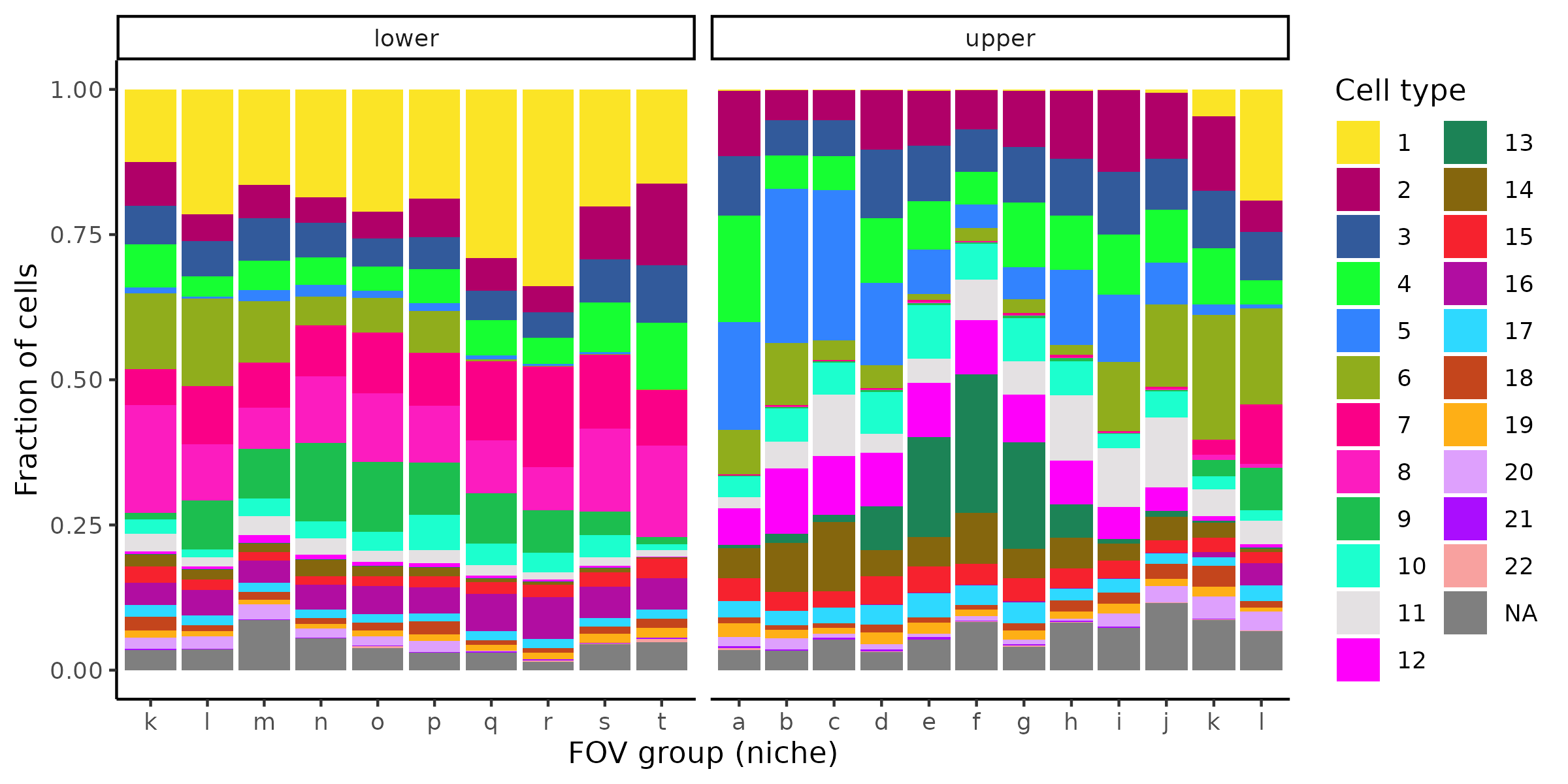
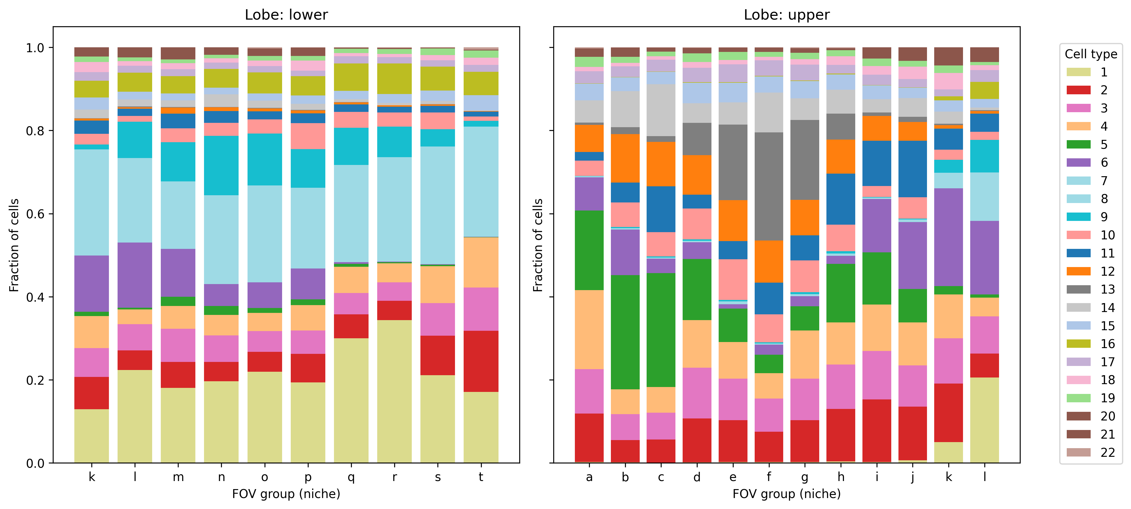
5.2 Cell type composition by annotation
We often want to show the cell type composition within a specific region or across patients. We don’t have multiple patients or slides in this dataset, so instead here we show the cell type composition by groups of FOVs, after splitting the sample into an upper and lower lobe. A more common use might be to show cell type composition by niche, but we have not calculated niches on this dataset.
# Add a basic lobe designation for demonstration purposescell_meta$lobe <-ifelse(cell_meta$CenterY_global_px >50000, "upper", "lower")# Add FOV group for demonstration similar to nichecell_meta <- cell_meta %>%mutate(fov_group = letters[ceiling(fov /20)])# Use polychrome palettemy_pal <- pals::polychrome(n =length(unique(cell_meta$leiden_cluster)))names(my_pal) <-unique(cell_meta$leiden_cluster)# Plot cell composition by niche, split by lobeggplot(cell_meta,aes(x = fov_group, fill =as.factor(leiden_cluster))) +geom_bar(position ="fill") +scale_fill_manual(values = my_pal, name ="Cell type") +facet_wrap(~lobe, scales ="free_x") +ylab("Fraction of cells") +xlab("FOV group (niche)") +theme_classic()ggsave(paste0(out_dir, "/barPlot_cellTypes_annotations.png"),width =8, height =4, units ="in")
Code
# Add a basic lobe designation for demonstration purposescell_meta['lobe'] = cell_meta['CenterY_global_px'].apply(lambda y: 'upper'if y >50000else'lower')# Add FOV group for demonstration similar to nichecell_meta['fov_group'] = cell_meta['fov'].apply(lambda x: string.ascii_lowercase[int(np.ceil(x /20)) -1])# Get unique cell types and assign colorsunique_cell_types = cell_meta['leiden_cluster'].unique()colors = plt.cm.get_cmap('tab20', len(unique_cell_types))color_dict = {cell_type: colors(i) for i, cell_type inenumerate(unique_cell_types)}# Prepare datagrouped = cell_meta.groupby(['lobe', 'fov_group', 'leiden_cluster']).size().reset_index(name='count')grouped['fraction'] = grouped.groupby(['lobe', 'fov_group'])['count'].transform(lambda x: x / x.sum())# Plotlobes = grouped['lobe'].unique()niches = grouped['fov_group'].unique()cell_types = grouped['leiden_cluster'].unique()fig, axes = plt.subplots(1, len(lobes), figsize=(6*len(lobes), 6), sharey=True)iflen(lobes) ==1: axes = [axes]for ax, lobe inzip(axes, lobes): data = grouped[grouped['lobe'] == lobe] lobe_niches =sorted(data['fov_group'].unique()) bottom = pd.Series(0, index=lobe_niches, dtype='float64')for ct in cell_types: values = data[data['leiden_cluster'] == ct].set_index('fov_group')['fraction'].reindex(lobe_niches, fill_value=0) ax.bar(lobe_niches, values.values, bottom=bottom[lobe_niches].values, label=ct, color=color_dict.get(ct, '#333333')) bottom[lobe_niches] += values ax.set_title(f"Lobe: {lobe}") ax.set_xlabel("FOV group (niche)") ax.set_ylabel("Fraction of cells")handles, labels = axes[-1].get_legend_handles_labels()labels = [str(int(float(label))) if label.replace('.', '', 1).isdigit() else label for label in labels]fig.legend(handles, labels, title="Cell type", bbox_to_anchor=(1.02, 0.5), loc='center left')plt.tight_layout()plt.savefig(f"{out_dir}/python_barPlot_cellTypes_annotations.png", bbox_inches='tight', dpi=300)plt.close()
6 Summary
This post introduced a suite of visualization techniques for CosMx spatial transcriptomics data starting from flat file inputs. Whether you’re assessing data quality, visualizing spatial structure, or exploring cell interactions, these plots can provide a powerful first look.
References
Hao, Yuhan, Tim Stuart, Madeline H. Kowalski, Saket Choudhary, Paul Hoffman, Austin Hartman, Avi Srivastava, et al. 2024. “Dictionary Learning for Integrative, Multimodal and Scalable Single-Cell Analysis.”Nature Biotechnology 42 (February): 293–304. https://doi.org/10.1038/s41587-023-01767-y.
Palla, Giovanni, Hannah Spitzer, Michal Klein, David Fischer, Anna Christina Schaar, Louis Benedikt Kuemmerle, Sergei Rybakov, et al. 2022. “Squidpy: A Scalable Framework for Spatial Omics Analysis.”Nature Methods 19 (February): 171–78. https://doi.org/10.1038/s41592-021-01358-2.