
library(data.table)
library(ggplot2)
library(ggrepel)

options(Seurat.object.assay.version = "v3")

#### Make a combined Seurat Object
sem_v20 <- readRDS("sem_v20.tiss_a.rds") ## tonsil dataset A with CosMx v2.0
sem_v15 <- readRDS("sem_v15.tiss_b.rds") ## tonsil dataset B with CosMx v1.51 Abstract
This post discusses batch effects in CosMx; how they impact analyses, how to detect them, and how to correct them. We recommend Harmony (Korsunsky et al. 2019) as a useful method for correcting batch effects in dimension reduction embeddings such as PCA, and demonstrate an example of how to use the software package.
For those in a hurry to ‘just see the code’, feel free to jump ahead to the Harmony Analysis section of this post.
2 Introduction
When analyzing multiple samples or ‘batches’ of data collected under different technologies or sample conditions, we may need to harmonize the data in a way that preserves biological variation while minimizing technical variation.
For example, suppose I were interested in analyzing multiple breast cancer tissue samples, but these samples were processed in different labs, by different scientists, or with different sample prep protocols. These technical differences could subtly effect gene detection efficiency in ways that may influence or confound an analysis. In particular, PCA, which responds quickly to small systematic changes impacting large numbers of variables, is highly sensitive to batch effects. This sensitivity then cascades down to analyses depending on PCA, e.g. UMAP and the Leiden and Louvain algorithms.
To check for presence of batch effects and whether correction is required, we recommend plotting the ‘batch’ on a UMAP plot or in principal component (PC) space (link to example figure). In the presence of batch effects, we may observe that cells cluster together by batch more distinctly than they do by their biological cell type.
For dimension reduction and clustering analyses, there is a multitude of existing research on batch correction methodology (Luecken and Theis 2019). The Harmony method (Korsunsky et al. 2019) has been recommended as a best-in-class approach in several studies which benchmarked different batch correction methodology for scRNAseq (Tran et al. 2020) (Emmanúel Antonsson and Melsted 2024) . Harmony takes as input a low-dimensional cell embedding such as PCA, and projects cells onto a new unsupervised joint embedding that groups cells by biological cell type rather than dataset-specific conditions. This Harmony embedding can be used as an input to downstream dimension reduction and clustering algorithms like UMAP(Ghojogh et al. 2021) and Leiden(Traag, Waltman, and Van Eck 2019).
For some other downstream analyses, batch effects can be explicitly handled or may be less of a concern. In the case of differential expression (DE) analysis, we could account for the technical effects by specifying ‘batch’ as a covariate in our DE models. Supervised or semi-supervised cell typing analyses that are independent of PCA dimension reductions (i.e., InSituType (Danaher et al. 2022)), may be less affected by batch effects. If we were to observe batch effects in this setting, one useful approach would be to perform the cell typing separately by batch before aggregating the cell type annotations.
In this post, we demonstrate using Harmony for batch effect correction on two 6k-plex tonsil tissue datasets; one dataset generated with CosMx 1.5, while the other generated with CosMx 2.0. The recent CosMx 2.0 release offers noticeable increases in sensitivity; often obtaining 1.5-2x the transcripts compared to the same sample processed with previous CosMx 1.5 software. In case we want to analyze a v1.5 and v2.0 dataset in the same analysis, we might consider treating this variable as a batch effect.
3 Initial Look at the data
3.1 Plot the two batches
Let’s take a quick peek at these two tissues, where unsupervised clustering has been performed independently on each:
Code
xyplot <- function (cluster_column, x_column = "x_slide_mm", y_column = "y_slide_mm",
                   cls = NULL, clusters = NULL, metadata, ptsize = 0.25, plotfirst = NULL,
                   alphasize = 1){
  pd <- data.table::copy(data.table::data.table(metadata))
  if (is.null(clusters))
    clusters <- unique(pd[[cluster_column]])
  if (!is.null(plotfirst)) {
    plotfirst <- intersect(clusters, plotfirst)
    notplotfirst <- setdiff(clusters, plotfirst)
    p <- ggplot(pd[pd[[cluster_column]] %in% plotfirst],
                aes(.data[[x_column]], .data[[y_column]], color = .data[[cluster_column]])) +
      geom_point(size = ptsize)
    p <- p + geom_point(data = pd[pd[[cluster_column]] %in%
                                    notplotfirst], aes(.data[[x_column]], .data[[y_column]],
                                                       color = .data[[cluster_column]]), size = ptsize,
                        alpha = alphasize) + theme_bw()
  }
  else {
    p <- ggplot(pd[pd[[cluster_column]] %in% clusters], aes(.data[[x_column]],
                                                            .data[[y_column]], color = .data[[cluster_column]])) +
      geom_point(size = ptsize, alpha = alphasize) + theme_bw()
  }
  if (is.null(cls)) {
    cls <- rep(unname(pals::alphabet()), 100)
    if (any(is.na(suppressWarnings(as.numeric(as.character(clusters)))))) {
      clnames <- sort(clusters)
    }
    else {
      clnames <- sort(as.numeric(as.character(clusters)))
    }
    cls <- cls[1:length(clusters)]
    names(cls) <- clnames
    p <- p + scale_color_manual(values = cls, guide = guide_legend(override.aes = list(size = 4,
                                                                                       alpha = 1)))
  }
  else {
    p <- p + scale_color_manual(values = cls, guide = guide_legend(override.aes = list(size = 4,
                                                                                       alpha = 1)))
  }
  return(p)
}

xyp <-
cowplot::plot_grid(
  xyplot("seurat_clusters",metadata =  sem_v20@meta.data,ptsize = 0.02) + coord_fixed() + labs(title = " v2.0")
  ,xyplot("seurat_clusters",metadata =  sem_v15@meta.data,ptsize = 0.02) + coord_fixed() + labs(title = "v1.5")
  ,nrow=1
) +  theme(plot.background = element_rect(fill = 'white',color='white')) +
cowplot::panel_border(remove=TRUE) 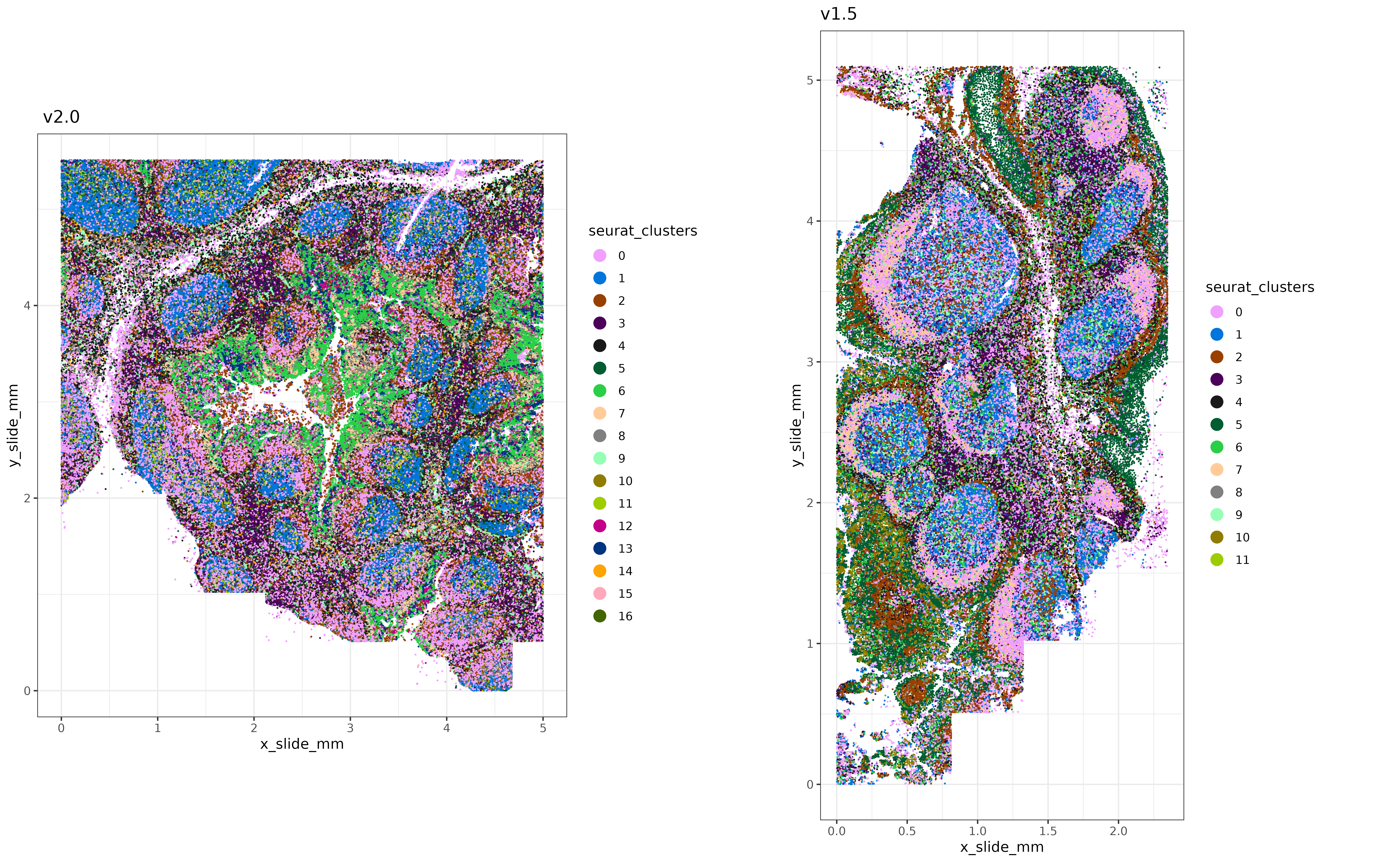
3.2 Differences in sensitivity between batches
Here, we can compute a few high-level summary stats like transcripts per cell and signal to noise ratio (SNR) for each batch.
We see ~2x increase in transcripts per cell with the v2.0 dataset, and higher signal to noise ratio (snr).
## Comparing counts/cell

cts_cell_1.5 <- mean(Matrix::colSums(sem_v15[["RNA"]]$counts))
cts_cell_2.0 <- mean(Matrix::colSums(sem_v20[["RNA"]]$counts))

## Comparing SNR
snr_1.5 <- mean(Matrix::colMeans(sem_v15[["RNA"]]$counts)) / mean(Matrix::colMeans(sem_v15[["negprobes"]]$counts))
snr_2.0 <- mean(Matrix::colMeans(sem_v20[["RNA"]]$counts)) / mean(Matrix::colMeans(sem_v20[["negprobes"]]$counts))

summary_stats <-
data.table(transcripts_per_cell = c(cts_cell_1.5, cts_cell_2.0)
           ,snr = c(snr_1.5, snr_2.0)
,version = c("v1.5", "v2.0"))[]print(summary_stats[]) transcripts_per_cell snr version
<num> <num> <char>
1: 448.3808 3.770205 v1.5
2: 1026.5255 6.043639 v2.04 Combining the data
Here we’ll combine the two datasets and prepare to harmonize them.
### Get overlapping genes (all the genes in this case) to combine the two datasets
overlapping_genes <- intersect(rownames(sem_v20), rownames(sem_v15))
combined_metadata <- data.table::rbindlist(list(
  sem_v20@meta.data
  ,sem_v15@meta.data
  )
  ,use.names=TRUE,fill = TRUE)
combined_metadata[cell_ID %in% colnames(sem_v15),batchid:="v1.5"]
combined_metadata[cell_ID %in% colnames(sem_v20),batchid:="v2.0"]

### Create a combined seurat object
sem_comb <-
Seurat::CreateSeuratObject(counts = cbind(sem_v20[["RNA"]]@counts[overlapping_genes,]
                                          ,sem_v15[["RNA"]]@counts[overlapping_genes,])
                           ,meta.data = data.frame(combined_metadata
                                                   ,row.names = combined_metadata$cell_ID)
                           )

### offset the x-coordinate of v1.5 to
### more easily plot both tissues side-by-side
x_offset <- max(sem_comb@meta.data$x_slide_mm[sem_comb@meta.data$batchid=="v2.0"]) + 1
sem_comb@meta.data$x_slide_mm[sem_comb@meta.data$batchid=="v1.5"] <-  sem_comb@meta.data$x_slide_mm[sem_comb@meta.data$batchid=="v1.5"]  + x_offset
5 Harmony Analysis
With our combined dataset containing all batches, we’ll perform a few standard tertiary analysis steps using the Seurat package. After principal component analysis, we will pass the PC embeddings to Harmony for batch correction.
### Normalize, Scale, and Run PCA on the combined dataset
#### (standard data analysis steps so far)
sem_comb <- Seurat::FindVariableFeatures(sem_comb)
normed <- Seurat::LogNormalize(sem_comb[["RNA"]]@counts
                                 ,scale.factor = mean(Matrix::colSums(sem_comb[["RNA"]]@counts))
                                 )
sem_comb <- Seurat::SetAssayData(sem_comb, layer="data", new.data = normed)
sem_comb <- Seurat::ScaleData(sem_comb)
sem_comb <- Seurat::RunPCA(sem_comb)
Now we run harmony with our PCA embeddings, specifying "batchid" as our variable to adjust for (our indicator for v1.5 and v2.0).
harmony_embeddings <- harmony::RunHarmony(sem_comb[["pca"]]@cell.embeddings
                                          ,meta_data = sem_comb@meta.data
                                          ,vars_use = "batchid"
                                          )
The harmony_embeddings returned are a cells \(\times\) # of pc's dimension matrix, with the same structure as the PCA embeddings.
str(harmony_embeddings)
harmony_embeddings[1:10,1:5]
num [1:405690, 1:50] -0.6465 2.4765 -0.8616 -0.0705 1.3351 ...
- attr(*, "dimnames")=List of 2
..$ : chr [1:405690] "c_1_204_1008" "c_1_204_1026" "c_1_204_1032" "c_1_204_1037" ...
..$ : chr [1:50] "PC_1" "PC_2" "PC_3" "PC_4" ... PC_1 PC_2 PC_3 PC_4 PC_5
c_1_204_1008 -0.64646187 -0.2827039 -2.8347802 1.6610461 2.2474144
c_1_204_1026 2.47653185 0.5783416 -0.4183124 0.9130872 -1.6640251
c_1_204_1032 -0.86158008 -3.1340938 -7.1958762 -3.2585168 1.8184731
c_1_204_1037 -0.07046239 0.8755237 -1.8787555 0.8000141 2.5718387
c_1_204_1046 1.33506948 1.1483278 -1.8171200 1.0649917 3.6876637
c_1_204_1051 2.10865793 1.8783302 -0.9869917 1.3061003 5.2610306
c_1_204_1068 -0.12255521 -1.0006297 -3.8287685 0.2517314 2.7422425
c_1_204_1099 -0.09401621 -0.3220125 0.3505044 -0.5086164 4.4133441
c_1_204_1100 1.21582681 1.8189899 0.1252721 -0.4560591 4.1331302
c_1_204_1110 2.92880860 1.4376377 -1.6135393 2.6411662 -0.4019986Here are what the original PCA embeddings look like for comparison:
str(sem_comb[["pca"]]@cell.embeddings)
sem_comb[["pca"]]@cell.embeddings[1:10,1:5]
num [1:405690, 1:50] -1.117 1.994 -1.456 -0.476 0.869 ...
- attr(*, "dimnames")=List of 2
..$ : chr [1:405690] "c_1_204_1008" "c_1_204_1026" "c_1_204_1032" "c_1_204_1037" ...
..$ : chr [1:50] "PC_1" "PC_2" "PC_3" "PC_4" ... PC_1 PC_2 PC_3 PC_4 PC_5
c_1_204_1008 -1.1173966 -0.6867905 -2.8949895 1.6105015 2.9180760
c_1_204_1026 1.9937914 0.2274147 -0.3855459 0.8213885 -1.0934278
c_1_204_1032 -1.4558828 -3.6307548 -7.3110656 -3.5378910 2.5581377
c_1_204_1037 -0.4759800 0.5822518 -1.8031810 0.6380289 3.0891367
c_1_204_1046 0.8686478 0.7673256 -1.8542354 0.9790450 4.3717053
c_1_204_1051 1.7701286 1.6232100 -0.9709824 1.1699966 6.0201625
c_1_204_1068 -0.6146554 -1.4230712 -3.9015371 0.1792131 3.4066027
c_1_204_1099 -0.5735693 -0.6600411 0.3747940 -0.6467651 4.9810832
c_1_204_1100 0.8734515 1.5610131 0.1432252 -0.5936082 4.8778765
c_1_204_1110 2.4355067 1.0686404 -1.6010894 2.5582519 0.18926886 UMAP and clustering with harmony
Let’s continue the analysis. We’ll use the Harmony embeddings rather than PCA embeddings to generate a UMAP and perform unsupervised clustering on the combined dataset.
Code
## (minor side-note), this helper function `make_umap` calls the same package
## and function as Seurat::RunUMAP, but also returns the
## 'nearest-neighbor graph' used in the UMAP algorithm.
## Using the same nearest neighbor graph for clustering and UMAP,
## can give better concordance between UMAP and unsupervised clusters.

make_umap <- function(pcaobj, min_dist=0.01, n_neighbors=30, metric="cosine",key ="UMAP_" ){
  ump <-
    uwot::umap(pcaobj$reduction.data@cell.embeddings
               ,n_neighbors = n_neighbors
               ,nn_method = "annoy"
               ,metric = metric
               ,min_dist = min_dist
               ,ret_extra = c("fgraph","nn")
               ,verbose = TRUE)

  umpgraph <- ump$fgraph
  dimnames(umpgraph) <- list(rownames(ump$nn[[1]]$idx), rownames(ump$nn[[1]]$idx))
  colnames(ump$embedding) <- paste0(key, c(1,2))
  ump <- Seurat::CreateDimReducObject(embeddings = ump$embedding, key = key)
  return(list(grph = umpgraph
              ,ump = ump))
}
##### Run helper function to make a umap and return the
##### nearest-neighbors graph used for unsupervised clustering.
umapharmony <- make_umap(pcaobj = list(
reduction.data = Seurat::CreateDimReducObject(embeddings = harmony_embeddings)
))sem_comb[["umapharmony"]] <- umapharmony$ump
sem_comb[["umapharmonygrph"]] <- Seurat::as.Graph(umapharmony$grph)
sem_comb <- Seurat::FindClusters(sem_comb, graph.name = "umapharmonygrph")
sem_comb@meta.data$clusters_unsup_harmony <- sem_comb@meta.data$seurat_clustersHere’s another look at the tissues, with clustering results generated downstream of the Harmony embeddings.
Code
xyp_harmony <-
  xyplot("clusters_unsup_harmony", metadata = data.table(sem_comb@meta.data),ptsize = 0.02) +
    coord_fixed() + labs(title = "After integration: v2.0 (left) and v1.5 (right)")

print(xyp_harmony)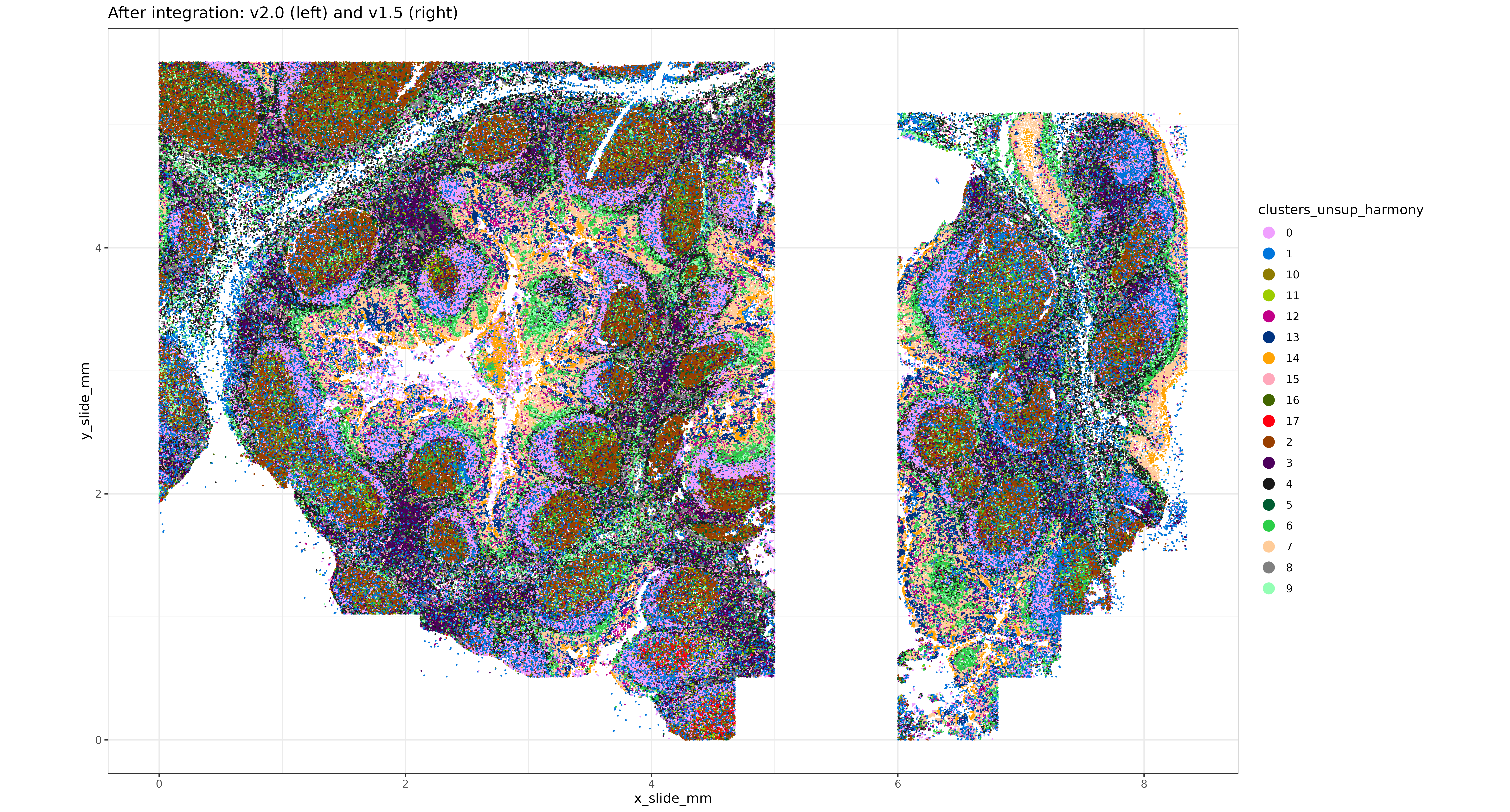
7 UMAP and clustering without harmony
Here we can re-make the UMAP and cluster without batch correction for sake of comparison.
##### Run helper function to make a umap and return the nearest-neighbors graph.
pcaobj <- sem_comb[["pca"]]
class(pcaobj)
umapobj <- make_umap(list(reduction.data = pcaobj))sem_comb[["umap"]] <- umapobj$ump
sem_comb[["umapgrph"]] <- Seurat::as.Graph(umapobj[["grph"]])
### Unsupervised clustering
sem_comb <- Seurat::FindClusters(sem_comb, graph.name = "umapgrph")
sem_comb@meta.data$clusters_unsup_unintegrated <- sem_comb@meta.data$seurat_clusters8 Comparison with and without integration
Plotting the first two PC’s, colored by batchid, it looks like the v1.5 data may span a more similar domain of PC1 and PC2 space after Harmony, indicating better integration.
Code
set.seed(123)
shuffle_order <- sample(1:nrow(harmony_embeddings)) ## shuffle cell order for plotting
cls <- c("#1f77b4", "#ff7f0e")
names(cls) <- c("v2.0", "v1.5")

all.equal(rownames(harmony_embeddings), sem_comb@meta.data$cell_ID)
pc1vs2_harmony <-
cbind(data.table(sem_comb@meta.data)[,.(cell_ID, batchid, x_slide_mm, y_slide_mm)]
      ,data.table(harmony_embeddings))

harmony_plt <-
ggplot(pc1vs2_harmony[shuffle_order], aes(x = PC_1, y = PC_2, color=batchid)) + geom_point(size=0.2, alpha=0.5, shape=16) +
  scale_color_manual(values = cls) +
  theme_bw() +
  coord_fixed() +
  guides(color = guide_legend(override.aes=list(size=4, alpha=1)))

pc1vs2_regular <-
cbind(data.table(sem_comb@meta.data)[,.(cell_ID, batchid, x_slide_mm, y_slide_mm)]
      ,data.table(sem_comb@reductions$pca@cell.embeddings))

regular_pca_plt <-
ggplot(pc1vs2_regular[shuffle_order], aes(x = PC_1, y = PC_2, color=batchid)) + geom_point(size=0.2, alpha=0.5, shape=16) +
  scale_color_manual(values = cls) +
  theme_bw() +
  coord_fixed() +
  guides(color = guide_legend(override.aes=list(size=4, alpha=1)))

pc_comparison_plt <-
cowplot::plot_grid(harmony_plt + labs(title = "integrated using harmony")
                   ,regular_pca_plt + labs(title = "un-integrated")) +
  theme(plot.background = element_rect(fill = 'white',color='white')) +
  cowplot::panel_border(remove=TRUE)

print(pc_comparison_plt)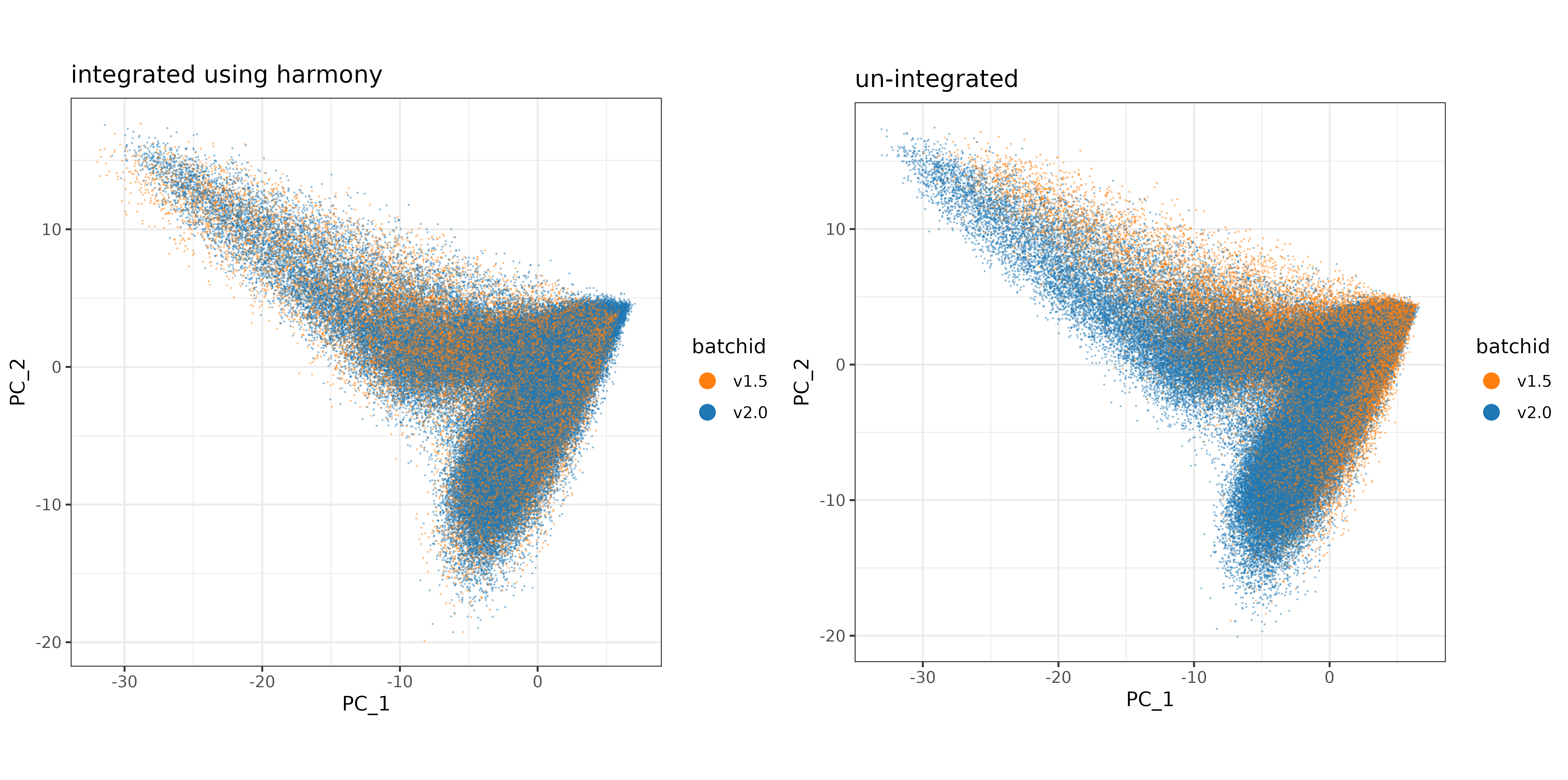
Plotting the UMAP, colored by batchid, there doesn’t appear to be an enourmous difference (which is not a bad thing), but it does look like there may be areas of the UMAP better covered by both datasets (less batch-specific) after Harmony integration.
Code
umap_harmony <-
cbind(data.table(sem_comb@meta.data)[,.(cell_ID, batchid, x_slide_mm, y_slide_mm)]
      ,data.table(sem_comb@reductions$umapharmony@cell.embeddings))

harmony_plt <-
ggplot(umap_harmony[shuffle_order], aes(x = UMAP_1, y = UMAP_2, color=batchid)) + geom_point(size=0.2, alpha=0.5, shape=16) +
  scale_color_manual(values = cls) +
  theme_bw() +
  coord_fixed() +
  guides(color = guide_legend(override.aes=list(size=4, alpha=1)))

umap_regular <-
cbind(data.table(sem_comb@meta.data)[,.(cell_ID, batchid, x_slide_mm, y_slide_mm)]
      ,data.table(sem_comb@reductions$umap@cell.embeddings))

regular_umap_plt <-
ggplot(umap_regular[shuffle_order], aes(x = umap_1, y = umap_2, color=batchid)) + geom_point(size=0.2, alpha=0.5, shape=16) +
  scale_color_manual(values = cls) +
  theme_bw() +
  coord_fixed() +
  guides(color = guide_legend(override.aes=list(size=4, alpha=1)))

umap_comparison_plt <-
cowplot::plot_grid(harmony_plt + labs(title = "integrated using harmony")
                   ,regular_umap_plt + labs(title = "un-integrated")) +
  theme(plot.background = element_rect(fill = 'white',color='white')) +
  cowplot::panel_border(remove=TRUE)

print(umap_comparison_plt)
Code
umap_harmony_clusters <-
cbind(data.table(sem_comb@meta.data)[,.(cell_ID, clusters_unsup_harmony, x_slide_mm, y_slide_mm)]
      ,data.table(sem_comb@reductions$umapharmony@cell.embeddings))

harmony_plt_clusters <-
ggplot(umap_harmony_clusters, aes(x = UMAP_1, y = UMAP_2, color=clusters_unsup_harmony)) + geom_point(size=0.2, alpha=0.5, shape=16) +
  scale_color_manual(values=unname(pals::alphabet())) +
  theme_bw() +
  coord_fixed() +
  guides(color = guide_legend(override.aes=list(size=4, alpha=1)))

umap_regular_clusters <-
cbind(data.table(sem_comb@meta.data)[,.(cell_ID, clusters_unsup_unintegrated, x_slide_mm, y_slide_mm)]
      ,data.table(sem_comb@reductions$umap@cell.embeddings))

regular_umap_plt_clusters <-
ggplot(umap_regular_clusters, aes(x = umap_1, y = umap_2, color=clusters_unsup_unintegrated)) + geom_point(size=0.2, alpha=0.5, shape=16) +
  scale_color_manual(values=unname(pals::alphabet())) +
  theme_bw() +
  coord_fixed() +
  guides(color = guide_legend(override.aes=list(size=4, alpha=1)))

umap_comparison_plt_clusters <-
cowplot::plot_grid(harmony_plt_clusters + labs(title = "integrated using harmony")
                   ,regular_umap_plt_clusters + labs(title = "un-integrated")) +
  theme(plot.background = element_rect(fill = 'white',color='white')) +
  cowplot::panel_border(remove=TRUE)

print(umap_comparison_plt_clusters)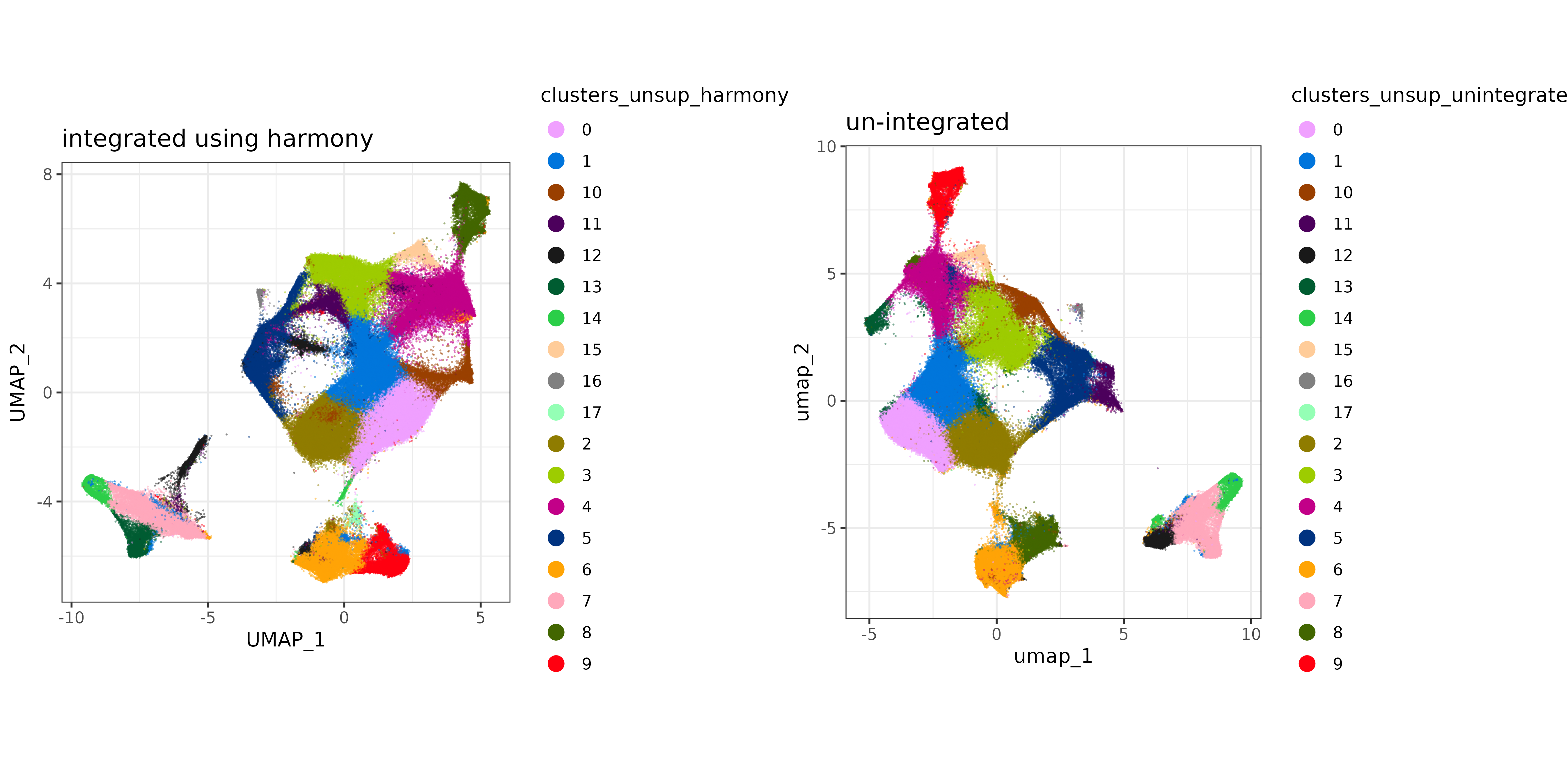
9 Conclusion
In this post we demonstrated applying the batch effect correction technique ‘Harmony’ to two 6K-plex tonsil tissue datasets generated with very different sensitivity performance. In general, the impact of batch effects may depend on the severity of the technical artifact, as well as the scope and depth of the analysis. In the event that one wishes to analyze multiple samples together which were generated under different technical conditions, we recommend plotting the technical batch variable in UMAP or PC space as a qualitative diagnostic, and inspecting whether cells are clustered by ‘batch’. For this example, the batch effect between our two datasets was visually noticeable when plotted on a UMAP and the first two principal components. Cells were visually less segregated by batch after the correction was applied.
References
Danaher, Patrick, Edward Zhao, Zhi Yang, David Ross, Mark Gregory, Zach Reitz, Tae K. Kim, et al. 2022. “Insitutype: Likelihood-Based Cell Typing for Single Cell Spatial Transcriptomics.” bioRxiv. https://doi.org/10.1101/2022.10.19.512902.
Emmanúel Antonsson, Sindri, and Páll Melsted. 2024. “Batch Correction Methods Used in Single Cell RNA-Sequencing Analyses Are Often Poorly Calibrated.” bioRxiv, 2024–03.
Ghojogh, Benyamin, Ali Ghodsi, Fakhri Karray, and Mark Crowley. 2021. “Uniform Manifold Approximation and Projection (UMAP) and Its Variants: Tutorial and Survey.” arXiv Preprint arXiv:2109.02508.
Korsunsky, Ilya, Nghia Millard, Jean Fan, Kamil Slowikowski, Fan Zhang, Kevin Wei, Yuriy Baglaenko, Michael Brenner, Po-ru Loh, and Soumya Raychaudhuri. 2019. “Fast, Sensitive and Accurate Integration of Single-Cell Data with Harmony.” Nature Methods 16 (12): 1289–96.
Luecken, Malte D, and Fabian J Theis. 2019. “Current Best Practices in Single-Cell RNA-Seq Analysis: A Tutorial.” Molecular Systems Biology 15 (6): e8746.
Traag, Vincent A, Ludo Waltman, and Nees Jan Van Eck. 2019. “From Louvain to Leiden: Guaranteeing Well-Connected Communities.” Scientific Reports 9 (1): 1–12.
Tran, Hoa Thi Nhu, Kok Siong Ang, Marion Chevrier, Xiaomeng Zhang, Nicole Yee Shin Lee, Michelle Goh, and Jinmiao Chen. 2020. “A Benchmark of Batch-Effect Correction Methods for Single-Cell RNA Sequencing Data.” Genome Biology 21: 1–32.